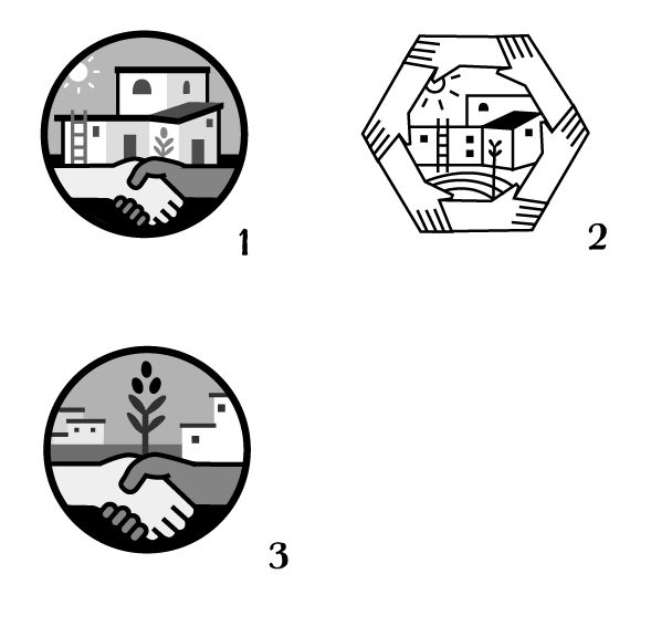
I’m so stuck with this mark, it’s currently too complicated and doesn’t reduce well in size, but the icons of partnership and buildings/village has got to be a part of it.
Any thoughts on these? I’m somewhat limited on time which is adding to it.
#3 is the simplest but emphasizes the plant rather than the buildings. I’d take this one off on a few tangents and see where you go.
#2 is the least inspired. All the line weight is the same. There is no visual hierarchy.
#1 has too many elements. You don’t need ladders or the sun icon. Also has too many potential color variations. Working in Grayscale is not the same as working in black and white.
But since you haven’t said what this is or who it’s aimed at, hard to tell if any of them are effective.
Does it need to be contained? Have you tried only having the hands, and then that first building (more simplified) on top of them? As if to say “We build villages through partnership”.
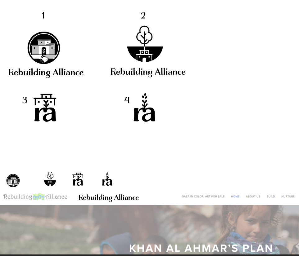
#1 doesn’t translate well at the reduced size. #2 seems to have a focus on the environment with the dominance of the tree. At the reduced size you lose the house and it looks like roots (which is kind of cool, but I don’t think you’re going for that.) #3 & 4 at the reduced size looks odd with the plant. But the “ra” reduces best.
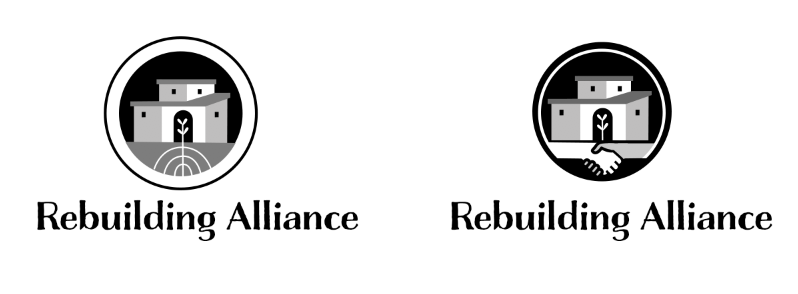
Also, with the semi-circle (#2) there is less stability in terms of balance. If the wind blows it looks like it will rock from left to right. A solid rectangle may give the mark more stability in that sense.
Maybe a solid black rectangle, with the “ra” inverted (white text) and then the house icon (minus the plant) on top (or if it’s required, maybe on the side and/or if you are going with the tree theme, I think an olive tree/branch would communicate better as pursuing peace, which is an aspect of their mission statement). The solid block would symbolize a solid foundation (with the “ra” representing the organization) and the house would represent rebuilding homes/communities–the overall mission of the organization.