Logo + Name For Clothing Company

Hello, I am new here and would like some feedback for the logo I created for the clothing company I am starting.

The name is “Stone Brand” and it will be focused on making aesthetically pleasing yet patriotic/bad-ass style clothing. I’m not completely set on the name “Stone Brand”, I just thought it sort of fit the kind of things I’d be selling; the word stone makes me think of the words modern, strong, and cool. I also wanted to incorporate a stone/gem element to the logo, and after a long time playing with different designs, I came up with this elongated hexagon shape. The blacks and greys I used made it very “stoney” if you know what I mean, and I like the tone it brings to the design. I will probably tweak the colors later on to create more contrast.


Any feedback is greatly appreciated!

Without picking it apart much, I think the look is not bad, but here’s the thing:

At small size / long distance, it’s gonna read ‘STORE BRAND’ to at least some people. That’s not a good result. Maybe it’s good the name isn’t…

…wait for it…

…set in STONE.

:roll_eyes:

Haha! Thanks for your input, I will definitely consider that.

And, just my 2 cents, most brands don’t label themselves as brands. Stone by itself may or may not work, but perhaps another work combined with stone.

1 Like

I almost choked on my McDonald’s brand burger. Fortunately I cleaned it up with my Kleenex brand tissue.

Having read your whole post, I say good for you for thinking through this and having reason behind what your doing. That said, this feels a little flat to me. Not flat as in “flat design” as a style, but flat as in lacking life. I don’t look at this and think “patriotic/bad-ass style clothing.” I’d like to see you push more and really knock it out of the park. Just my two cents.

It would help if you define your ideal customer – sometimes referred to as an “ideal customer profile” – and then create a mood board with other brands, colors, textures, etc. that appeal to your demographic.

I don’t see the word BRAND as something to avoid. I think you’re embracing a down-to-earth, generic, blue-collar and no-nonsense approach as part of your image, which to me, seem like a legitimate direction. Honestly, it’s sort of a made-up, hipsterish creation, but still, it’s headed in a well-thought-through direction if that’s your primary target audience (which you didn’t mention).

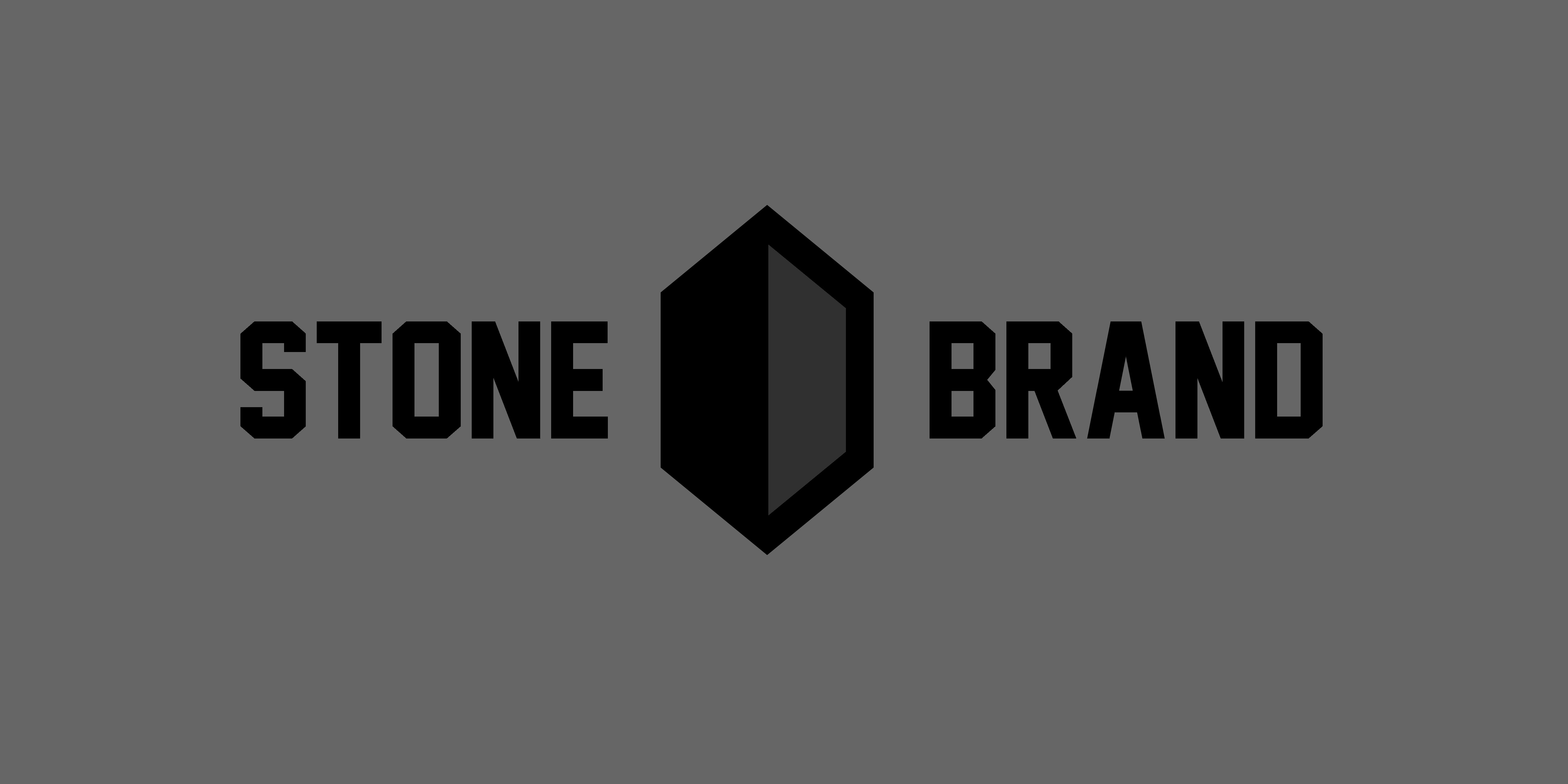
However, your choice of colors are, well, dark, dreary and depressing. It’s not even an interesting gray you’ve used, it’s a flat, lifeless gray lacking a soul, which is what I think Steve was referring to. I get it when you say you want to play up strength and stone-like qualities, but you’ve tossed out all the nuances of what you could do with subtle stone-like colors, and made it as dull, boring and monotonous as a cinder block.

From a practical standpoint, you won’t be able to reproduce this logo using four-color process printing since color shifts typically occur with neutral grays composed of process colors. If the magenta prints just one percent darker than, say, the cyan, it will cause a noticeable shift to red or the other way around if the cyan is a little off. This reduces the background to never being anything but a lifeless screentint of black ink.

And speaking of the way-too-dark and dreary background, why is it there anyway? A background isn’t normally part of a logo and controlling the background color each time your logo is used will not be practical or desirable. I mean, what are you intending to do, make a dark gray box around every instance of the logo being used — that won’t look good.

I like the industrial look of the typeface since it fits with the personality you’re trying to create, but your letter spacing is, well, not so good, as in S T ONE BR A ND.