Hi, I realise I have already done a similar post so this is not intended to be a duplicate, but more of a refined question.
I need to finalise a logo for a fitness/strength brand which sells gym equipment, clothing, supplements etc and have narrowed my choice down to two variations.. but still really undecided.
The only difference between the two is the arrow chevrons, which are to symbolise getting bigger / stronger / enhancement etc.
They are not supposed to symbolise anything to do with military, but the fact that they might do is not a problem as that would still work anyway.
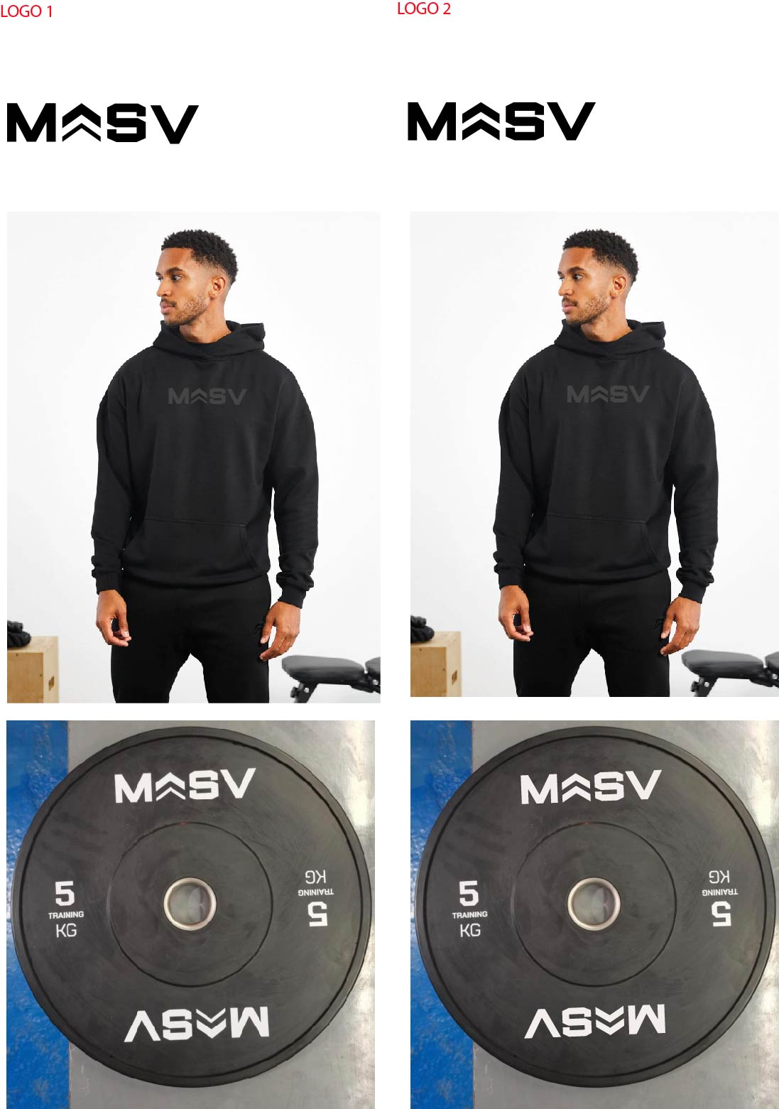
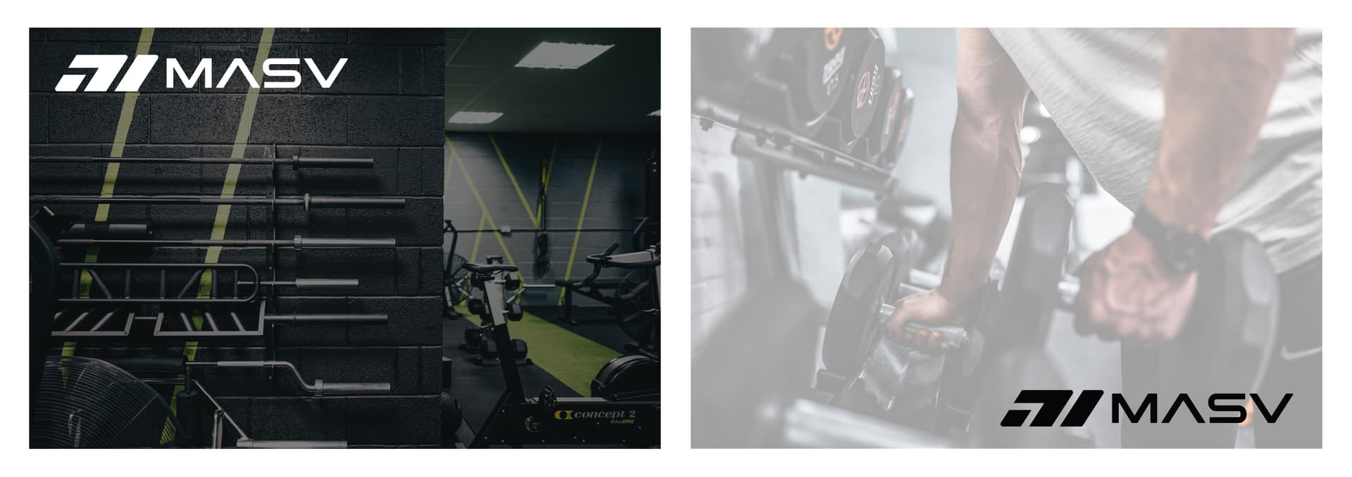
I was previously advised to fix the kerning between the S and V which I have now done, and have provided an updated example.. also mockups of the logo on a piece of equipment and clothing item help give context.
Which do you guys think is better, has the most potential?
I also have a suggestion. Someone mentioned it in your previous thread, but you haven’t implemented it.
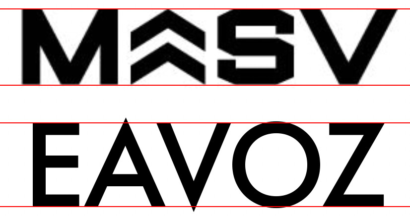
Have you heard of overshoots?
The flat tops and bottoms of letters in most typeface line up. However, letters that have rounded or pointy tops need to extend just a little ways past where the flat letters line up. This extension is called an overshoot.
This overshoot compensates for the optical illusion of letters that only touch the top line and the baseline looking visually smaller than the flat letters. Overshoots are part of every well-designed typeface that has rounded or pointy letters.
The typeface Futura is a good example since the lighter weights have lots of pointy and rounded letters. In the example below, you can see how the points on your chevrons line up. In the Futura example below it, you can see how the pointy and rounded letters have overshoots that make those letters appear to be the same height as the flat letters.
Thanks for ‘pointing’ that out! I didn’t know about overshooting no, must have overlooked that reply on the old thread.
Glad you mentioned because I did wonder why at first glance the chevrons seem to appear ever so slightly smaller than the rest of the letters to the naked eye.
@Joe was right of course, and it took me a little while longer to see something that has been staring at me that I didn’t notice.
The M and V are simple, straight forward shapes, but the S is unnecessarily complex. I understand that’s the way the font was designed, but in this case the S is standing out like a sore thumb in comparison with the M,S,V combination.
Ahh guys and gals!.. appreciate your advice but this has left me in a real dilemma now I was totally set on Logo 1, and even have already had some stuff printed using it.
But I can’t ignore what everyone is saying which is that Logo 2 is better (problem is I personally don’t like lol)
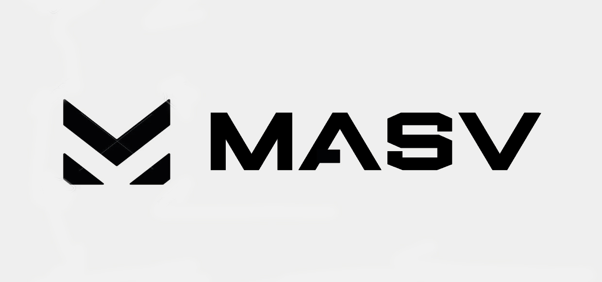
Am I better do you think just doing something different like this new idea below?
Easier to read the word MASV at first glance, and has an Icon. (It’s only a rough draft.. need to sort kerning etc)
Still has military vibes I know, bit I like that font.
@Eriskay I hear you re the letter S.. since the shape of this new icon incorporates the diagonal lines now, do you think this makes the S blend in better?
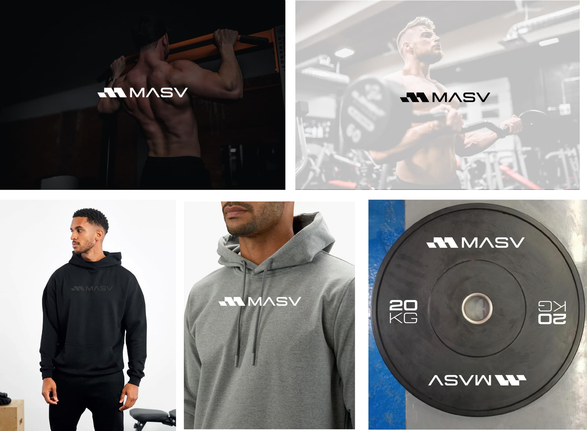
Ok people I have took a new approach to this now and gone in a different direction (see attached)
I think this would work better on a consumer / commercial level, and has better scope for if going into to other areas such as clothing, nutrition etc as well as just equipment.
Got rid of any military assumptions whatsoever.. and now just looks like a general, modern fitness brand.
Hi guys, sorry to post about this again but need another round of opinions
See attached.
I have decided I am going with the second style of font for the typeface (not the hexagon / military one) and have re done the ‘M’ icon, as I didn’t like the fact that as @Billyjeanplxiv said the last one looked like a person curling the weight., which as I said would have worked if it didn’t look like 2 arms instead of one.
Anyhow, could you guys confirm if you think I have now nailed the logo once and for all.
Could you imagine seeing this is your local gym on some of the equipment etc. and not think it looks out of place.
To recap, this is for strength/gym equipment brand, and is supposed to read MASV (meaning Massive)