Hey guys
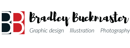
Recently I did a re-brand for my personal logo, and I would be interested to hear peoples opinion of it. As you can see, I used the first two names as the basis of my symbol, with the colour choices aiming
to represent creativity, passion and professionalism.
Thanks
You had previously posted the razor blade themed logo, correct?
Listen, you’re working hard on this, so I hate to be a downer, but this isn’t working. There are too many separate things going on, and they don’t hold together.
The double B is the obvious solution, but I think you could be on to something with that.
Here’s my strong recommendation. Don’t worry about the Bradley Bucknaster type or the tag line. Spend time concentrating on the BB monogram. Step away from the computer and spend time sketching out ideas. Sketch a lot of ideas. This phase isn’t a 30 minute exercise, it could be days.
From there, take the top 10 or 12 ideas and develop those on the computer. Show us the options you’ve come up with for a BB mongram and get feedback on that. Get that nailed down and then tackle the type.
3 Likes
I agree with Steve_O. Too much going on. The BB needs to be your main focus and make your name more readable and simple. The BB monogram could have a more fun font, focus on that.