I’m working on the branding for a startup in the clothing industry. At the most basic level, our app will take your body measurements and tell you what size of any particular clothing brand & product will fit you best.
The ideas here all stemmed from the idea of tailoring tape measure, in its simplest form, of course.
None of these are finalized, but I’ve been struggling with the shape so I was hoping to get some feedback on the most promising one and go from there. I’ve been staring at them so long I have become numb.
I know which I prefer, but my co-workers disagree, SO, I thought it would be interesting to have some feedback from this wonderful community
My comments are based on the lined presentation PDF rather than the black and whites you’ve posted here.
Overall, I like the concept of using a tailor’s measuring tape to form an M. Good job on that.
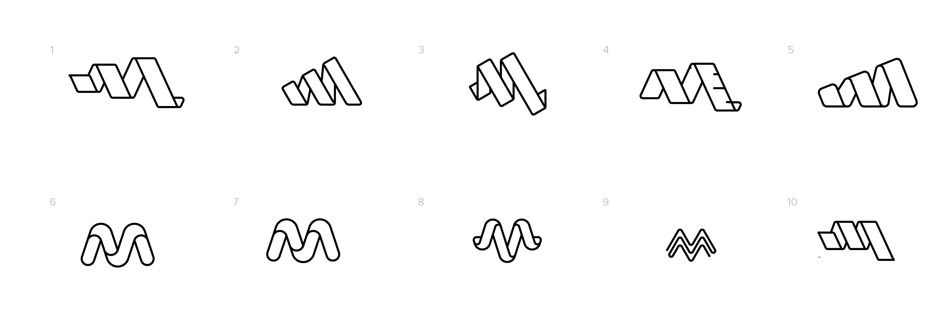
1 – Feels a bit more like a spiral than an M.
2 – I like this one. The only drawback is that it’s a bit close to the Adidas logo.
3 – The M isn’t as immediately obvious.
4 – I think the tick marks are an unnecessary detail.
5 – Again, a little too Adidas.
6 & 7 – My favorites of the bunch. I lean towards 7.
8 – Looks more like a V than an M.
9 – I’d oddly okay with this version.
10 – I like this version. For some reason, it reads less like a spiral than version 1. I’d be curious to see this with the white lines separating the foreground tape from the background tape.
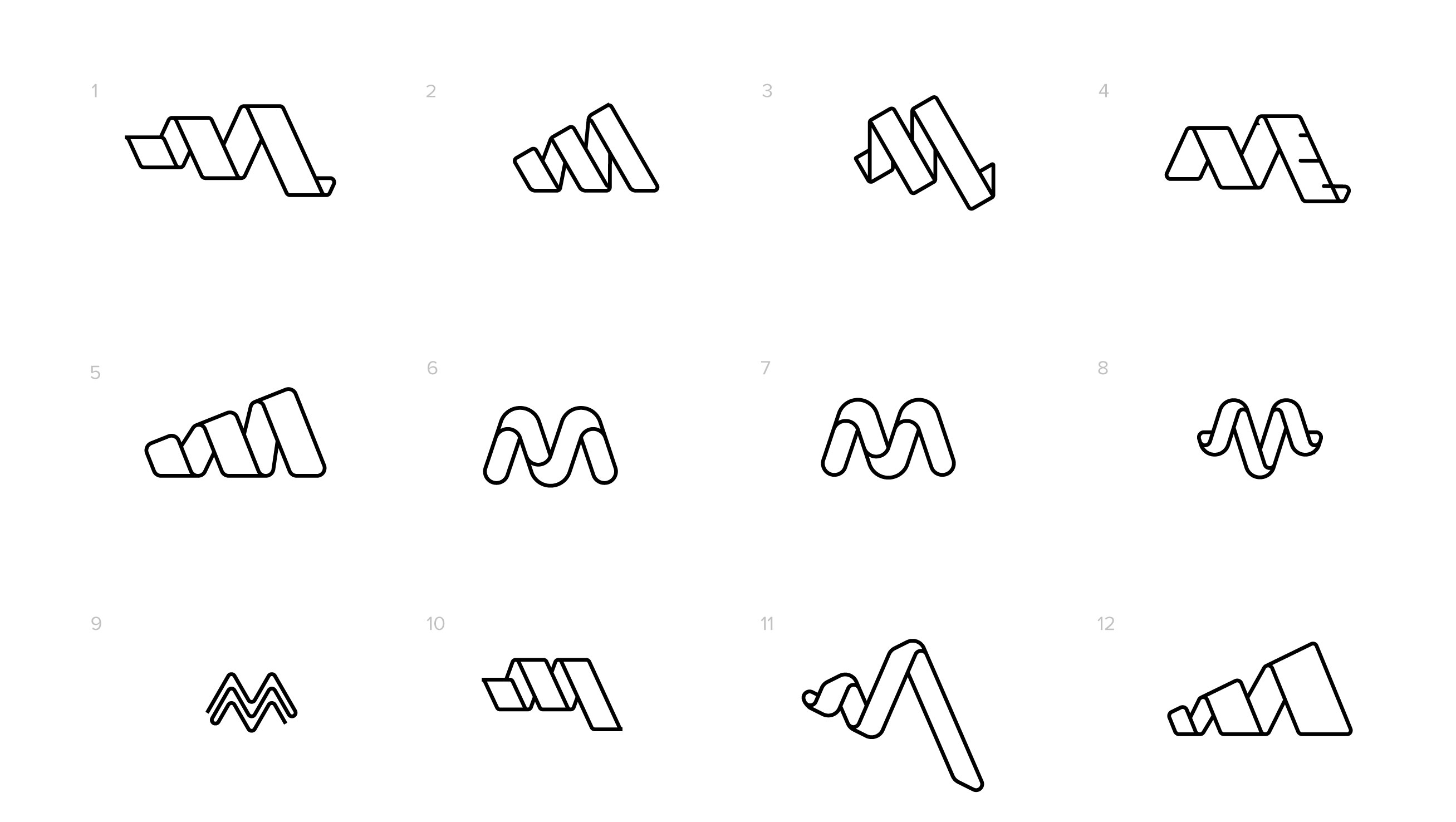
I like numbers 6, 7, 8, and 11 the least since, to me, they look more like egg noodles than measuring tapes.
Number 1 is okay, but the M is a bit obscure. Number 2 is nice, but as Steve_O said, it looks too much like the Adidas logo. Number 3 could work, but it’s not my favorite. I like number 4, but the piece with the marks on it looks a bit forced. I don’t see much of an M in number 5. Number 9 is the outlier, but it could work despite it not having an obvious connection to clothing. Number 12, has varying widths, which measuring tapes do not.
Will the company name go with this logo? If so, I would work on them side by side. What looks good on its own might feel really different alongside the company name.
I would steer well clear from anything that looks adidas-like.
I think #10 makes the most sense in terms of proportional balance, and I like the idea of the tape measure, but the concept would tie more readily if the wrap direction was something closer to horizontal (you know, the way a tape measure would wrap around your waist).
That said, I can’t see the linked content so I don’t know if it provides more context. I’d want to know what the M stands for, and what the potential might be to reinforce the recognize-ability of the tape measure with respect to planned applications.
I spend almost all of my screen-time at a primary client’s facility. It’s a company that’s very protective of its technologies and computing environment, so blockage of various domains is common. Probably just that.
Not sure whether that has a meaning of which I’m unaware, but in any case, I’d need more context. Who/where is the target market? Do I understand correctly that it’s an app which processes a person’s measurements (that they enter) and recommends specific clothing by brand and item? That’s actually kind of interesting; what else does it do? What are the logo applications?
Thanks for the replies, everyone! This is a huge help.
I should mention that a large part of what we’re building is about data-sharing.
It’s just the beginning for us, but there are some very big plans in the future if this application is a success–which is the meaning behind number 12. I really like the concept behind it, but the execution is lacking. Any ideas on improving this “growing” concept would be super helpful.
The target market is anyone looking to get better recommendations for clothing sizing–which is most likely to be online shoppers. It recommends the correct size of the item they are viewing for their own personal fit. It does a lot more, unfortunately, I can’t go too far into detail. Just know that we plan to grow, and we want to represent that and the people who use this app in all their variety of sizing and shapes.
Logo applications are mostly going to be digital but could include company apparel in the future.
I’m usually opt fot simplicity, so my favorite since the beginning has been #7. I agree that it may not represent the company and it’s vision perfectly, but for pure aesthetics I lean towards it.
#10 is growing on me and I’ve been playing with it the most lately. I agree with Hotbutton that It’s well balanced and I’ve never seen another logo like it which is a big plus.
I appreciate the concept of 12, however, I feel like the execution of it is pretty rough, though I’ve messed with it a lot and am having trouble finding balance with it.
Im a perfectionist in my designs, so any lines that are at random angles are always going to drive me nuts. This is why the Adidas-like shapes are hard for me to get behind. It’s proven extremely difficult to match angles and keep the mark balanced.
If anyone wants a design challenge, try gridding that out to perfection and you’ll see what I mean.
Number 10 was my favorite too. I mentioned #7 looking more like an egg noodle than a measuring tape, which I still think is the case (sorry). Even so, I do like the shape and can see why you’re favoring it. Still, it doesn’t really look like a measuring tape to me — assuming that’s what it’s supposed to be.
I don’t know all the details, of course, that factor into choosing the best logo for the company’s particular situation, but honestly, just from mainly an aesthetic viewpoint, you’ve got a winner in #10. It’s a good, solid mark.
Doc, I was hoping the OP would elaborate. All of your points are valid. But why in this case do they not agree with the designer?
OP:
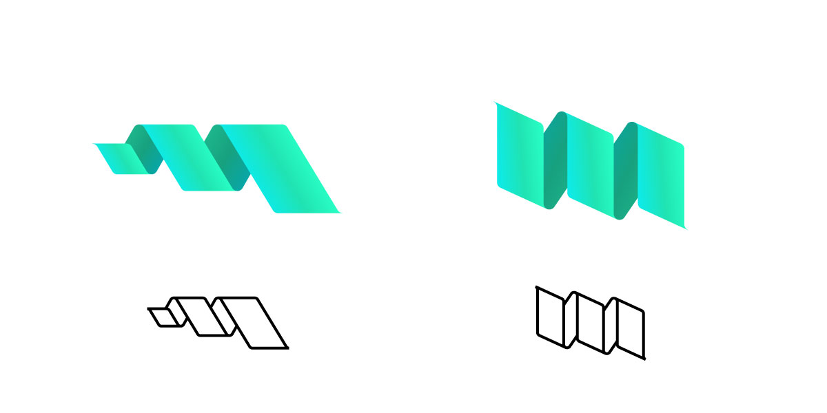
You need to make that logo work without using gradients.
Just an FYI, you’ve chosen the two WORST colors to use in a gradient, light blue and green. Alone those colors behave badly in gradients. Together they make a bad thing worse.
The first one is more successful at denoting a tape measure.
The second is disjointed. I can see the logic behind the attachment of the planes but it still looks unintentionally like a mistake is going on somewhere in there.