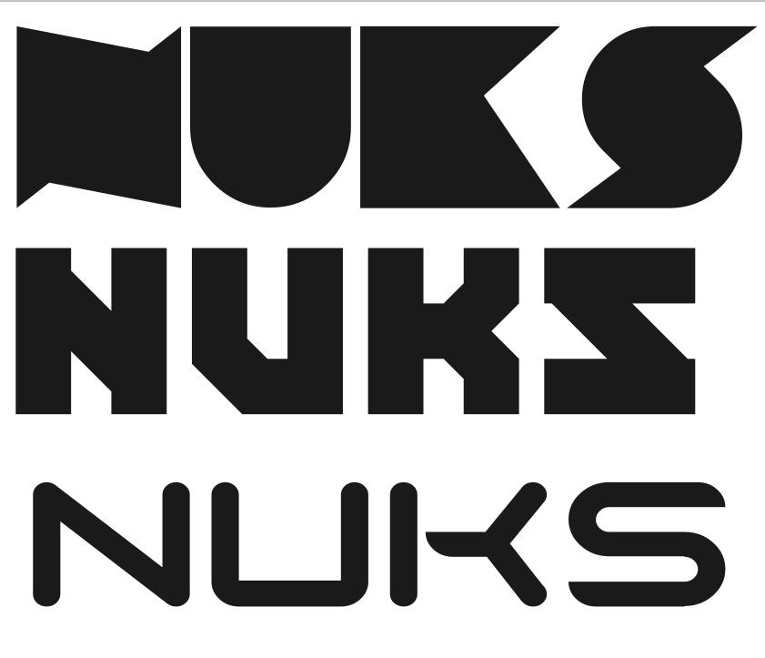
Hello! I need some feedback on a logotype I made recently. I’ve been tasked with managing projects at my University, and one of them required some graphic design - which my Uni’s design department could not aid with. This logo was made to replace a first emblem design, which was to be used only within a report on work progress. “NUKS” is an abbreviation in Russian, but the project founder asked for me to render it with latin letters. Please tell me how understandable it is, and if this design fits.
The font was licensed for commmercial use. The logotype’s actual file is a vector graphic which can be scaled to any size, the site does not seem to allow SVG file upload. Colour is also not definitive, this is just an example, made to fit with the project presentation colour scheme.
Logotype: