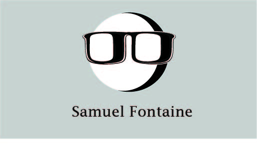
First of all, showing us the before and then two alternates is a good way to ask for a critique – so this is a step in the right direction. if you don’t mind, and if this isn’t too personal, would you mind answering the following questions to help put your work in context?
– Are you in school? If so, what level?
– Have you completed your schooling and working full time?
– If you’re working full time, what do you do?
– What are your career goals? Is graphic design a side thing? Do you hope to be a full time designer?
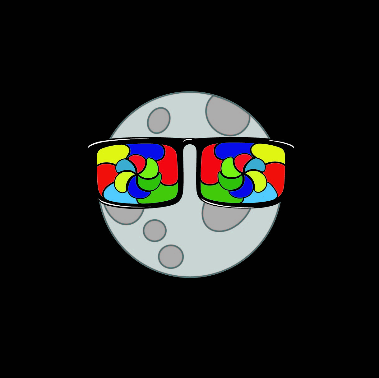
– What is the significance of the moon wearing glasses?
Hey Steve-O to answer your questions
1: I am in school, second degree seeking in New Media, my first degree was in Studio Art (Useless for my purposes)
2:I work 15 hours a week with the school’s marketing team making flyers and event marketing materials. Freelancing is my side job that helps keep me afloat financially.
3: My goal is to become full-time whether that’s with a company or full time freelancing.
4: The moon significance came about when I first designed that first logo almost 8 years ago after learning that a birthday in July makes you a Cancer and the moon is that symbol. I actually see now that that connection is not apparent in the slightest, but I’d like the keep the motif in one way or another for that reason.
Thanks Doc, I’ll check that out really soon! Design is such a conceptual field of work, and it’s also pretty subjective. The conceptual aspects of design are not a natural trait for me, which is why I know that seeking critiques is one of the main ways I’m going to improve. I appreciate everyone’s input on everything I have posted and will post.
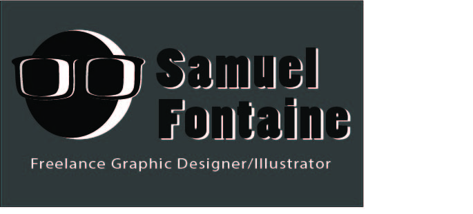
I didn’t see a moon in your original logo. I thought the spots were liver spots. I guess it’s pretty subtle. Maybe too subtle. If you plan on moving away from the moon concept, that’s cool.
At the moment, it only really works on a dark or coloured background. This is really limiting. Have you thought about how your logo will look on a white background?
Designing a logo for yourself is often the hardest thing. I think it’s important to brainstorm your brand as if you were a paying client. Step outside of yourself and see it from the perspective of a client.
Haha yeah, I had that thought more than once in the design process all those years ago. I always assumed no one else would see it if I made the overall design busy enough, I was so naive back then, lol.