I need honest feedback. Constructive criticism.
Let me know your thoughts!!
Overall, it looks very nice. These suggestions are fine tuning in nature.
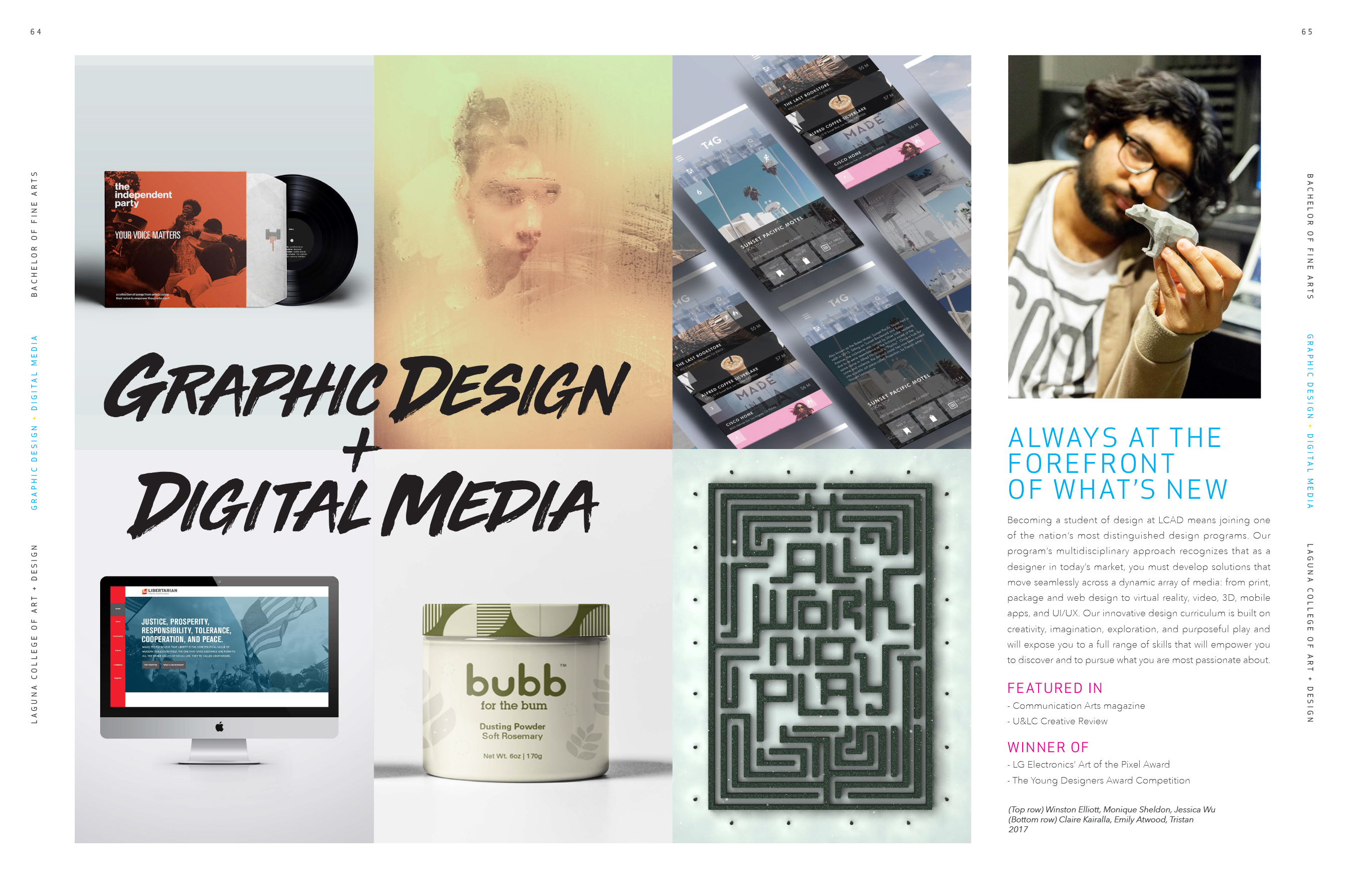
64 / 65 spread
– Maybe move the + so it’s right at the intersection of the four images. You’d have to make that change and see how it looks.
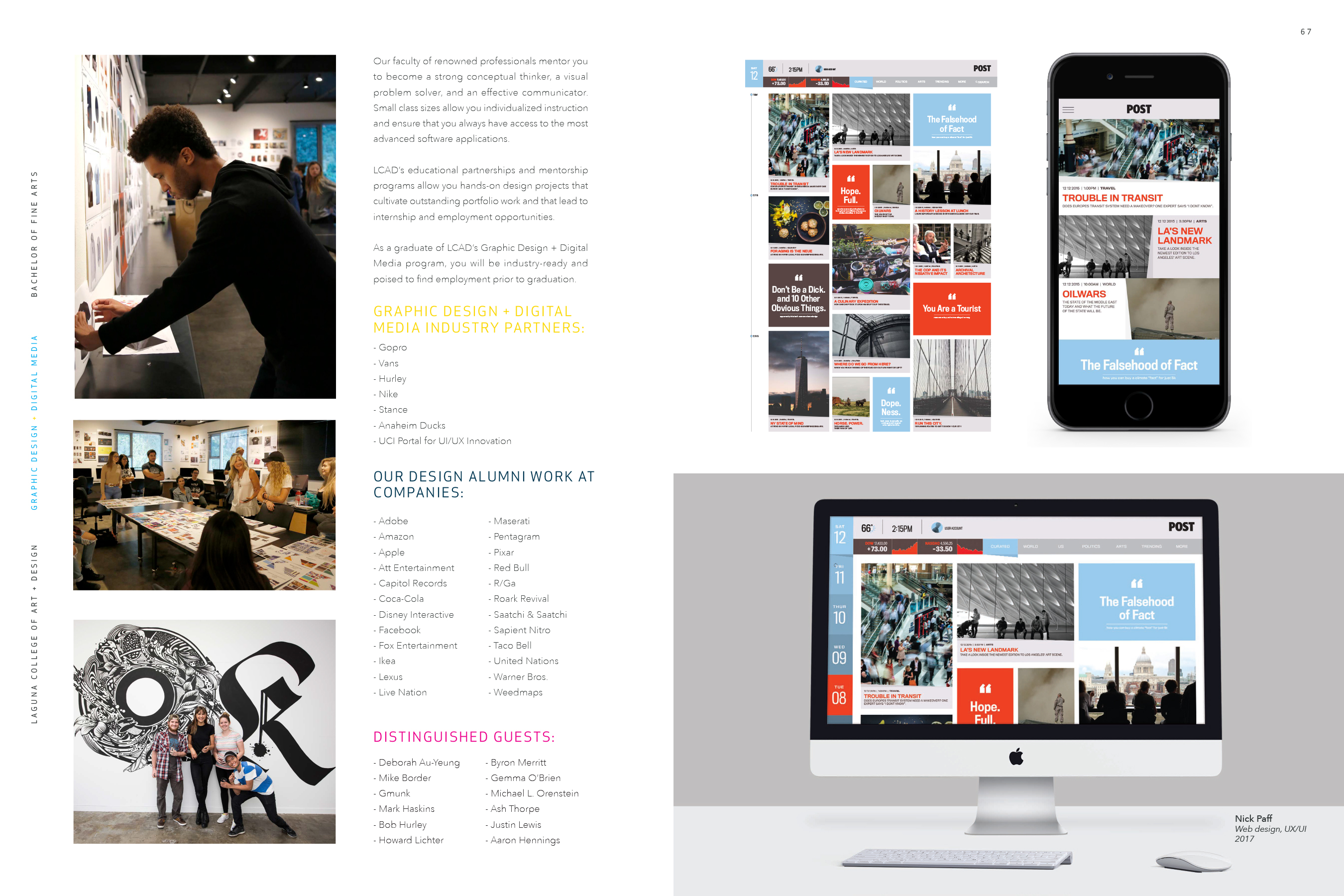
66 / 67 spread
– I get the CMYK theme, but the yellow headline does not contrast very well with the background.
– The “our design alumni work at companies” doesn’t sound right. It seems like it should say, “our design alumni work for top brands including” or something like that to set up the list better.
– If you end up keeping the headline, move “work at” to the next line with “companies.”
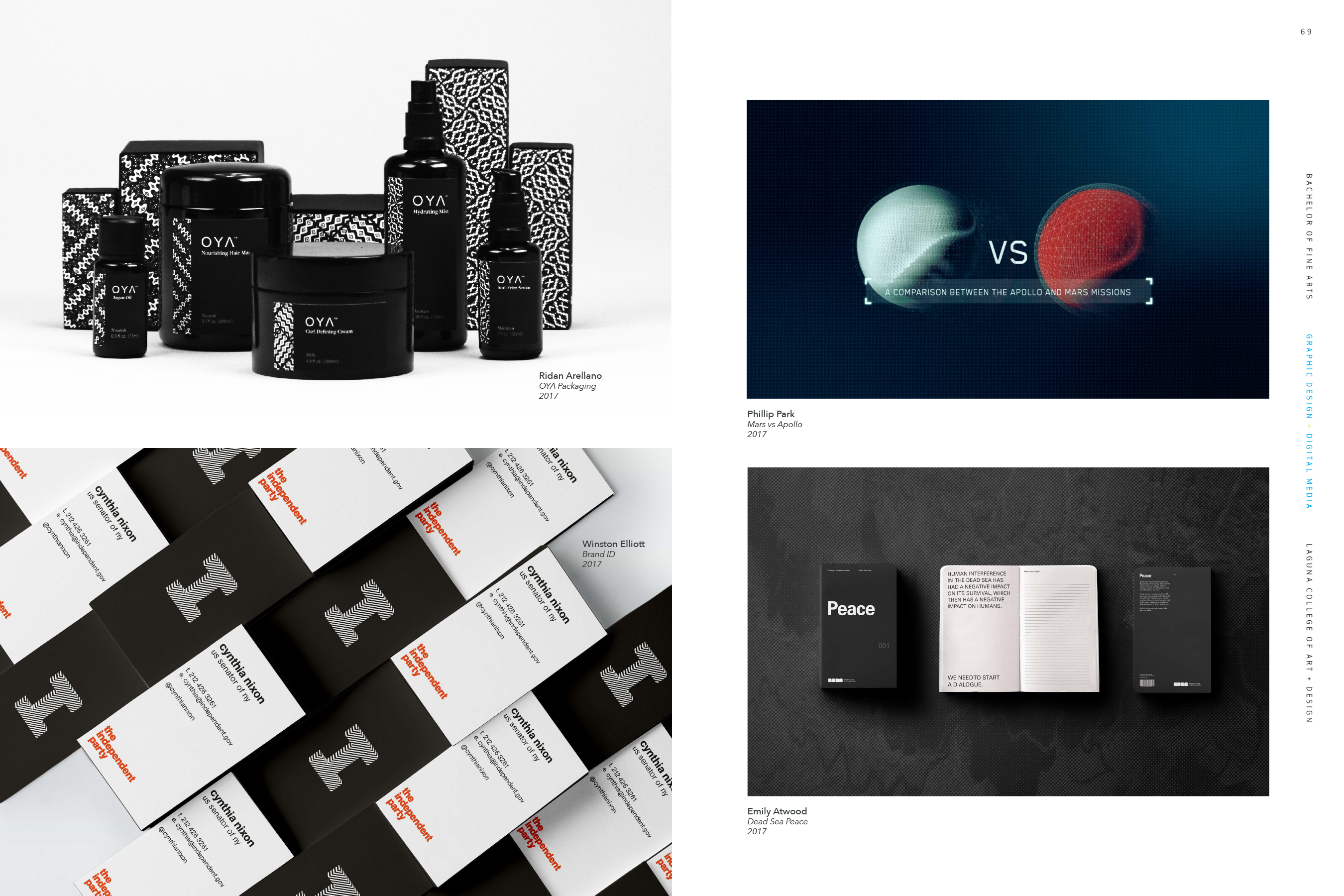
68 / 69 spread
– This one could use a little work. I get that you don’t want the two layouts to be a mirror image, but I’m not digging this. Maybe try knocking the background tint out of the OYA photo so the entire background is white and just leave the cast shadows. Also, you’re missing credit in the independent photo.
Clean, easy to read, interesting spreads. Good job.
Thanks for your feedback Steve! I’m appreciate your suggestions and if you think of anything else please let me know.
This looks great.
The first thing I noticed was that some of your brand names aren’t set correctly. “Gopro” vs “GoPro”, “Ikea” vs “IKEA”.
My second observation is how the mood changes in the later spreads. The first is very dark and bold, then it ends with some pastels. If I had to suggest something, it would be to try and create similar visual moods throughout the spreads.
Thanks CRHain88! Great Feedback! If you have any other suggestions please let me know!