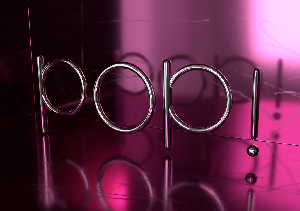
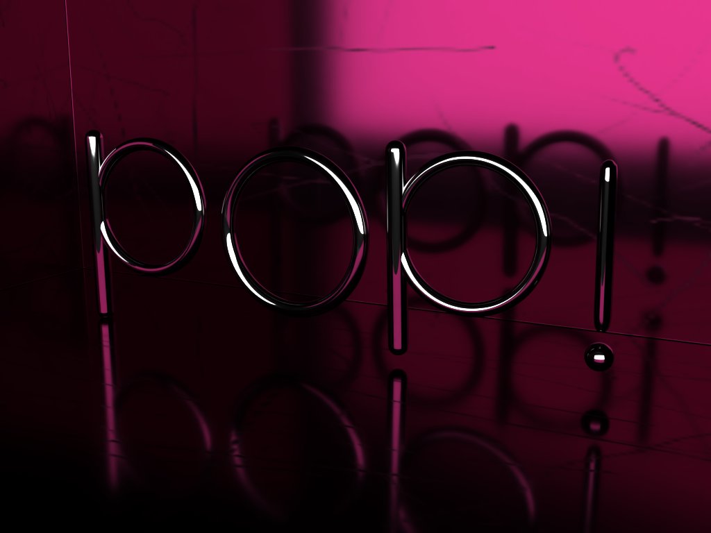
I created some renders in Adobe Dimension of the word POP!
I want to know which one of these you like better, or if you think something else (besides what you see here) would work better!
Some context of the image: I grew up when the pop music era took off big. I use to listen to N*Sync, Britney Spears, and the like! Just thought I’d put together something as a tribute to the music genre! Let me know what you think, thank you!!
I think the first is stronger. The second is difficult to read. I could see this used as a visual communications window, however I think additional elements need to be included.
You a 90’s kid? I like the color your chose. Have you tried experimenting with a solid unreflective floor maybe? I think the reflection has become a bit too much. Perhaps if there were some more solid planes it would become a bit softer.
Let me give it a try! I had tried a non-reflective floor but the text wasn’t as visible on it as I’d have liked. I’ll try experimenting with some more materials!
Out of the two, I’d say that the first one sticks out a bit more as it is actually eye catching. The colours are fairly nice, but it still seems a little bit dark to me. That might be because of the amount shadowy reflections though. I also feel that if the object itself is reflective, it might be a bit better to tone down the rest of the reflective surfaces around it.