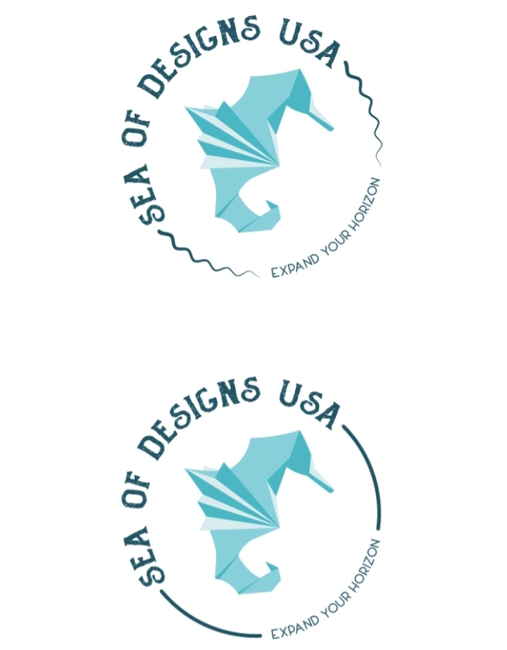
Hey guys/girls i need your opinion on this logo i made for an contest on 99design (just using the briefs and exercises and I’m out of the contest). I know is not a great logo but can you point me some directions or what i sid good or bad? Here is the brief
Name to incorporate in the logo
Sea of Designs USA
Slogan to incorporate in the logo
Expand Your Horizon
Description of the organization and its target audience
E-commerce company specializing in hand crafted sewn items (clothing, blankets, outdoor products, items for horses), textiles, vinyl prints and etchings. Historic clients include medical staff, horse owners, individuals seeking hand made masks and PPE, blankets, etc. I’m interested in combination logos. Would like to see options that incorporate a wave and sea horse into the image. Some options with company slogan and some without since I’m looking for a logo that’s not overly busy and can eventually be printed as a vinyl cutout.
Were you actually in the contest or just using the brief?
Spelling is important.
Also important is knowing how to design a logo for cut vinyl. Your circle logo has elements that include grunge effects and tiny, skinny type. Actually all of them do, except the bottom one. That won’t happen in cut vinyl at any usable size.
The sea horse appears to be 3 solid colors which is ok, but it is intricate for cutting in vinyl. It would have to be fairly large to do it, too. Most likely the dark color would be laid as a solid shape, and the two lighter ones added on top, but those elements have to butt and they are way too small to trap. Would take a lot of time and effort.
Of course it could be printed and cut to a circle, rectangle or triangle with a white field but I doubt that’s what they had in mind when they said cut vinyl.
And it is really a 4-spot logo.
You don’t need the backside fin in there. It’s an extraneous detail.
Sadly, round-headed, tapering squiggle lines almost always scream “Sperm” no matter what you do to them.
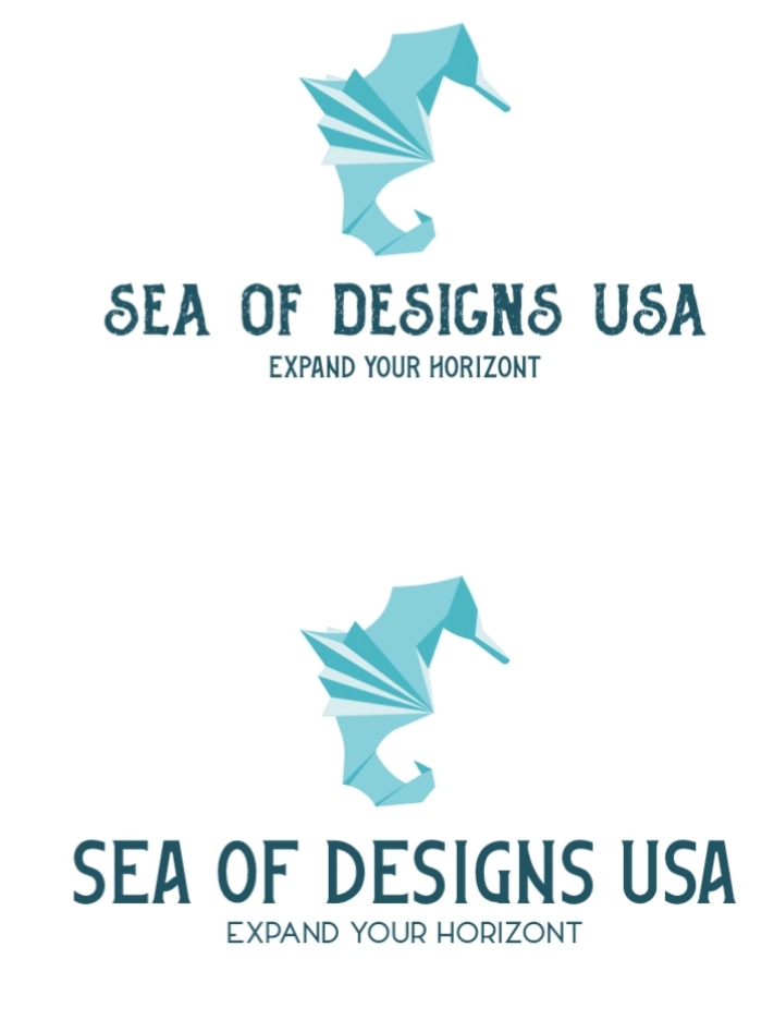
I actually like the bottom one the most (except for the extra letter.) Maybe with the seahorse to the left of the words rather than stacked.
1 Like
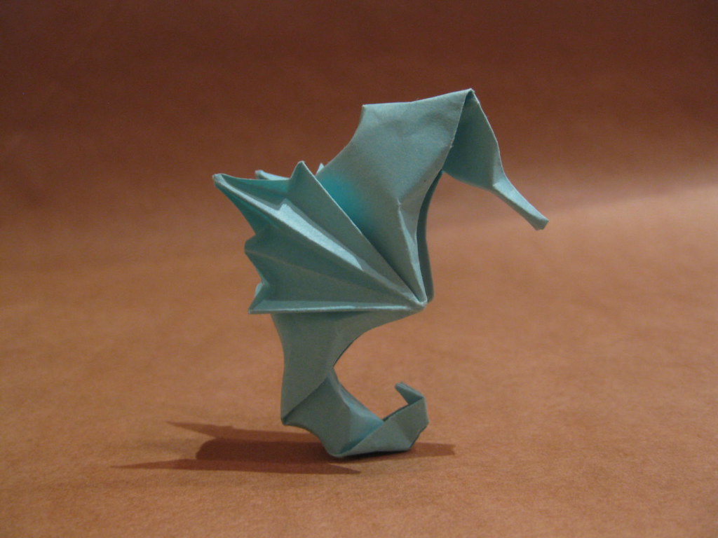
I’d say that too, for the composition, but the seahorse still needs work, IMO. Squinted down, the upper 60% looks too hummingbird-like. A bit less depth on the midsection and a more refined head shape would help a lot. I suppose it’s meant to look like origami, but that just isn’t the right shape for the head of a seahorse, even in folded paper.
@PrintDriver - You must be in the sign making business? You mention cut vinyl often is why I ask… I do a ton of decals, real estate signs and vehicle graphics. Our local economy is heavily industrial - big decals!
John David
I’m not exclusively a sign maker. I work in a company where graphics is just one small division. I wrangle a lot of large format print for medium to large venues of all kinds and purposes. Some small ones too. We do a lot of cut vinyl, most often for those purposes for which logos need to be created properly, like window decor, bar back mirrors, paint mask stencils, etc. on top of the usual street signage and vehicle graphics - but we don’t do vehicle wraps on purpose. I’ve only done those if they are an unavoidable part of a larger gig.