I’m more so looking for critique of the presentation but if you see something that could be better with the actual design work I’d like to hear that too.
https://www.behance.net/gallery/77805987/Outrage-inc-Logo-Identity
Thank you for your time.
I’m more so looking for critique of the presentation but if you see something that could be better with the actual design work I’d like to hear that too.
https://www.behance.net/gallery/77805987/Outrage-inc-Logo-Identity
Thank you for your time.
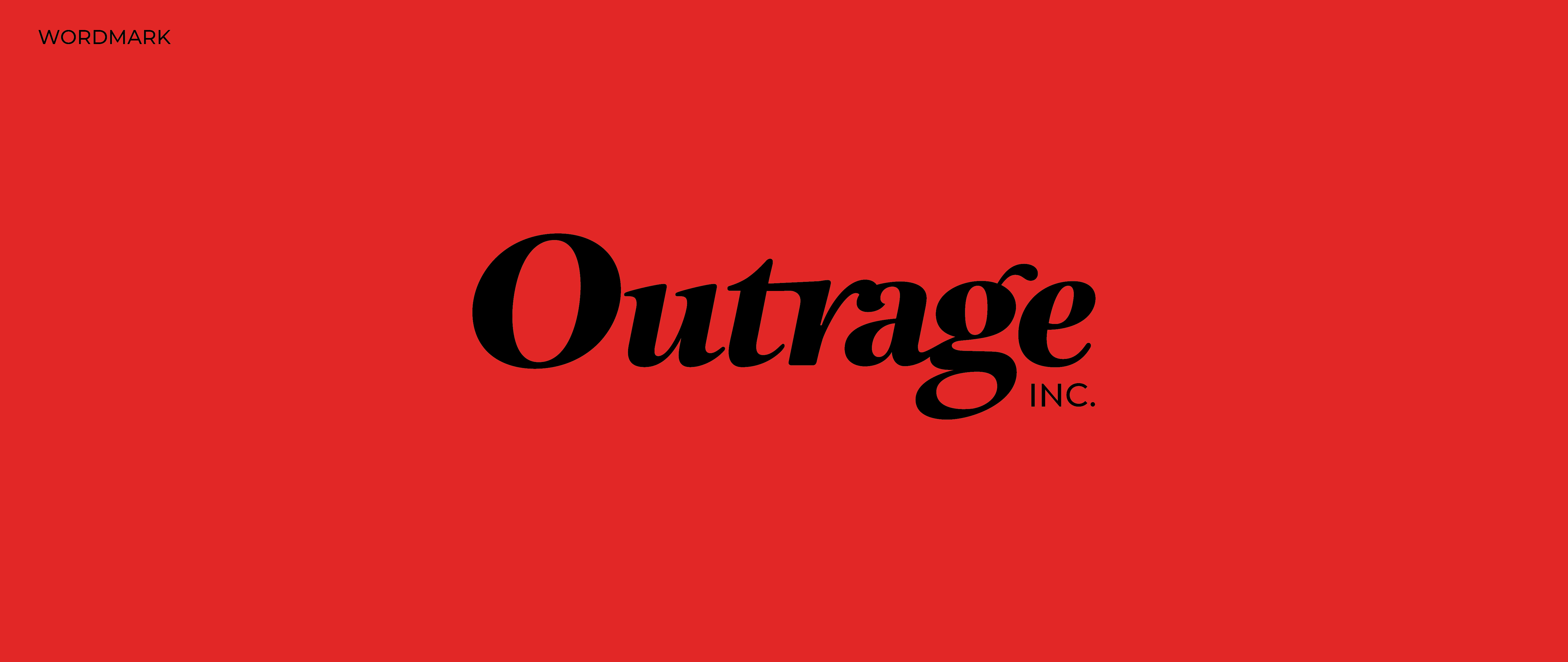
Here is the wordmark and icon for anyone that doesn’t want to follow the link.
The work is for a rage/anger room.
Who is the target market, and who is selling the anger room?
Ditto on what DocPixel said. Whatever the purpose and audience, however, the red is a little overwhelming.
About the red, I was hoping to create some visual tension sort of symbolic of the tension one might be seeking to relieve by going to a rage/anger room. Maybe I went to far with it though.
It looks like you were trying to achieve that with the tracking of the type as well. I don’t think it’s there yet. You may want to play with the tracking a little more.
I think so.
Red is good, but rather than look overwhelming and suffocating, it should probably look angry and explosive. The red, I think, should punctuate rather than dominate.
Black, red and white is certainly a powerful color palette. I’d just be inclined to balance it out more and break it up with more white.
Presentation is nice and so is the design work.
I like the red color choice but I kinda feel like the red background across the entire page is making the red color less impactful/bold than it could be. Red is bold, all of those red branded pieces will look very bold in person, but the all red presentation dilutes that.
As for the logo, it’s hard to tell what the business does with the word mark alone. While the symbol helps, I can’t help but wonder how the word mark could look if ‘rage’ stood out more than ‘out.’
Great advice everyone, thank you.
Not much to add, just want to reinforce that the red background on the presentation is too much for the eye. Nice work on the design and execution.
I still am curious about the target market and the purpose of the piece.
Those should be defined so they can guide the design decisions.
Because, for example, if it’s for anger management, you probably don’t want to emphasize red zone anger or tension in a positive way.
Yes, I think so too.
Middle to upper class.
Its not for anger management in the clinical sense. It’s a recreational activity for fun. I wanted the wordmark to be somewhat elegant to give a sense of professionalism that is lacking with other anger rooms. And the “edginess” can be conveyed through the icon and the rest of the identity. I wanted to convey that the customers experience will be more polished and enjoyable compared to the competition.
I sincerely hope that you have more information about the target demographics than this. Because the target market drives the design decisions and makes that process easier and more effective.
Here, give this a read. It will explain, better than I can.
https://www.inc.com/guides/2010/06/defining-your-target-market.html
It’s a good design, but I think the font is too traditional and formal to express rage. Should be a little angry like Riot logo.
A Rage Room is a place where people go to take out their frustrations by PAYING to break stuff (I am definitely in the wrong industry.) That’s a very specific middle to upper class market - it’s a very millennial concept. “We’re frustrated so we break things.” ![]()
Anyone without money just goes outside to take a walk and cool off.
Oh, well, no wonder I didn’t know about it. ![]()
Back in the day, they used to do useful things with their rage like chop wood.
exactly.![]()
Chopping wood is wonderfully cathartic. Each summer, I get a forest service permit, head into the mountains with my chainsaw and cut down a few of the biggest, tallest dead spruce trees I can find (also cathartic).
Chopping up the wood over the next few weeks with a sledge hammer, splitting mauls and an axe is great upper body exercise. Besides, there’s just something enormously satisfying about hitting a foot-wide log with a sledge hammer, driving a maul into it and watching the thing crack wide open.
I highly recommend it.
Warms you three times, too.