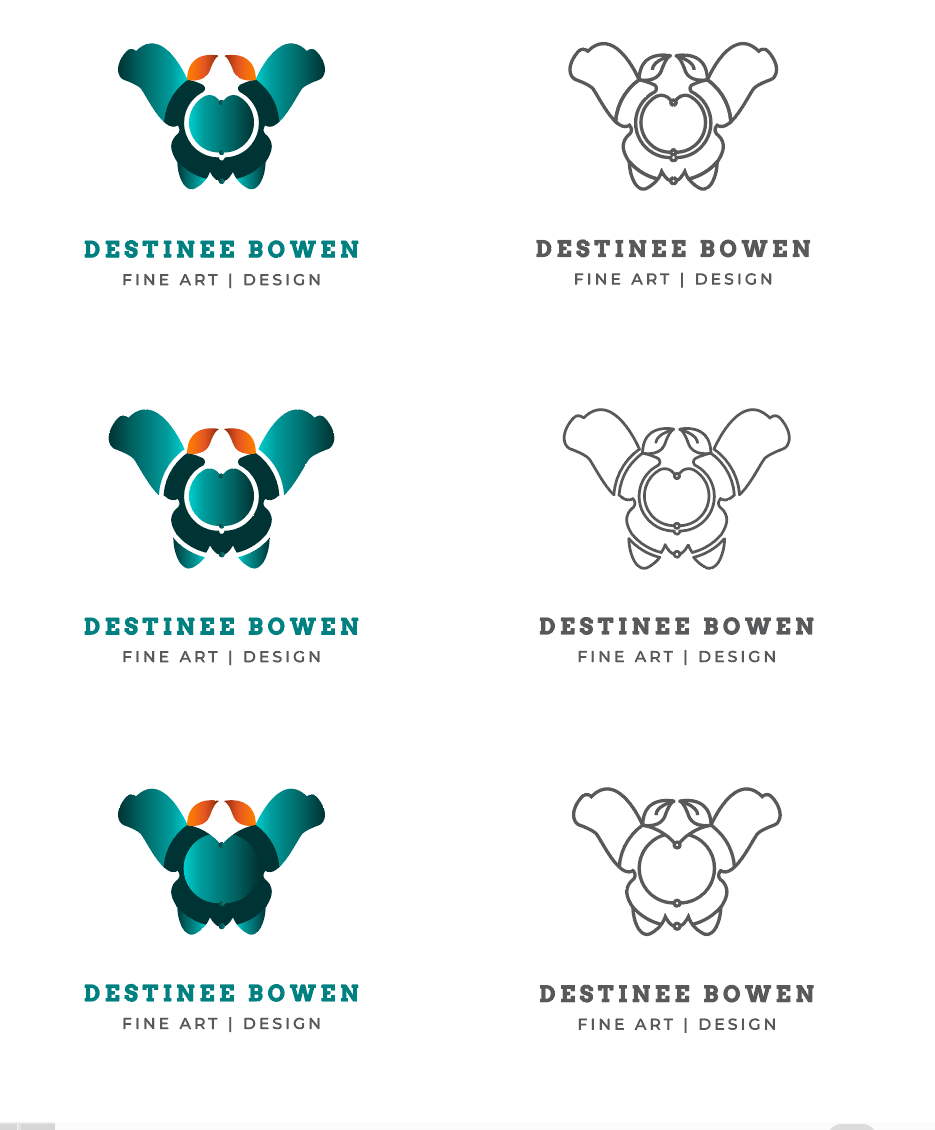
Hey there! I’m creating a logo for my personal brand, so far I came down to three different options. Any advice would be gladly appreciated, thank you.
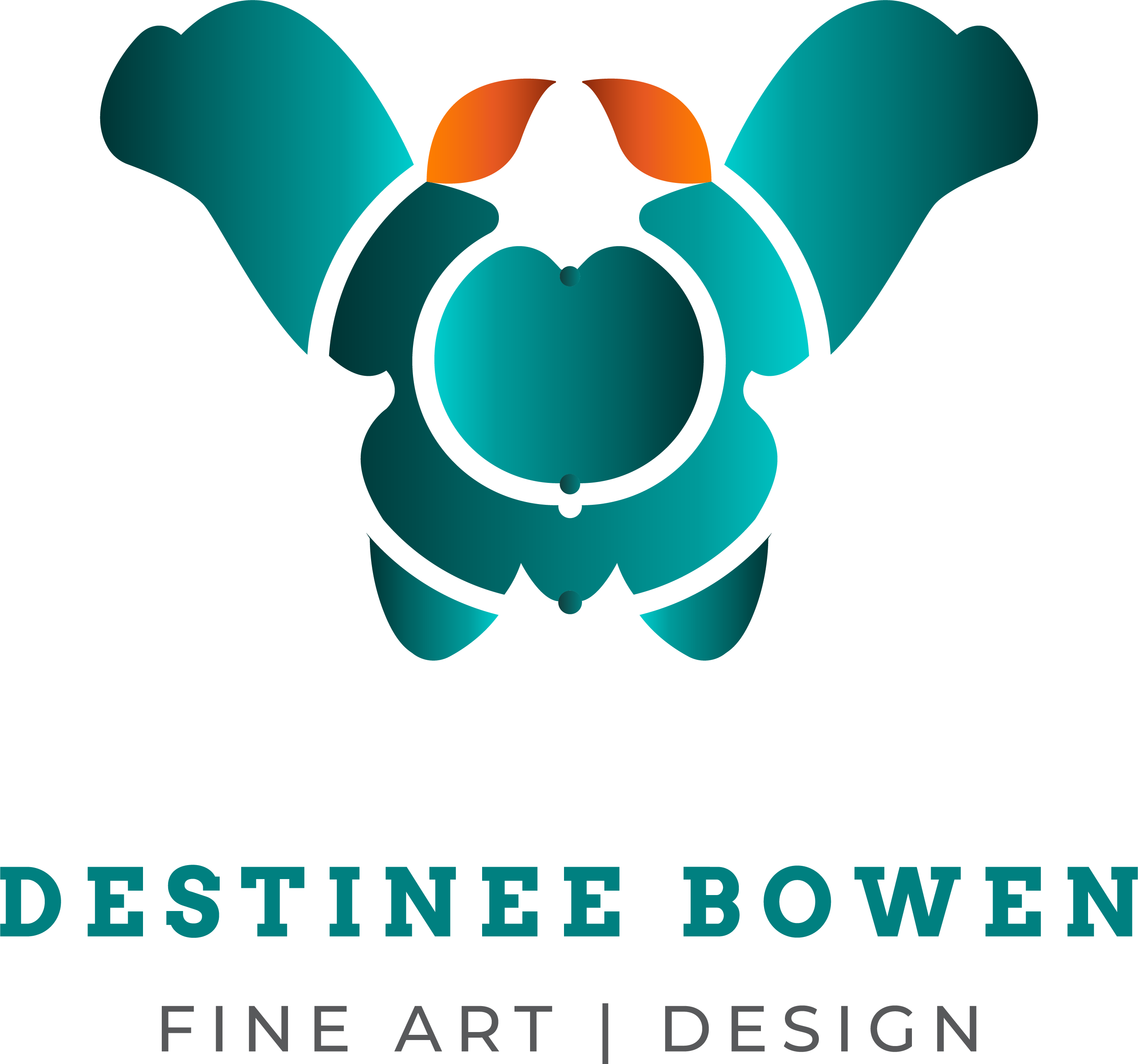
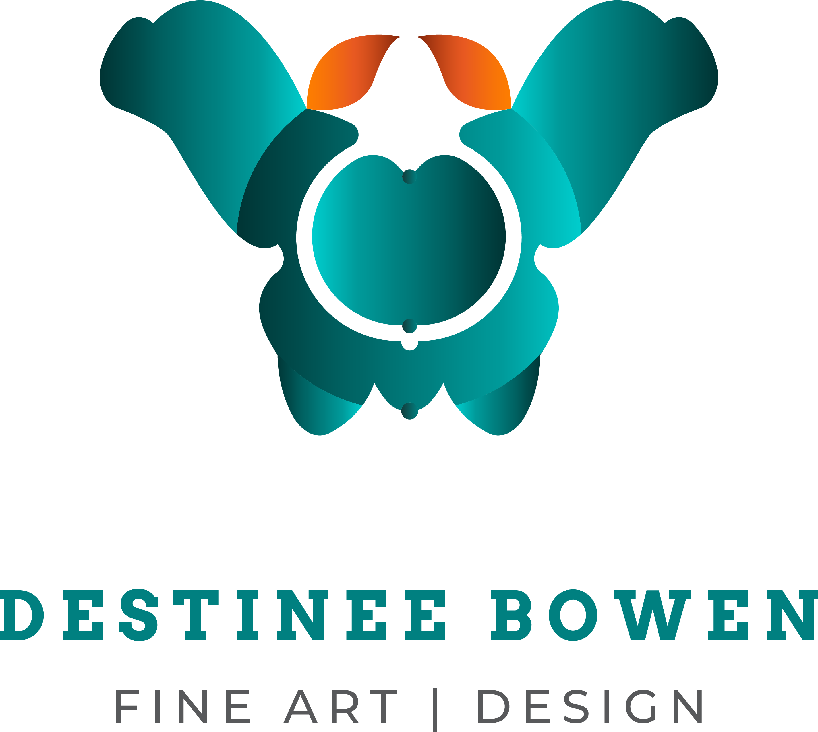
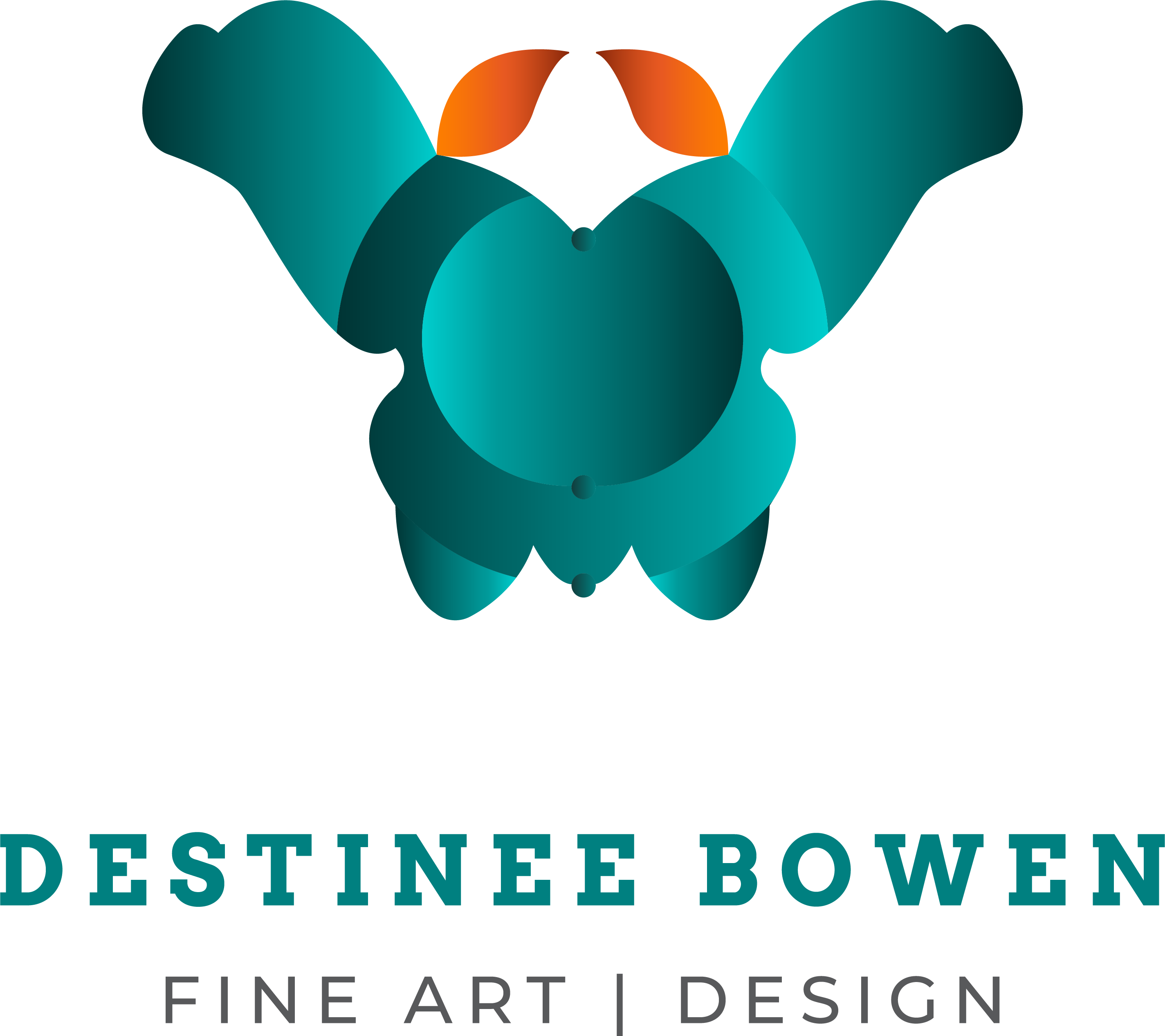
Can you give a little guidance about what you’re trying to portray? What image you’re trying to project? I like the font and layout of your name and fine art/design. I’m not too sure about the graphic below… what is it representing?
Thanks!
It’s a butterfly + paintbrush
I didn’t get that at all. Also, it’s not an attractive image. Just bizarre.
I thought it was a blue girl with red pigtails viewed from above. Sort of… ![]()
1 Like
To my depraved mind it was something worse.
Yeah, I get what you mean. It kinda flickered back and forth but the red-pigtailed girl won.
that protrusion on the lower circle above the EE looks phallic by a county mile, umm inch.
every drawing i create, i always try not to draw anything thing that resembles that.
unless viagra is sponsoring the comic.
1 Like
I’m sorry, I didn’t see that. Apparently, most people didn’t. ![]()
It was quite abstract to me until you said it, then I could see it. I think you have your answer. Most people will not see what you’re seeing, so it’s likely your message will not get across the way you intended… so maybe consider reworking it?
Good luck!
1 Like
Uh, no itin’t.
1 Like
It is quite abstract, I intentionally made it that way so it wouldn’t be that obvious + it’s my art style. Thank you for your input, much love and blessings!
I think font choice and color choice are nice. I consider myself a beginner with typography but during my first look at your fonts I had no issue with them.
I agree with previous comments for the logo but I enjoy the b/w logo images you shared. I tend to prefer simplicity but after viewing your logo options the b/w had a calm sense. This makes me think, the design needs work but consider staying away from gradients… Esp that they can be difficult for printing.
Good luck! I’m gradually in the same process.
Then perhaps you should go into fine art rather than practice commercial art.
Looks like you answered your original question.
Nice design but so attractive. However i think it’s a butterfly.
1 Like
I also thought this!