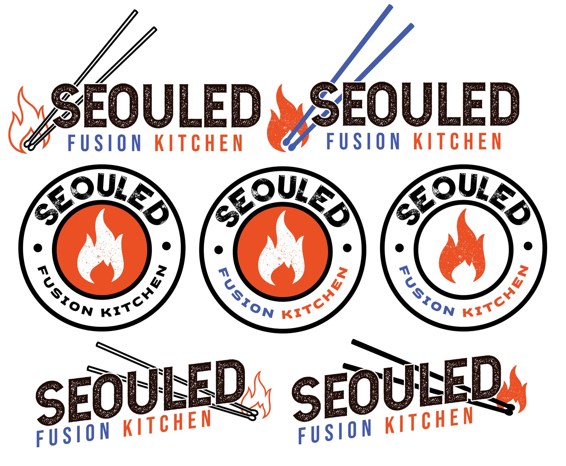
Hey there! Currently working on branding for a Korean + Soul Food fusion restaurant. This is a fake restaurant for a portfolio. I am aiming for casual, urban, and friendly with my design.
The name was created playing with Seoul (the capital of Korea), Soul (Soul food of course) and Sold (we’re sold!). My iconography is supposed to represent chopsticks, as well as matchsticks. I used Korean restaurant branding as well as BBQ restaurants as my references here.
Thanks for the help! Any and all feedback is much appreciated!
From a legibility point of view, I like how clear and bold your design is, however it feels a little generic and inauthentic to me, maybe this is because chopsticks and fire icons and the distressed stamp-style are very common.
I also don’t think your choice of colours and typeface really convey a feeling of: casual, urban, and friendly.
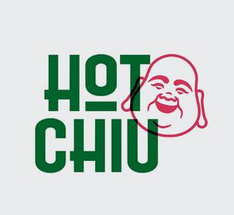
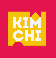
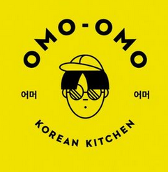
Here are some examples of what feels casual, urban, and friendly to me:
I would recomend being a bit more specific with the brief about the resturants identity - the fun part is you can totally make this up being a fictional resturant.
What kind of meals do people come to your restuarant for? Is it for officeworkers on their lunchbreak or a sit down dinner in the evening ? Is it an expensive place or is it affordable ? Is it a serious restuarant or is it fast food? Would you take a date here for a romantic evening or is it maybe a place where drunk people go late at night to fill up before stumbling home ?
And by the way, grunge fonts are really hard to cut out of vinyl to make a sign.
I would not even consider that for this logo grunge effect. Not unless YOU want to attempt to weed it.
That leaves print as your only - shorter term - option.
I’ve had vinyl signs last 20 years (in non-sunstruck locations.) A printed sign may last you 5. Maybe 8-10 if NOT backlit.
In my opinion, the logo is decent, but if you go to Pinterest and search for Korean + Soul Food logo, almost all logos will be similar to this one. I think it would be cool for the logo to showcase some uniqueness of the establishment. For instance, you could take the most popular Korean ingredient and integrate it into the logo, adding a less Americanized font to make it more Asian. Additionally, I have my own life hack, such as showing the color scheme of the establishment in the logo where the colors of the logo match the interior color. It’s a trick to associate such a combination with the establishment for visitors.