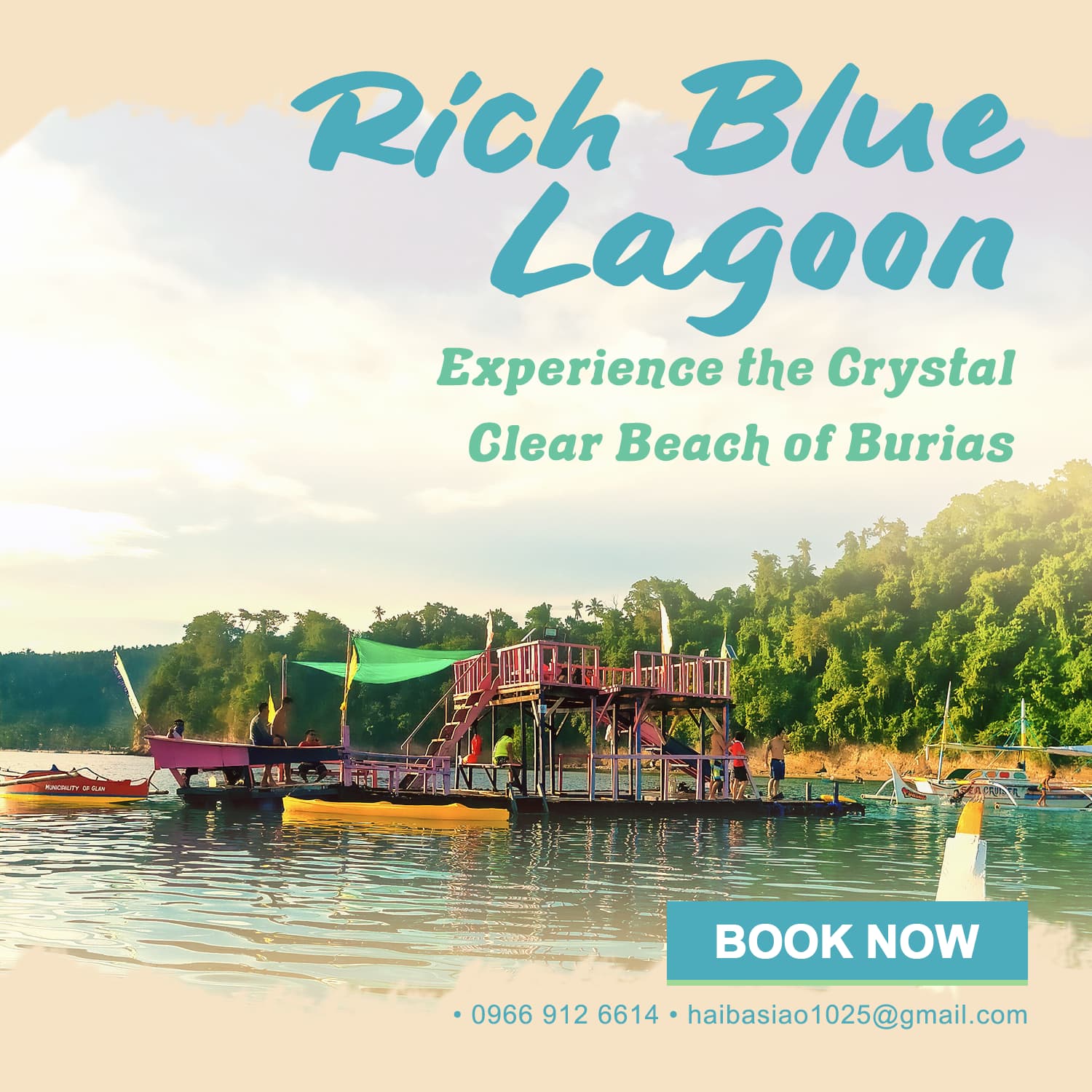
In this art, I wanted to evoke the emotions of joy, awe, and peace. I chose the colors blue, green, and yellow because they are often associated with these emotions. I also found a color palette that is related to my goals. The hierarchy for me is somehow leads the viewer’s eye to the CTA button, with the tip of another boat getting a little attention. I added horizontal lines at the top and bottom of the art to create a sense of calmness and tranquility.
I know that my art is still amateurish, but I’m proud of the progress I’ve made. I’m always looking for ways to improve, and I’m hoping that by sharing my work with others, I can get some constructive feedback. I’m confident that with continued practice, I’ll be able to create even better art in the future.
I will offer comments in light of your self-described amateur status.
First, I think you have a messaging problem. What is being advertised? Is it “Rich Blue Lagoon” or the “Beach of Burias”? When someone is scrolling through a social media feed, you have a split second to grab their attention. This is largely going to be the job of the photo. If the photo grabs their attention, then you have another split second to hook them with copy. What about the copy is the hook? Why do you think “Rich Blue Lagoon” will work?
Even if I loved the copy, you have a leading problem. The leading on “Experience the Crystal” is too tight, and the leading on “Clear Beach of Burias” it too loose.
I’m not crazy about the photo, and I don’t think it works with your mission to evoke joy, awe, and peace. The focal point isn’t a lagoon or beach, it’s a floating dock that looks like something kids would use for play (sliding, diving, goofing off). This photo could just as easily have been taken at any number of summer camp lakes in the U.S. If you’re going for families with kids, maybe this would work, but I don’t think it works to evoke joy, awe or peace. This gets back to the messaging. What are you trying to convey?
I think your call to action could be stronger. What about something like “Book Your Dream Vacation” or “Start Planning Your Beach Getaway Today”?
Are the email and phone numbers really needed on a social post? Do you anticipate someone typing the email address from a post to send a new email?
I do like the blue and green color combo, that’s nice. Not sure it works with the photo, but you already know I’m not crazy about the photo. The ecru color doesn’t do much for me. It does blend with the photo, but I don’t think it has stopping power for someone scrolling through social.
Is that a photo of the actual destination? If it is, you’re advertising a lake, and “lagoon” doesn’t apply. The claim of a “crystal clear beach” might apply, but the image does nothing to reinforce it.
What is being advertised? Is it “Rich Blue Lagoon” or the “Beach of Burias”?
their business name is “Rich blue lagoon” and I only copied their tagline from their facebook page which is “Experience the Crystal Clear Beach of Burias”, after what you’ve said im now confused of what should I do with the message. >.<
.
it’s a floating dock that looks like something kids would use for play (sliding, diving, goofing off).
You’re right about this, its a floating dock, but for me, here in our area its not really common.
.
I think your call to action could be stronger. What about something like “Book Your Dream Vacation” or “Start Planning Your Beach Getaway Today”?
I think this CTA too long sir? I’ve never tried one this long before.
.
Are the email and phone numbers really needed on a social post? Do you anticipate someone typing the email address from a post to send a new email?
I see, I shouldn’t have included the email.
but I don’t think it has stopping power for someone scrolling through social.
Do you have a better suggestion in this matter sir? should I make it a bit more solid?
I agree with what’s already been mentioned, so I won’t repeat it.
Instead, I’ll mention something that hasn’t yet been mentioned. What is a Crystal Clear Beach? The water adjacent to a beach might be crystal clear, but not the beach.
Is the ad for a specific location or business on Burias Island? If so, judging from the photo, the business doesn’t focus on “awe” and “peace”. A floating dock with what looks like a viewing platform suggests fun, joy, and a good time, but not awe nor peace.
I am a beginning design student. I think it looks great being right aligned. It is a nice picture but I think as a customer I would want a picture of the beach. I like the colors you used for the text. I like that the picture covers the entire page.