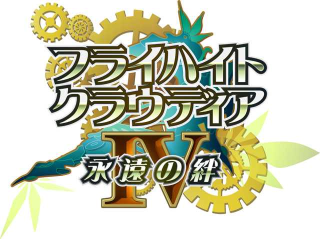
Hey, I’m looking for help on my personal Graphic design project which is to make an English logo for the game Flyhight Cloudia IV (フライハイト・クラウディアIV).
But unlike the other Flyhight Cloudia logos I’ve recreated into English. So far I have not found any reference material that was a high enough quality to be usable in recreating Flyhight Cloudia 4’s logos.
Now, I am still on the search for reference material and I am looking for your help in my search. If you could provide any assistance in my search it would be very much appreciated.
Update still looking for a quality reference image of the Flyhight Cloudia 4 logo without text. Help is much appreciated. Got a little farther with the project despite the set back
Unfortunately this is design 101. I have stayed out of this so far, as I didn’t really know where to start. Even now I am reluctant, but to say nothing just feels like it would be doing you a disservice.
I have to add a caveat to this before I start; I have no idea how old you are and if you are very young, then this will probably come across as a little harsh. I have not forgotten that we all started out drawing Iron Maiden and Fender (or whatever) logos on the back of our maths workbooks and that we all have to start somewhere.
I also don’t know if you did the original, or it something existing that you are adapting. Even if it is the latter and your interest is in design, not the game, I’d suggest starting with a better designed logo as your starting point.
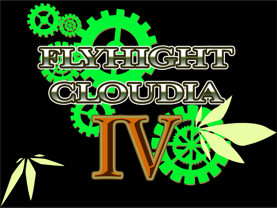
As logos go, I’m afraid this one breaks just about every rule there is. Gradients, unprintable colours (although it will probably never be printed), illegible typography, the fact that as soon as you reduce that in size, it will all fall over. I could go on…
This one needs to go back to the drawing board. Otherwise you will be flogging a dead horse.
You really need to do a lot more research on how logos and typography work.
By the way, is the spelling of height intentionally incorrect.
Apologies if this very deflating, but homely brutal honesty will help in some way.
Yes, I already know the text for the logo doesn’t look that good that why I put W.I.P.
Also this of yours speech does not actually have to the to do with the topic of thread which is find high quality reference material for my project.
If you want to give me some criticism then you can pm me and tell me that I’m find with it, but don’t clog the thread with unrelated discussion
Some forums are sticklers about things staying on the topic set by the person starting the thread. This forum works a little differently. We treat every topic as a fluid conversation where others are allowed to say whatever they think is relevant as long as it’s respectful and in keeping with the forum rules.
Not sure what you are even looking for. Are you hoping to find a stock art that is the actual “logo” without the text? (and I put that in quotes cuz as a logo, this is horrendous)
A complete redraw of the original, using the original as a base template is about 3 hours work without using any stock art.
Are you looking for tutorials maybe.
Just not sure what you are asking here.
Try a Google Advanced Search. Once you are on that page you will find options to choose image type (probably “clip art or line art.”) You then put in your desired image type, then format, and most important, License type (here, be sure to select “Commercial & Other” This way you will know your image selection is really free to use.)
By the way …
(1) Simplify, simplify, then simplify again. That is the key to good logo design.
(2) You seemed open to suggestions in your initial post, but when Sprout gave you excellent advice your response to him seemed totally closed. Read Just-B’s comment again
I wish you the best of success in finishing your project.
I seem to have an uncanny knack for posting in haste and cringing at leisure! Honestly, corrective typing can be great, but when it does stuff like change, ‘hopefully’ to, ‘homely’, I despair.