I just joined these boards in hope to find some guidance. I am not particularly a graphic designer, but I am working on designing my own logo. I have limited knowledge of Illustrator. I am diving into becoming a serious Prop Maker and I want to make a logo to represent my work.
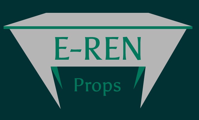
This is where I am at right now after a good amount of tweaking. I hope to get some feed back as to what could be changed, what I did right, and simply to know my logo “follows the rules” enough before I officially release it to all my social media sites. Too many colors? Should I not have a background color?
I also had this one with a small gap between the top piece and the green bar. But as much as I liked it was told to think about removing it due to potential scaling changes
Using that same logic, would you try to remove your own appendix?
If your aspirations to be a prop designer are serious enough to warrant custom visual branding, that branding really should represent the kind of professionalism that you have in mind for yourself.
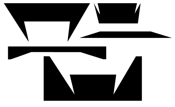
Just for example, your logo is composed of all kinds of jagged and irregular shapes (below) — none of which are particularly attractive. Putting them all together into a composition, like you’ve done, doesn’t make those shapes any more attractive. Logos are mostly composed of shapes, not pictures, so those shapes — both negative and positive — need to be well-planned and not random and accidental.
And speaking of shapes, you’ve also fallen into the beginner’s mistake of thinking your logo should be a picture of the business or product. Using that logic, Nike’s logo would be a picture of a shoe. Apple’s logo would be a picture of a computer or a phone. Coca-Cola’s logo would be a picture of a can of Coke.
Logos don’t really need to look like anything. They just need to convey a sense of the personality of what they will eventually come to represent.
For that matter, why do you even need a logo? You don’t have multiple products to brand under a common theme? You don’t have different storefronts that need to be unified within a common look? At this point, it might be best to concentrate on establishing yourself as a prop maker and simply use some good, clean typography instead. If down the road, you find yourself in a situation that really needs a logo, that’s probably the best time to think about it because if that day ever comes, you’ll need to redo this particular logo anyway.
Thanks for the input. And like I said I am no graphic designer, nor am I making logos for others. I know my set of skills and where they lie. I thought it would be cool to sort of turn the image of the logo into a work bench representation, because I just built mine from scratch and to me, it is a symbol of everything I love doing and want to accomplish. That is why I went in this direction. These shapes are polygons I have been messing with since I randomly made this initial one
But i wanted something more simple. All I want is a logo, or a stamp to put on my social media to be the symbol representing me and what I love to do. And I did not want to portray a logo incorrectly. That is why I started this thread.
I’m in an industry that encompasses the art of very large custom stage scenery myself. I saw the table right away but didn’t even consider it to be a work bench. Thought maybe an end table and wondered “why so boring?” or “maybe ‘props’ means ‘furniture’” which is different from props. Furniture is set dressing.
If you want your logo to portray “craftsmanship” you may want to explore some more.
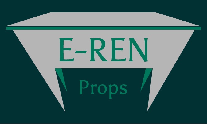
Your second logo is simply photoshop-alicious. Fine for a website, but if you are doing embroidery on custom polo shirts to wear for your install/deliveries, it ain’t gonna fly. You might want to consider something more vector and no effects first, then add the bling later.
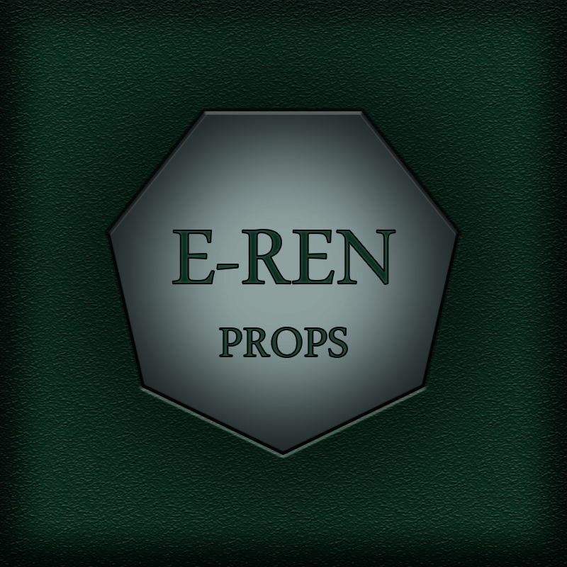
Are you always going to have the green leatherette background? And if so, perhaps you want to define its borders the way a plaque with a leatherette finish would. When doing a logo that looks like a sign, you always have to consider the sign blank itself. You also have to consider that sign blank when doing a logo for something that intends to be a brick and mortar establishment.
Consider your clientele. The client doesn’t care about your work bench. They don’t care to see props in your logo (they most certainly want to see them on your website!) But they might want to see something that shows, intuitively perhaps, that you care about attention to detail and looking good.
The first logo has all the problems B mentioned. The second, while slightly plain, is more theatrical looking, even if it is only web-ready. If you intend to get stuff printed, with the second logo you’ll need to take care that your dark colors don’t close in too fast. What looks good on your monitor may turn into a big dark blob on a business card.
This is one of the very reasons I try to stay clear of designing logos. Way too many clients, for whatever reason, seem to misunderstand the purpose of a logo. Falling in love with and forming a personal and meaningful attachment to a logo is not the criteria around which a logo should be designed.
I’m always at something of a loss in how best to explain that their logo isn’t for them to cuddle up with on cold evenings. Their logo is, instead, a strategic business tool specifically designed to resonate in a pre-planned way with their target audience — their customers, clients and constituents.
Certainly, the most daunting obstacle between the designer and a good logo is the client. When the client is a self-proclaimed, amateur designer, “daunting” can become insurmountable.
This is quite a common situation. You need a logo that looks good, but you don’t have the budget to hire a professional.
I’ve been in this situation in the past. I found the most useful thing was to think about the purpose of a logo. Often most people need a logo to create the impression that they are a professional business that can be depended on.
Of course, a good logo should do other things such as communicate the services of the business as well as its aspirations. But designing such a logo requires skill. If you are doing the logo yourself, I’d just focus on making it look good. I wouldn’t even bother with conveying the message of ‘props’, because it will be tricky to do well.
I would start by reviewing these resources from Before and After Magazine. They will show you how you can create a smart looking logo. The logo might not standout or instantly convey that you specialize in prop making. But it will look like it belongs to a professional company.
That relates to the question I posed in my response. The question wasn’t answered, but I asked why he thinks he needs a traditional logo.
I’m not disagreeing with your advice, by the way, which is actually similar to what I’m suggesting.
From what he wrote, I’m thinking that he mostly just needs to enhance the professionalism of his image or brand, and a traditional logo isn’t necessarily required for that. A good logo wouldn’t hurt, of course, but no logo is better than a bad one that suggests amateurishness. Setting the name of the company in a distinctive and appropriate typeface and using consistent colors would be a better branding route than a less-than-good stand-alone logo that sends the wrong message.
Your logo doesn’t represent Prop Making unfortunately. I think you should start over with a better idea. Try choosing a subject or object form your profession that is visually compelling.
I’m not a believer in “the logo must represent the product.”
That’s where the workbench idea fails here.
However a logo that is revealing itself from a darkness, the way lights come up on a stage set, is far more effective, IF done right. The one shown here, isn’t quite there yet.
Now having visited the Go-fund-me page for this OP, the workbench in question and the items it displays do not instill me with confidence in any of this. The OP says he’s even studied Graphic Design though not to what extent. A designer would help immeasurably with the presentation of hat GFM page. For instance, if the prop being built is the drawing to the far left, that needs to be more apparent. Everyone starts somewhere though. If E-ren has a business plan to go with a good logo, maybe it will get off the ground.
(Hint, desktop CNC. Start there. For what you want to do, CNC skills are a must. If you can hook up with a 3D printer vendor of some size, and can create the objects in AutoCAD or SolidWorks for output, even better. While some things are still hand scuplted, it’s all about being able to do it fast and on budget. We might be carving a life sized giraffe, but when only given a week or two to do it, the foam pieces are CNCed before being glued into an animal shaped stack for finishing.)
I don’t mean to be cruel, but the warning does say to wear a heavy jumper. Sometimes we come across people who are tone deaf, but because they are, they don’t realise how horrible they sound. A friend of mine actually believes a few lessons might help her to sing, yet she is as tone deaf as a brick. This logo says the same thing to me. I don’t claim to have a gift for design, but I do believe I can spot a total lack of talent when I see it. Believe it or not, I think a task like removing appendix might be easier for the O.P. since this procedure can be learned, but you can’t learn to have a talent, since after all, a talent is gift you’re given, as opposed to something you learn.
I respectfully disagree. I believe that talent comes from (1) learning and working at something very hard, and (2) the genetic wiring to have a passion or fondness for that something. (3) Or maybe just how the chips fall.
My mother praised my drawing as a child, which made me do more of it to earn more praise, then I improved and kept doing it because I enjoyed it. And yes, the praise… Is this talent?
Design can be learned, and a person can become a competent, effective designer by learning the principles and tools. Talent is not required for good design. Just the drive to learn and accomplish the goal.