Thank you!
Moved to the Crit Pit. 
Thanks. I’m new here and didn’t know any better. 
Do you work at a newspaper? I spent 15 years at a metro daily in various capacities. In many ways, it was the best, most fun, most rewarding job I ever had.
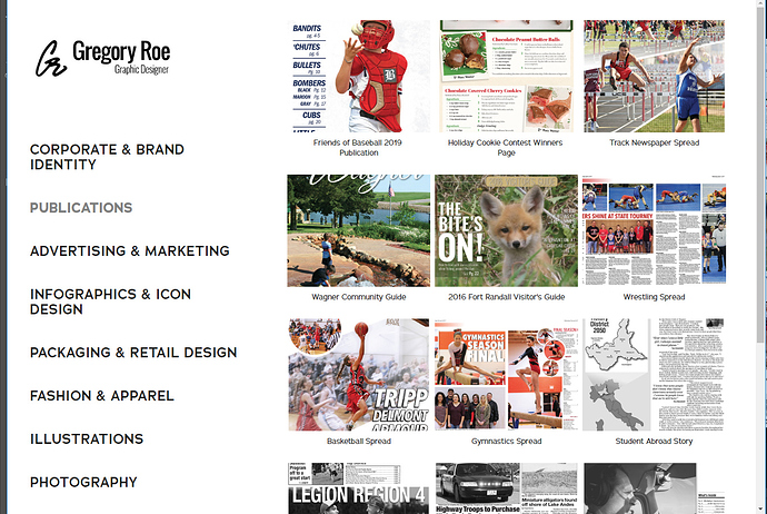
As for your website, if it were me, I’d create larger margins on the side to pull the content away from the edges to give it some breathing room. The mobile/tablet widths don’t have this problem, but the desktop sizes seem a bit claustrophobic.
No worries and welcome aboard 
Yes, I’m currently working at a newspaper.
The portfolio site is powered by Behance with Adobe and just set to whatever default settings they have. I guess I always view this at home on an ultra-wide monitor, so the margins adjust to be pretty wide. I’ll have to look into it on different monitors and see what settings Behance has to offer.
Thanks for your input!
Yeah, me too, but you can see what I mean by just adjusting your browser width. Between around 750 and 1400 pixels the outside margins are no more than around 2 or 3 pixels wide. I’ve never used Behance’s website builder, so I don’t know any of the options it might have.
Here’s a screen capture of what I’m seeing, though.

I see what your saying. I found where I can adjust the margins and gutter. So I tried to give a little more breathing room there. I also adjusted the leading in the navigation and aligned the logomark to the left. Is this working a little better do you think?
Yeah, I think so. The additional leading between the lines of type is good too.
Thank you!
