Looking for some advice regarding a poster brief

Hello!

First of all I’d like to apologise for that massive post. I’ll be lucky if anyone reads it. But I had to write all this, in order to explain the situation…

Just looking for some advice as this client is starting to drive me crazy…

So, this is a massive company/factory that wants to start an internal scheme/programme called end-to-end. This programme has also 3 categories, which are Innovation, Integration and Performance. After numerous discussions and drafts (via email as we’re based in different countries), we have “kinda” finalised the logo for the programme, but they are also in need of 3 posters. One for each theme/category.

I should let you know at this stage that I am not working for the actual client. My client is a marketing agency that is dealing with this company. That makes it even more difficult as I don’t speak with their client directly and I’m not present at their meetings.

The problem is, I’m struggling to understand their brief for the posters as 1) they haven’t told me very important things about what they want and I’m trying to get answers asking them questions, 2) They already have an idea of what they want, however this idea is (I really don’t know how to describe it) complicated? and 3) They do require specific images on the posters, such as images of the actual factory and the offices and staff of the company, and they are willing to arrange a photoshoot, but they want to see mockups first, before they arrange the photoshoot! The images of staff and the factory that they’ve given me so far, won’t do what they want as what they want is very specific.

I am literally struggling to come up with an idea or to do what they are asking me to do and I am looking for some advice. So, here’s their brief:

“Company’s logo and programme’s logo.
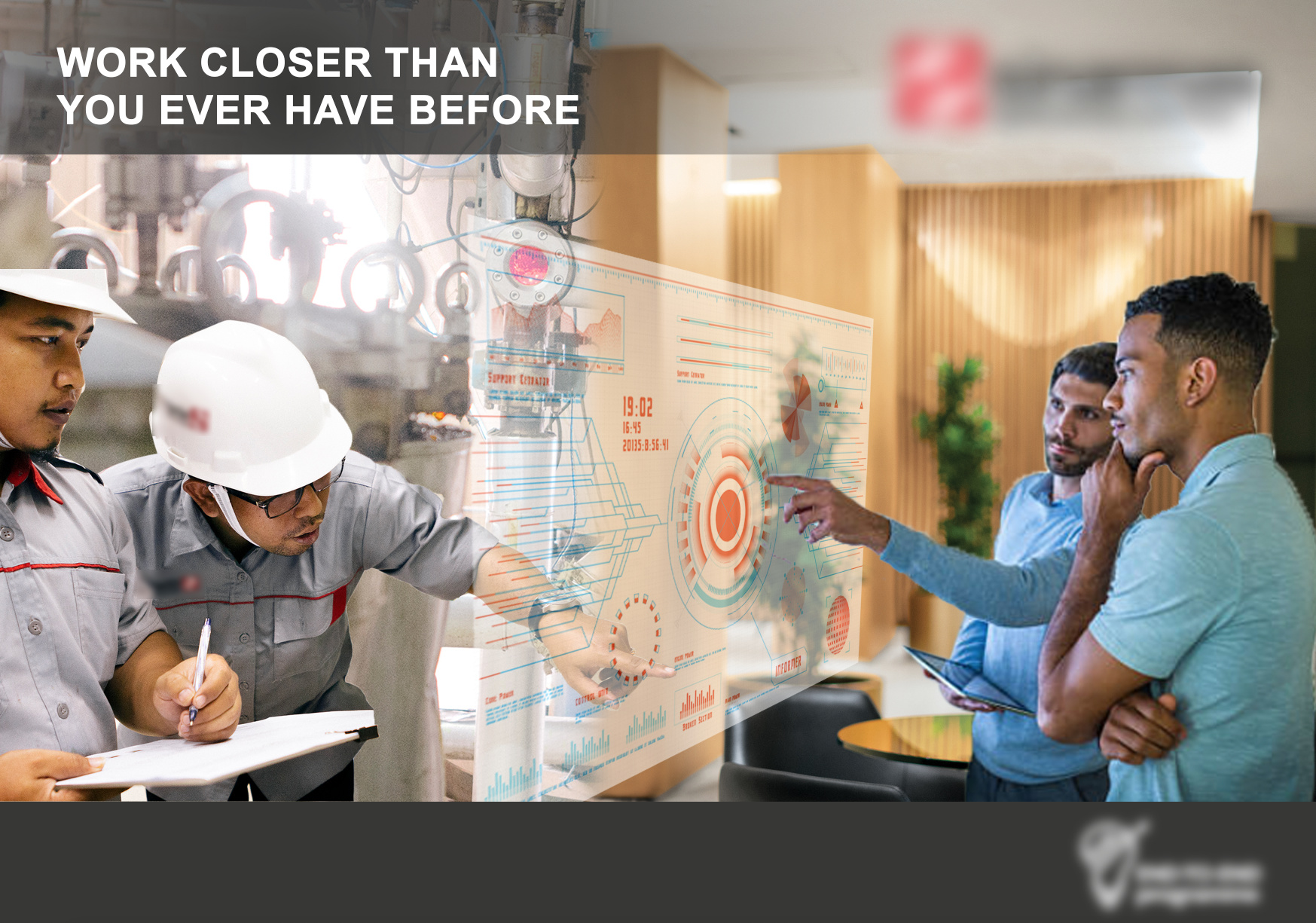
Person A in front of a factory/mill background, reaching out to touch a virtual dashboard display, perhaps of production
levels.
Watercooler in the middle (like the 2 persons are having a conversation in the same space.
Person B in front of an office background. Reaching out to touch the same virtual dashboard display.
We’re trying to show how dispersed employees (eg. blue collar staff at the factory) can connect with each other (eg. white-collar staff in the office) through the dashboard interface.”

It’s worth mentioning here that none of the images they gave me is even close to what they say on the brief. And when I told them that, the answers I got from different emails were:

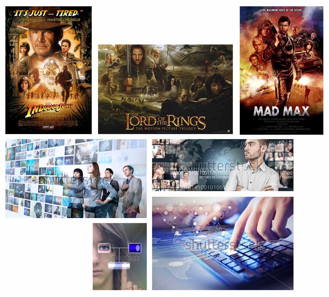
  • Let’s find something close on stock images if the above don’t work.
  • Yes, it should be the actual factory in the final poster. Interior is preferred, as that would be where they are working and collecting information for the dashboard. (I only have one image of the interior of the factory were there is one worker in the image as well, however they want to show how the blue collar and white collar staff are connected through a dashboard???)
  • They don’t have to be and shouldn’t be in the same picture – we’re hoping to merge the two with photoshop. It’s just going to be a mock-up for now so having someone in the background is ok.
  • Because the programme is supposed to communicate the linking of workers in different countries through a dashboard, having them in the same background would mean that they are in the same location and country, which in fact is the opposite.”

Please help me… I’m so confused, I don’t have resources and I don’t know what to do. And how am I supposed to show all these details through a draft with stock images? Is it me or are they actually looking for something that’s impossible?

Any advice would be much appreciated.

Thanks for your time!

It looks like communication is a huge issue for you on this project.

If at all possible, I would strongly insist on talking with the client directly. They are responsible for communicating their needs clearly.

Whenever I have a new project, I insist on brainstorming with the the decision-maker. In the beginning. For at least an hour, or however long it takes to get on the same page. It saves time and money, and the projects usually flow smoothly after that.

1 Like

Thanks for your message!

Unfortunately I don’t think that’s an option… Something tells me that the client doesn’t know that they hired a freelance designer. :smirk:

Any creative ideas? Any chance anyone gets the brief better than me?

I don’t think we can, or should, clarify your brief for you. You should go to whoever is directing your work, and ask them your questions. It’s their responsibility to make your project goals clear to you.

Send them in an email, in writing. :slight_smile:

1 Like

DocPixel, as I said, I’ve already done that, numerous times. I have asked them many questions but unfortunately it seems that they don’t have any experience. And I’m afraid that by asking even more questions, I might seem like I don’t know how to do my job. And that is something that has never happened to me before. But I don’t think that this should result to not doing the job and rejecting them.

I do agree with you, however that’s not always the case as the client might be lacking communicational skills, or the distance might be an issue and many more. And to be honest I’m not in a position where I could just reject a client due his communicational issues, and that’s for several reasons (financial being the most important one).

I’m not asking anyone to do my job for me. I am just asking for some advice on how to approach this design-wise, from some colleagues and people who might have experienced the same problem. That’s all. :blush:

I totally get your concerns, Lisa. And I’m not suggesting you turn down the job. In your position, I’d probably tell your contact person that I can’t move forward without more information/direction.

You said, “And I’m afraid that by asking even more questions, I might seem like I don’t know how to do my job.” I feel that you will look more professional by requiring the information you need to do your job. They may even respect you more.

I have been in your shoes before, and I’m sympathetic, believe me.

I was working with a subordinate of the decider. She didn’t know, so her guidance was vague. I tried to read their minds to come up with concepts. I felt confused and scared, didn’t want to bill for the time spent exploring and researching. I believed that I should be able to understand what they wanted. I spent a lot of unpaid time on it, finally provided work to the best of my ability, and the deciders rejected it.

Wasted a lot of unpaid time, and took a hard hit to my ego and professional pride.

Since then, I make damned sure to clearly understand what the deciders want.

I sincerely wish you good luck on this unfortunate situation.

1 Like

Maybe you can share these with the folks you’re working with, if they’re inexperienced.
https://www.adcracker.com/brief/Sample_Creative_Brief.htm

1 Like

That’s a ridiculously complex and restrictive set of parameters to work within. I wonder if the marketing firm pushed back at all on their client’s ideas.

What has consistently amazed me over the years is how the biggest obstacles to doing great work are often the very clients who are, with some irony, paying us for what they expect to be our best work.

Anyway, this sounds like a big Photoshop montage of ideas. Have you ever noticed how movie posters often use the same approach that incorporates half a dozen different themes from the movie into the posters? Despite them being crazily complex, they typically hang together as part of a larger design. Of course, they hire illustrators to pull this off instead of relying on photos.

Similarly, there are stock photos that take much the same approach of merging together various kinds of images to create a complex but cohesive composition.

Just an idea, but an approach similar to the various images below might work.

Thank you both so much for your replies.

DocPixel - I can tell you understand what I mean. I guess I’ll just have to ask even more questions.

MrB - Yes, these shutter stock images might actually do. But as you said “That’s a ridiculously complex and restrictive set of parameters to work within.” and I’m afraid that if they don’t see what they asked for, they won’t be happy…

I wrote them an email today sharing an idea for the poster:

“The poster should only have one image. This should be an image showing one or more blue collar staff, interacting-working with one or more white collar staff. They could be looking at a laptop, at paperwork, designs or whatever is related to your client’s nature of work, or even looking at the camera, clearly showing they’re a team. Best case scenario would be that this image is taken at your client’s factory or offices. We could try both versions (in the factory or in one of the offices). The message here is so much clearer than the one on your brief, while still being the exact same message, if you know what I mean.
In this case, we can certainly do a mockup with an stock image and if the client likes the idea, you can then arrange a photoshoot. My advice is that, I wouldn’t show to my client something so complicated. As I said, I’m not surprised he couldn’t understand it. In design we always say: The simpler, the better!”

That was before I found out that it should be clear in the poster that the staff are at different locations. HOWEVER, they do want the staff to use the same dashboard, even if they’re in different locations… (mental!)

I really appreciate the time you guys took to reply to me and you’ve both been a great help. I’ll work on it tomorrow and I’ll come back with what I’ve done to get some feedback.

p.s.: Mr-B, can I ask what was your search on Shutterstock that gave you those images?

Thanks again!!

I think it was high-tech montage or technology collage or some combination of those terms.

1 Like

Perfect!

Once again, thank you both!

I like the firm, decisive tone of your email, so clearly focused on their needs. :slight_smile:

You are oh so welcome! I’m happy if I could help.

1 Like

I feel for you. It certainly can be very frustrating trying to interpret so many seemingly disconnected issues.

Have you considered giving them what they’re asking for (more about that below) and also giving them a mock up of how you think the poster should look?

When I have clients that aren’t clear themselves — even if they’re the marketing team, it’s helpful to give
them both your version and their version. They might not really know what they’re trying to articulate so instead of showing you that, they’d rather give you something (no matter the confusion) and save face.

Unfortunately sometimes corporations want desperately to never show what they perceive as weakness or vulnerability so they might find it easier to pass that on to you.

As doc pixel said, ask them questions, lots of them. Asking questions is a sign of intelligence. Take the helm and guide them.

You can even explain that these are clarifying questions so as to make sure you’re both on the same page.

So I’m coming in a little late on this thread and might be way off but what if you just did a simple split screen on one side, one or two employees utilizing the new technology via the dashboard and interacting with it and on the other side two different employees from the second company utilizing the exact same dashboard but from the other side. So on the left is their company with their employee or an actor and in the right is the other company in another country so you can make the “fake” company with different office furniture, maybe a different style of clothing, maybe show a window with sunshine and a tree on one side and on the other side a window (or no window) with a rainy day, etc, but both employees are standing and interacting with the same dashboard. Add a relatively thick black line right down the middle. Add a simple subtitle on each side in black “LONDON” and on the other side, “TOKYO.” (Or whatever the locations you’re using.) possibly even scratch the window a put a clock the wall at each location with a different time.

Just an idea…forgive me if I’m way off base here… just thought I’d add a little and build on the great advice from @DocPixel & @Mr-B. I’d really like to see how it turns out! Best of luck! You’ll get through it and the next time your client is ambiguous, you’ll know exactly how to handle it! :sunglasses:

2 Likes

Oh God! I can’t describe how grateful I am guys for all your help! Sometimes, you know, when you are just stuck because you’ve been thinking the same problem for hours or even days and you can’t think of any solution, you just need someone with a fresh mind (yours is fried from all this thinking) to just give you a hint and point you to the right direction. This is exactly what happened here. Thank you so much for the time you took to help me. I’m more than grateful!

The images that Mr-B uploaded helped me so mush to understand what they want. I worked on it today (probably the worst thing I’ve even designed in my life but that’s a different story) and they loved it. It was also a very good example for them to understand that they MUST arrange a photoshoot and that without resources, they won’t have quality.

Since you took the time to help me, I thought I’d share with you the mockup I sent them along with the following email. I’ve blurred the logos, for obvious reasons. (as I said, that’s probably the worst poster I’ve ever designed in my life, but that’s what the client wants, so…:smirk:)

"So, after a lot of thinking, I think I now understand what you need. Sorry but the brief was not clear and one thing that confused me was that on your sketch you had a physical board whereas on your messages you talked about a virtual dashboard and on the brief you say: “Watercooler in the middle (like the 2 persons are having a conversation in the same space.”, however, you told me that they shouldn’t be in the same space. I hope you can understand this is all very confusing. But all good now (I hope), I think we’re getting there! :wink:

Please see attached and my points below:

  • As discussed before this is just a mockup, to show the concept to your client. Therefore, the image with the white collar staff is low quality, they are not wearing suits and the poster is not polished yet. It’s just an example to show.
  • Provided that I have understood the concept, this is a good opportunity to show you what I meant saying the images we have won’t do and also to show you how the images should be for when and if you arrange a photoshoot:
    a) White collar and blue collar staff should face to the side, and people should be pointing the dashboard.
    b) The images should show staff’s whole body without being cropped.
    c) They should be taken in the actual environment (i.e. left image in an office and right image in the factory) to avoid extra photoshopping/montage which would result looking fake, like the mockup attached.

For the other 2 posters, I will definitely need clarification. If you could please send me some images as an example of what you need and more details in general, that would be great."

They came back to me saying that this is exactly what they had in mind (Hallelujah!) and that they understand that they should arrange a photoshoot.

@US_IDeaS I totally agree with you. And this is exactly what I do when I don’t agree with a client or a stakeholder. But in this case, they were so stuck to their idea and I couldn’t understand what the idea was! It’s worth mentioning here that the brief I posted here, are bits and pieces I gathered from numerous emails and notes that they sent me.

Maybe my mistake was that I didn’t gather all the information they’ve sent me on a separate word file for example and then write all the questions I had and send them to them. I think this is what confused me the most. Different pieces of information spread in different emails and notes.

Again I apologise for another massive post!!

I can’t thank you all enough! If you’re up for giving some feedback, please feel free. I might come back with the final poster once they do the photoshoot.

1 Like

Congrats @lisa_akt, so happy your client is happy! It might be helpful for you in the future to figure out the creative brief with your clients next time.

We’re here to guide them, not to take art direction from them (as you know). I suspect the more you do that, the less of these kinds of run-ins you’ll have.

Would like to see the other two posters! Nice job!

All things considered, it turned out well for a client mockup — especially given that you had next to nothing to work with. If possible, it would be nice to see the final posters once you’re done.

About the only downside to turning a client’s less-than-great idea into something that works is that it reinforces their belief that they know what they’re doing. Oh, well. :grinning:

I really like that mockup. It visually tells several stories; about teamwork, projects, diversity, etc. It could be used for more than one client/project. (Unless they’ve claimed copyrights in the contract.)

One thing; posters are usually vertical - is this one supposed to be horizontal?

Are those images available as high-res stock? If so, could they work without a specific photoshoot? That would save them a ton of money.

You are totally right about the multiple emails and notes. Probably phone calls too? Been there too…

So I usually insist on structured communication. For example, when I send out a concept or proof, I tell them the revisions must be in one email, or on one hard copy. This means they have to get together on their end and coordinate with each other. I explain that this saves them wasted time and money.

Well done, Lisa. :slight_smile: