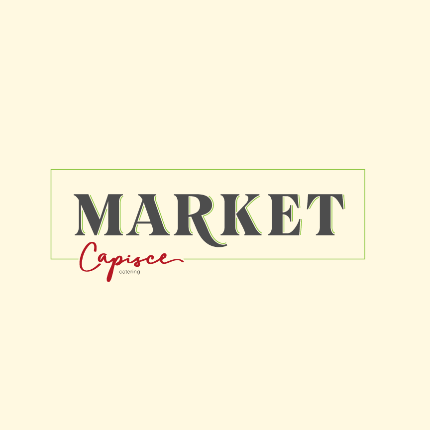
My client asked me to design a sign for them for a market they are opening. He likes what I’ve come up with but wants to see colors that are “richer, since we are going more luxurious European market feel”
Can anyone show me what 'luxurious European market" style looks like? When I think of European market I think of small and cheap meat market ran by an 80 year old man with the cheapest sign possible.
This market he is opening will be alot like Whole Foods. Certainly upscale with craft meats, cheeses, and beers.
Without knowing where this is, and with no sense of the locality’s personality it’s hard to say what exactly would induce a feel of “luxurious European,” or whether the traffic would recognize it. I’d be inclined to loosen up on that and perhaps focus more on the culinary aspects. For that you’re already pointing in the right direction,I think, but you’ll need deeper tones and weightier elements of gold (think ‘golden-brown and crispy’), leafy green, and ripened red.
Well, it’s sort of impossible to know what your client wants. Clients tend to describe things in ways that only they understand sometimes.
Most luxury brands have a minimal approach to branding. It’s as if they’re saying they have no need to pander to the masses with fancy graphics and designs.
You might try putting together a “mood board” on Pinterest to show lots of examples pulled from the Internet of the kind thing he/she might like. This way, your client can point to a dozen or so examples that match up with his/her ideas of what “luxurious European markets” might be. Sometimes it’s better to see what a client likes than trying to interpret what they describe.
Research “art nouveau” typography. This was used in the late Victorian era (1880s to World War I) and was characterized by this ornamental style of art, with its organic, asymmetrical, intricate and flowing lines. To me this is very European.
For a more broad approach, look up “French store sign,” and you’ll see some more variety.