Hello
I have been working on this for some time but I only know the basics and lack any good techniques for design. So I wanted to get some ideas or opinions to see if these could pass as useable logos for the meantime.
Thanks for your time.
Hello
I have been working on this for some time but I only know the basics and lack any good techniques for design. So I wanted to get some ideas or opinions to see if these could pass as useable logos for the meantime.
Thanks for your time.
What is the purpose of your logo? Is it a sig or is it a company logo?
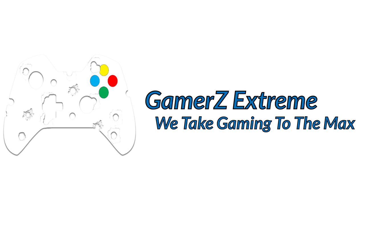
White on white is not working. Fuzzy drop shadows are not good practice when making the logo lockup.
The thin black outline on the text is closing in your type. It is an unnecessary detail.
So is the thin black outline on the buttons.
For something “Extreme” and taking it “to the Max” it’s a pretty boring treatment of the text and graphic element.
I’m guessing those are bullet holes in the controller? There are 4 too many, at least.
It’s a 6-color logo. That can get expensive.
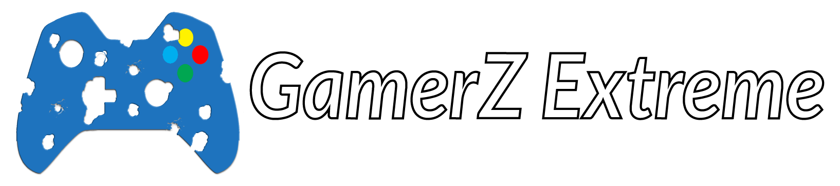
The second logo, the controller again has too many bullet holes that now don’t even read as bullet holes. They come across as bitmapped shapes similar to what you used to see in an old 70s arcade game called Asteroid. Not very extreme. You letter outlines work better this time, at this screen size. When printed or made smaller, they will close in.
Have a look at other “extreme” logos out there and see if you can gather some inspiration.
If this is part of your learning process of just starting out than may I suggest you post future questions in the Student Forum.
The advice given to you was straightforward and that is what you need to learn. Nothing was said in malice at all. And if you read the very first post in the Crit Pit what does it say?
Post your work for critique, but wear your heavy sweater!
Other than that good luck with your continued learning. We are here to help if we can.
![]()
There were only helpful comments made (all of which I agree with). It would have done you a disservice to mention only part of what you requested.
If this is a personal project for yourself, great. If it’s a project for a commercial entity, it could stand improvement for those reasons already mentioned.
I didn’t pick up on the bullet holes, but I’m not a gamer. Is what you posted a logo or a banner ad or header image of some kind? It matters because each needs to be designed with the end use in mind. A logo needs to function in a wide variety of environments and many different sizes. A banner ad, on the other hand, is only seen in one environment at one size, so it only needs to be designed with that use in mind.
As PrintDriver suggested, perform a few web searches for the kinds of thing you’re looking for. The objective, of course, is not to find something to copy, but to see what others are doing that might trigger some ideas that are a little less conservative and more dynamic.
The first step into getting better is to admit doing shit and to accepted being notified for that xD