Good day everyone! as you can see, I got another chance in pursuing my graphic design passion. my first project since last few years is a logo. I showed 3 design to my client and he really like this one below.. honestly I really don’t like it since its not a square or circle type, but he really likes it, so im now figuring out how to improve this. please help me friends.
- Concept : a logo
- Purpose or Goal : to have a logo for a trading card games online shop.
- Format : Later, it will be used for cards and shipping packaging. It will be mostly utilized for branding on the website.
- Audience : Target age: 14+. Gender: Mainly men. Industry: Collectors/Game
- Your Experience Level : An amateur who wants to graphic design as side job.
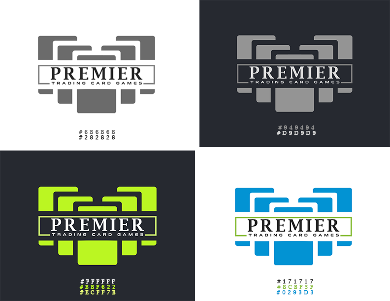
In that size I can read the premier but not the tagline. ![]()
As @Smurf2 did, the first thing I noticed was that the words will become illegible at smaller sizes.
Unless a logo is nothing but typography (a logotype), I rarely include the name directly in the mark. Instead, I’ll provide the client with two or three lockups of how the name can be positioned to the side, above, or below the mark.
Since you’ve already passed that point, if this were me, I’d suggest to the client that a simplified version of the logo is needed for those small sizes: one that doesn’t have the tagline and the thin line around the word PREMIER.
I’m curious why you included the hex colors in your post here.
It looks like a logo for a bank, an insurance company or a law firm. Such a design is certainly not going to appeal the intended, 14+ target audience.
The serif wordmark is totally out of place.
The tagline is too small.
Unfortunately, your design simply won’t work.
You should come up with a logo that is vibrant, dynamic and playful.
1 Like

Hi friends! how about this one! i made it this night..
I get the feeling that target customers will surely recognize that the letter P is made of cards. and the blue color that creates a sense of security while showing loyalty and professionalism… green can inspire feelings of harmony, growth, safety, and success
the icon is a bit dynamic, vibrant, playful.
but im not satisfied with the font.. please help.
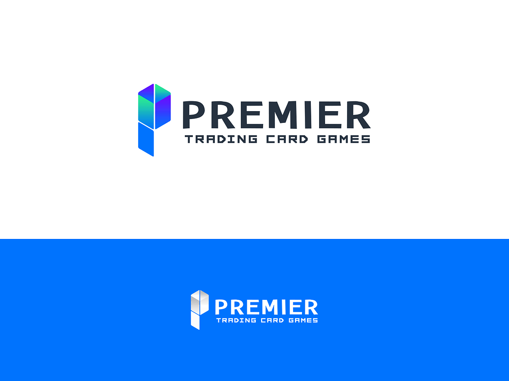
I do prefer the second logo you showed compared to the first, because of the simplicity of the illustration. Plus it has depth, which is more visually exciting. The use of gradients and colors in combination with the futuristic font (the one used for “trading card games”) is giving me tech company though. The typography of the previous font felt either high-end or traditional. 14+ is a broad range so I’m not entirely sure if that’s what you intended for the brand. If futuristic wasn’t the intention though, I would try a different font. Something less angular/intense maybe. Best of luck.
1 Like