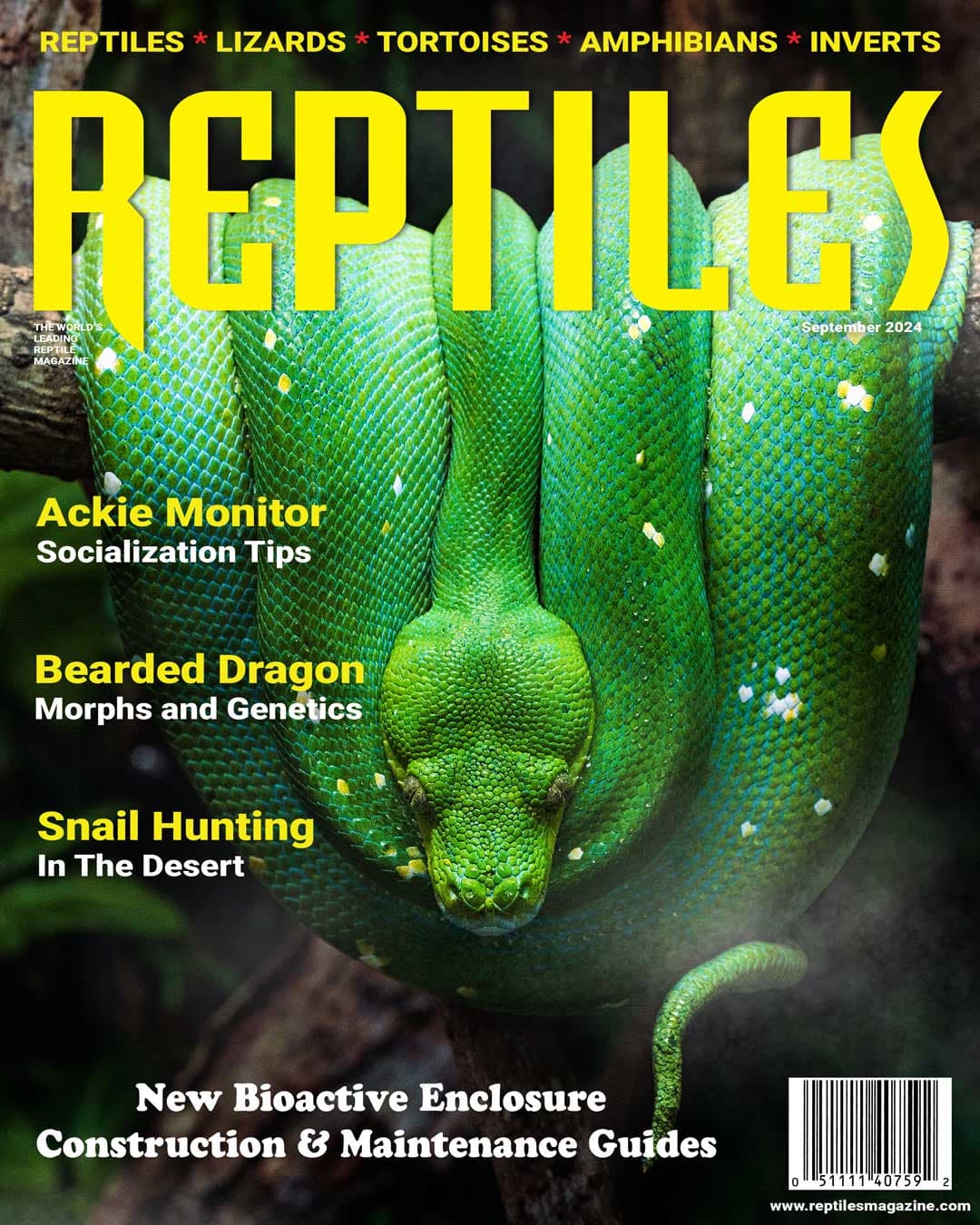
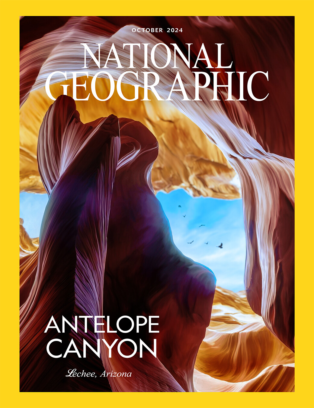
These are some of the latest print designs I did in a class I made a couple semesters ago. I really enjoy designing magazine covers (this being highly derivative since I challenged myself to match the style of these magazines as close as I could without outright copying), and I’d like to know what areas I could improve upon getting back into this type of work.
1 Like
Nothing really to critique here.
Sure you’ve matched the magazine styles. Actually you did it so closely, it is technically copying.
There’s no design challenge in that.
What type of work do you want to get back into?
It’s going to be a little slow in the forum. Big Holiday weekend in the US. I’m just on here waiting for the water to boil. Clambake!
I guess I want to know where to go from here? I really do enjoy designing magazine covers for fun, but I want to try to develop my own style for this too. What do you recommend I use as an exercise to develop that?
Years ago, when I was in graduate school, I helped a design professor teach an undergraduate course in publication design. Based on my memory, here is a modified version of one of the assignments I gave to the design students.
Design two magazine covers along with the magazine’s masthead (the magazine logo).
Choose two topics for two imaginary magazines. For example, sports, pets, business, hobbies, fashion, etc. The first topic should be something familiar to you that reflects your interests. The second topic should be something you’re less familiar with and might not know much about.
Once you’ve decided on each magazine’s subject matter, stick to it. Imagine that an art director assigned these topics to you. Designers never have the opportunity to change what a magazine is about.
After selecting the two topics, visit issuu.com or, even better, a local bookstore to browse other magazine covers. Put yourself in the designers’ shoes and try to understand why they made specific design choices. Keep in mind that not all the magazines you will see are necessarily well-designed, so pay attention to the differences and try to decide why one might work better than the next.
All magazines feature a logo, often referred to as the masthead. Mastheads are typically simple wordmarks that are easy to read, so avoid designing something too detailed that passersby at a newsstand can’t quickly read. Designers rarely get to name the magazine, but in this assignment, the name is up to you; just make sure it’s appropriate and compelling.
Most, but not all, magazines are centered around a photo or illustration. Covers often include teasers—story headlines meant to entice readers. Additionally, the magazine may or may not have ISSN, EAN barcodes, subheads, a newsstand price, issue number, and publication month.
The goal of magazine covers is to grab attention and engage the likely target audience of readers, but the way you achieve that is up to you. Think through the problem carefully and apply what you’ve learned when designing your two magazine covers.
Feel free to ignore my suggested assignment. My main advice is to design a magazine cover from scratch and post it here for a critique. Don’t try to redesign National Geographic, the Reptiles magazine, or any other. Redesigns tend to be more complex and nuanced than creating something new from scratch, as they usually require a fresh but recognizable interpretation of an already established brand.
1 Like
When I first started designing magazines, newsletters and mastheads etc. I found it absolutely brutal to get everything to sit together in a way that felt cohesive and intentional. Honestly, it felt like staring into the abyss of endless typefaces and thumbnail sketches that never looked quite right. But over time, with a lot of practice (and plenty of questionable early attempts), it gradually started to click.
Your covers show that you’ve got a solid handle on matching established styles, which is a really important skill. It’s how you train your eye and build your muscle memory for layout, proportion and hierarchy.
If you want to start evolving your own style, one thing that helped me was to mix and match influences in unexpected ways. For example, take the clarity and restraint of an economics magazine and try applying that to a fashion publication, or blend the energy of a skateboarding mag into a science title. That kind of cross-pollination can spark something that feels more personal.
I agree with the others and the exercises to design a masthead and visual identity system for a completely imaginary publication something you’d actually love to read yourself. Maybe even mock up a table of contents or a feature spread to see how the visual language carries through.
Don’t feel pressured to have a signature look overnight. Style emerges when you experiment, question your own decisions, and get comfortable taking risks.
1 Like
As I’m not the perfect designer, but can say that font styles can be better for the “Reptiles” magazine cover. And for “National Geographic” needs more content to add as I can see a lot of free spaces. The full screen photo don’t looks so fine as is not enough text. That’s just my two cents ![]()
1 Like
This looks like a ton of fun! I’ll give it a shot, thanks everyone!
1 Like
B, I like that assignment, but I’d take it even further.
In my hypothetical graphic design class, no one gets to choose anything. They pull topics out of a hat and they get to design to it, whether they know anything about it, like it or not.
That’s the way it is in the real world.
Good thing I don’t teach design. ![]()
Actually, our CD cover game here is a pretty good example of being tossed title, band and art and told to make it work.
1 Like
The assigned project from years ago involved a cover that each student was allowed to choose, with another one assigned to everyone in the class. I think it was a financial/banking magazine of some kind — something the 2nd-year design students probably didn’t have an interest in, but could still find examples of in bookstores and newsstands (there was no internet back then).
One of the unstated objectives was to provide students with the opportunity to experience the difference between something they might like to design for fun and something they probably wouldn’t choose to do. Interestingly, as a whole, the students did a better job on the financial magazine, where they felt a need to do research rather than engage in a personal art project of their choosing. During the class critique, this difference was discussed.
1 Like