Hello everybody,
I’d like to get some feedback on my work.
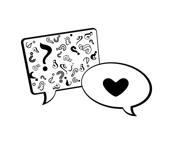
- Concept : poster design (that can translate to other products mugs, t-shirts, etc).
- Purpose or Goal : Convey “love is the answer” concept.
- Format : Print.
- Audience : Visual thinkers, like clean, pared down design style.
- Your Experience Level : Self-taught beginner.
- Nature of Job: Self-directed project for selling directly to customers via Etsy and via Products On Demand websites.
I’m interested if the concept of “Love is the answer” is coming through? If anything is missing or is redundant. General feedback. Would you buy a poster to hang or a t-shirt to wear, if not, why not? 
Thank you.
Dasha
Considering I’m aware that it’s Pride Month, I took a totally different read on your graphic at first glance.
It’s cute.
I wouldn’t wear it (gray haired old man here so not your demographic)
The heart shape bothers me a lot. It’s not drawn the way one expects a heart to be drawn. This may be on purpose? It also looks clipped on the right side, but that might just be pixel error.
On the speech bubbles, I’m not a fan of reversing the direction of the light source. It’s a conflicting look, and you don’t want to imply conflict.
Oh, and thanks for filling in the background info!
2 Likes
I keep getting the “Love Is the Question” vibe. Perhaps replacing the question marks with a single exclamation mark gives a more empathetic statement.
What @PrintDriver said about the background info.
Or restacking the art so the questions come first?
1 Like
Thanks for providing some context.
Have you considered adding a font to more clearly articulate what the question/answer is?
I don’t understand the correlation between someone asking a question and a heart is the response.
Had I not read the brief, the message wouldn’t be clear for me, but the graphic isnt communicating strong enough.
The question marks take on a lot of different styles, and structures. Try simplifying them down a tad, or have the heart relate to visual cues of the question marks. Sometimes less may be more.
The heart (love) is the answer. That’s the point.
I seriously took it as someone questioning their gender identity and the heart being “I’ll love you anyway.”
But like I said, I’m aware it is Pride Month.
Hello!
There are a couple of things that I think would help to make the message clearer:
- some of the question marks are very squiggly and don’t read as question marks, maybe reduce the number to de-clutter and only use ones that are clearly question marks.
- Most people read top to bottom (unless Japanese) so having the question box higher and heart lower will create a reading sequence. Another suggestion could be having the arrows more to the side, as many people are familiar with a text message type of view and would associate the bottom with the response.
Hello,
Thanks a lot for the feedback, I hugely appreciate it!
Yes, the heart looks clipped on the sides a bit, I’m guessing it’s due to the size/quality, as it seems to be ok in full size (couldn’t post a link to some POD site). Unless I’m totally delusional about that. I wanted a more organic curvy shape of a heart to communicate softest and acceptance rather than standard a bit pointy heart shape.
Good call on the light source, I will research that topic more. Didn’t spot that.. I somehow thought that current shadows emphases even more that question and answer come from opposite sides so to speak.
Thanks again
Thank you for the feedback. I want to avoid adding any text, as I’m trying to convey the meaning just via the design. I’m ok if people don’t get it straight away and take some time to look longer at it and try to solve the puzzle
Hello!
Thank you for the feedback.
- I actually tried that before, with less questions it looks bear. Also, I don’t mind if people spend some time looking at unusual question marks to recognise a question mark.. I quite like it to be kind of a puzzle, also representing variety of questions.
- Also tried that, with the space they look extremely separate concepts floating around. I feel overlap produce some kind of soothing and a “hug” to an overwhelm of questions. Could be just me, but it makes sense to me
Thank you for taking the time for the feedback, I do appreciate it