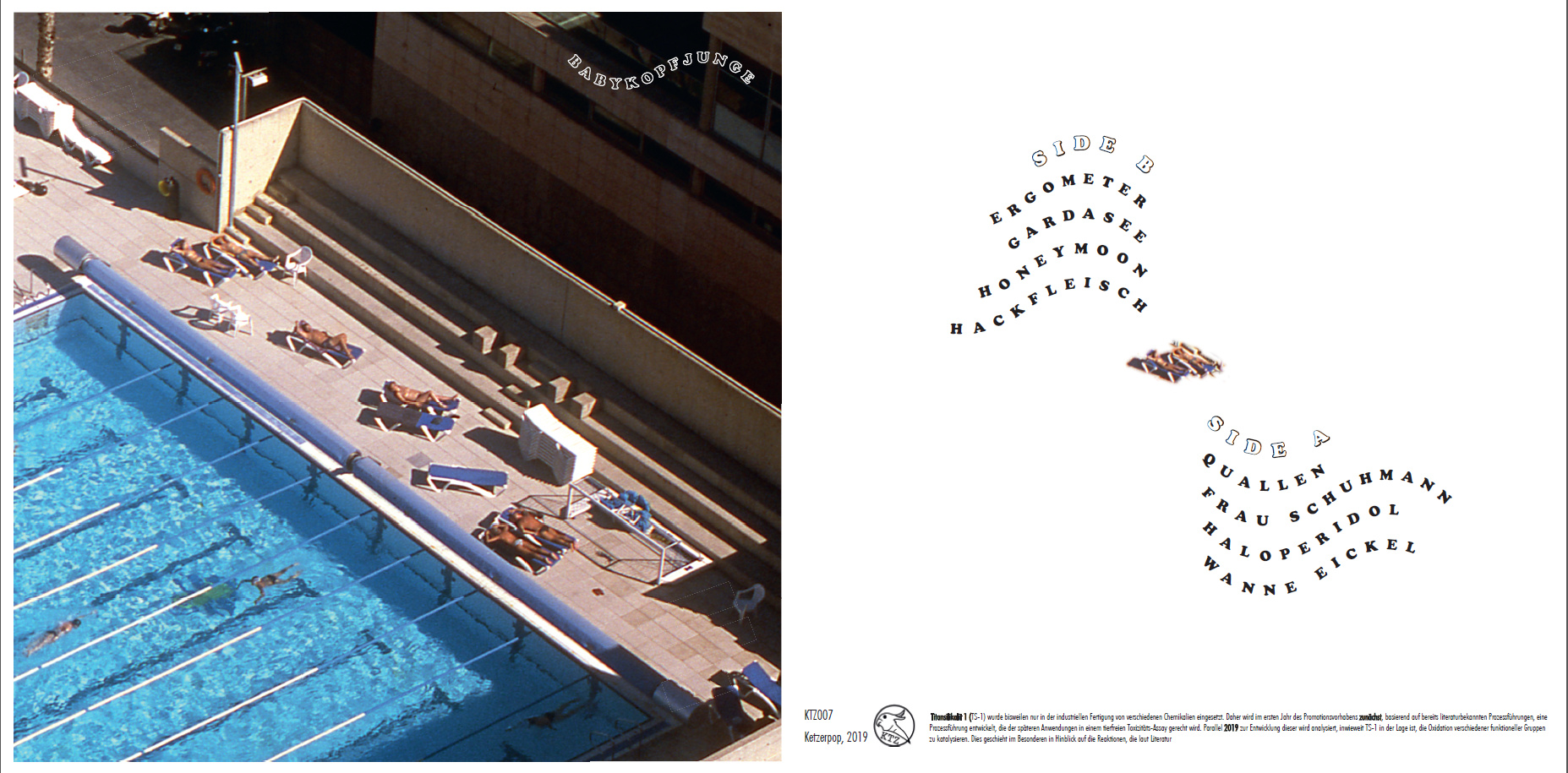
I’m currently working on cover for an LP release of my band. Attached you will see the draft version of it! I’m really struggeling with the front (left in the picture). Do you have any idea how to manage the typo (in particular on the front)? Somehow I like how the wavy typo on the front breaks with the structure of the picture, but maybe there is a much better solution?
Overall, I like how it looks, but given that I don’t know what kind of music your band plays, I can’t speak to whether it represents it well. For me it evokes a sort of retro 80s new wave pop rock aesthetic, somewhere between Duran Duran and Talking Heads.
I’m not a fan of the type treatment though. The combination of the exaggerated letterspacing and wave effect make it a little difficult to read. Is there a reason Side A is after Side B?
I agree with VirgoNightingale’s assessment, so I won’t repeat it.
I like the photo and the angles in the photo and how they relate to the square album cover. As you mentioned, the wave in the name makes a nice and unexpected contrast with those angles while also tying it in with water. However, its size and impact are anemic. The good things I just mentioned about the name are lost due to the insignificance of its size and lack of visual strength.
Thank you so much for your comment VirgoNightingale! The picture is small section of a photo (diapositive) I took in summer 2017 from a tower in Barcelona. It’s beach area full of people. First, we wanted to name the album “Anthrpozän” (Anthropocene), which relates to the picture. Currently, wer are strongly discussing this title and I deleted it from the cover. The track list is only a draft. It will start with side a and side b, as you proposed.
I will now try to prepare a version with more straight typo. I’m always struggling to put a straight typo on the front cover of the LP, because of the structure of the picture. Do you think it makes sense to put everything on the back and leave the picture as it is (without typo)?
I think having the name on the front is important (unless you’re a famous band and anticipate your release becoming ubiquitous enough to be recognized without it ;)). I do think it should at least be larger and more centered within that darker area, it gets a bit lost so small and in the corner.
Making the name readable is the most important thing on the cover, unless like stated previously you are a very famous band and have established this as your famous logo.
The waves are fun but they are associated more with oceans than pools, so that doesn’t connect immediately. Do you have a beach ocean photo you could use that has the same angle?
And I think you mean “type” not “typo”. Just asking because it’s repeated.
I personally really like the treatment of the image and typography quite a lot!
Fits very well with the general vinyl aesthetic, however as @VirgoNightingale stated, it does give an 80’s feel to it. So if that’s what you’re aiming for, then definitely go for it.
Would echo on the comment on making the name bigger.
As for the typeface itself, there might be some really nice references to help you get an edge to it in this book if you happen to be able to get your hands in it: Amazon.co.uk