Mable

I’ve been working on a type family design. As is usually the case, I begin losing my objectivity and need some fresh perspectives.

This is a display face made for sizes above 18 or 20 points to be used mostly for signs, headlines, posters, and that sort of thing. This is a slightly condensed version, which I’ll likely expand out to both regular and extended widths when I get the time. The italics are still just in my head at this point. I haven’t created any kerning pairs yet and am just trying to get all the glyphs to more or less look like they belong together before tackling letter spacing.

As I look at it now, I can see a few things in some glyphs that need work to make everything look consistent. I’m happier with the lowercase than the caps, but that’s usually the situation with most typefaces.

With all that out of the way, what problems do you see?

1 Like

I’m always fond of your typography work. I have nothing to add other than it’s lovely.

The hairline of the x is prevalent in the lowercase and uppercase.
I don’t see the same for the lowercase vs uppercase u and m - for example.

Overall, this looks nice. I like the thinner versions in particular.

I’d only make two comments. Take these with a grain of salt as I am not a type designer, so maybe you have good reasons for doing these.

First, I’d like to see a smaller radius on the curve on the lower case t.

Second, looking at the lower case fox, the kerning on the OX is really tight compared to the kerning on the fo – more so on the heavier versions of the face.

Thanks guys. I appreciate you both taking the time to look at it. I’ll play around with what you’ve both said.

As I mentioned, I haven’t done anything with the kerning pairs yet. Kerning and font hinting are typically the very last steps in building the files.

Overall; nice one. A couple of small things jumped out at me.

  1. The l/c y; the light stroke appears a little too light on all but the lightest weight (for the extra light, the balance appears reversed) On the u/c Y, the angle of it seems a little too obtuse (or the thicker one, too acute)

  2. On the l/c f, the top curve seems to flatten a little too much on the lighter weights.

  3. The heaviest weight glyph for #4 the vertical coming up from the baseline appears a bit too long. It creates tension with the diagonal.

It suddenly dawned on me, beyond a flag on 5, I don’t think I know if there are any specific terms that relate to numerals – apart from the obvious ones that relate to other glyphs. For example, What is the lower vertical on the 4 called? In the closed glyph for 4, naturally, it would be the stem, but in this open version, is it still called that? Stem doesn’t seem to describe it in this case. Anyway, I digress…

As I say, nice work and I am nit-picking with my comments, but for what it’s worth, those were the things that I noticed.

One day, I’ll get around to finishing mine. One day…! Ironically, the one I am closest to finishing is not a million miles from this one, in that, it is a sans with pronounced stroke contrast. One day…

It is very good, the curve of the lower case ‘t’ looks OK to me but I would agree that the diagonal stroke of the ‘y’ is a little thin. Sometimes diagonal strokes need to be thicker to appear the same width. The numeral ‘4’ gets a little congested towards the heavier weights.

This font has a character that develops more towards the heavier weights, this is not to say that the lighter weights lack character it is just different.

The spacing is a little tight for my liking but that is a personal choice. However I would format a page of text in this font at 12 point both on screen and on paper to see if it is comfortable to read. This may be OK as it is for display and signage but I would loosen the spacing a little if I was doing this.

It is common for font designers to set the spacing too tight as they usually view their font very large on the screen as they are designing it, but when it is used at it’s working sizes the spacing may be too tight. The smaller the text the more spacing it needs to maintain legibility.

Yes. The y is something of an anomaly, but I couldn’t quite put my finger on it. I think you’ve both identified the problem. The width of the thin stroke is consistent with both the v and w, but the descender appears awkward. I haven’t done so yet, but I might need to offset the optical illusion by gradually flaring out the descender from top to bottom.

Hmmm, you might be right. The f is mostly just the t tipped upside down with the crossbar repositioned. The lightest weight might need a bit more of a curve towards the terminal. @Steve_O mentioned needing a smaller radius on the t, so perhaps these observations are related.

Yes, I see that too. I’m unsure if the problem has to do with the length of the stem or the angle of the diagonal stroke changing from the lighter to the heavier weights. I’ll need to play around with it. There’s some congestion there.

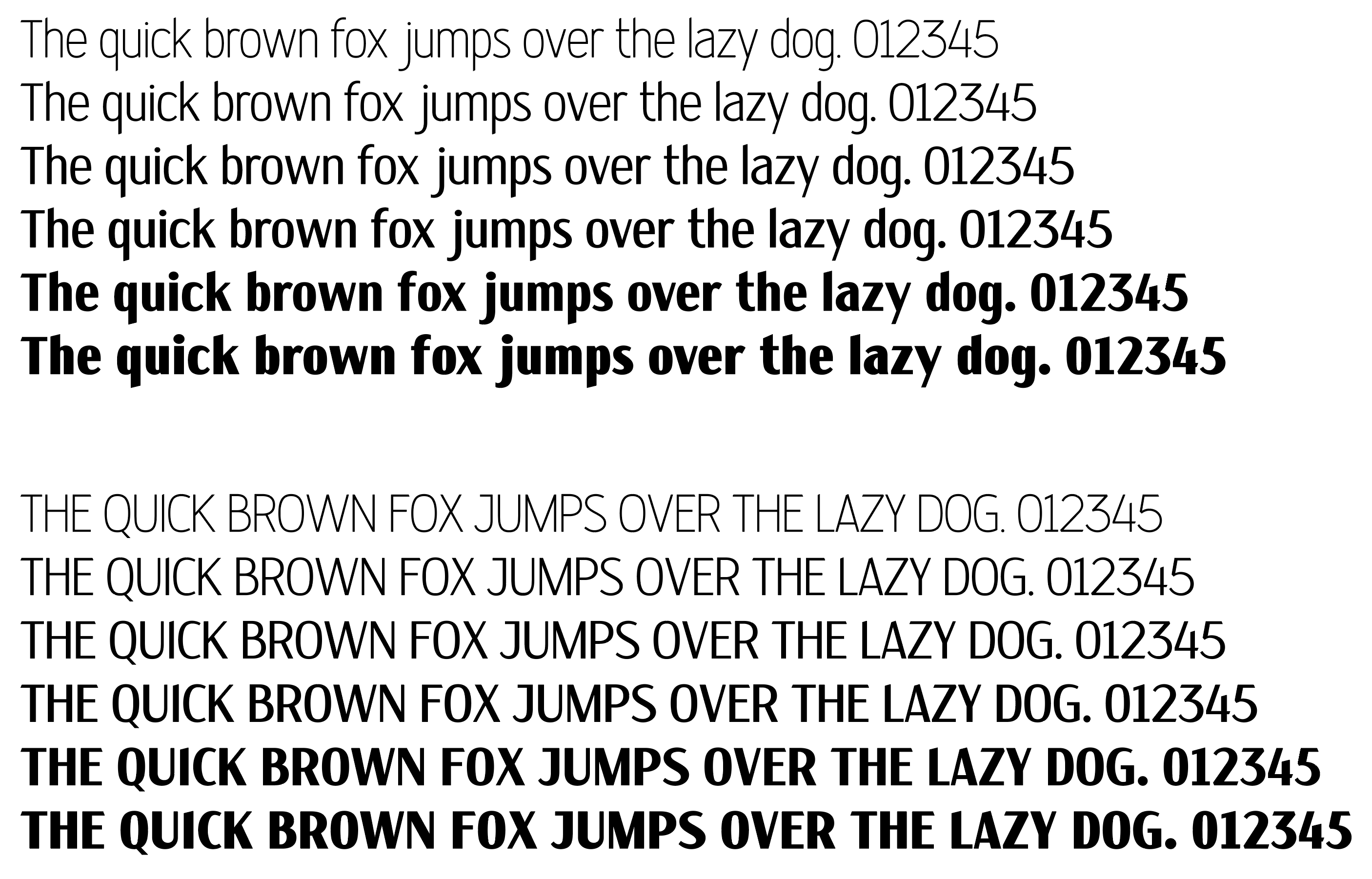
Numerals are awkward. At first glance, they don’t appear all that different from uppercase letters, but there are fundamental differences. I’ve always suspected it having something to do with to their Arabic rather than Roman origins.

In this typeface, I’m planning to create three different OpenType sets of numerals (plus the numerator denominator versions for the fractions): monospaced, old-style, and proportional. Each will require tweaking the numerals, which I never look forward to doing.

I’d be interested in seeing it at whatever stage it’s at.

Yeah, I agree. I’m glad you and Sprout noticed, which tells me that it’s not just me seeing it.

As I mentioned above, I’m planning three different OpenType versions of the numerals. What I’ve shown here are the preliminary versions of each that I’ll adjust for the monospaced, proportional, and old-style versions. As is often the case, the monospaced version of the 4 will need to be a bit awkward, but perhaps I can make the angle of the diagonal stroke a bit less acute. That dang crossbar needing to extend to the right of the stem always gets in the way. In the proportional versions, I can more easily adjust all these things. One good thing about a display face, as opposed to a text face, is that the proportional set can be the default rather than the monospaced version.

Yup. Despite designing and building fonts since the late '80s, I still fall into that same trap. I don’t really mind, though, since some sidebearing adjustments always need to be made once most of the glyphs are designed and the typeface starts coming together as a cohesive font. I do agree that the glyphs are spaced too tightly. I haven’t yet dived into that problem just yet, but it’s my next step. As a starter, I might increase the spacing by about 15%, then begin individually adjusting the sidebearings before tackling the one-off kerning pairs.

Great feedback! Thank you.