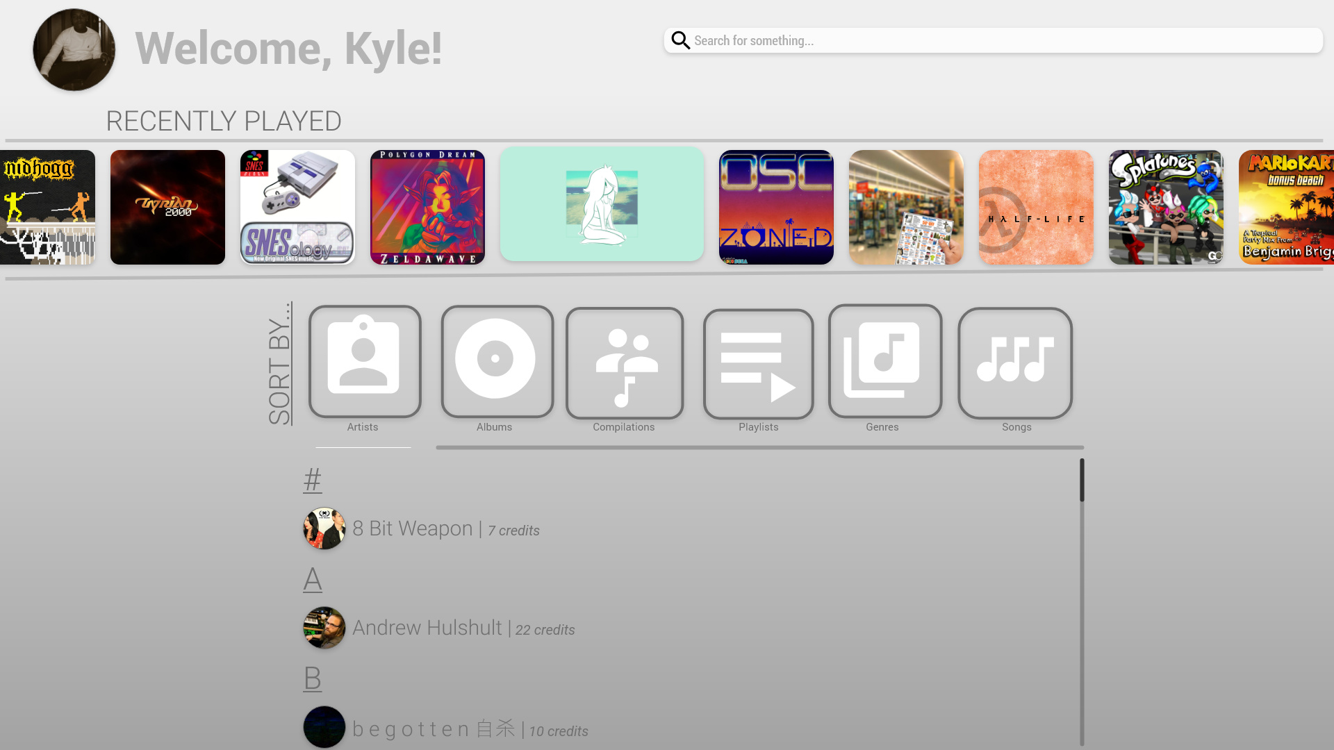
This is my first wireframe project, so I apologize if I’m not doing everything right. I did get some assistance from r/ui_design, but there isn’t really a huge audience here, so I decided to bring it here!
Sources Used:
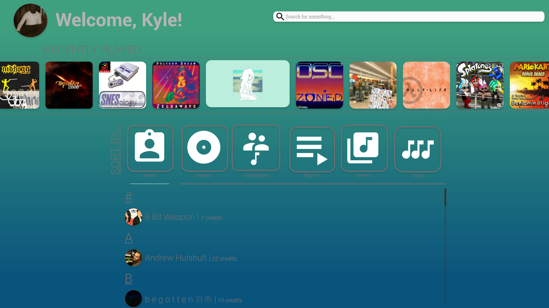
Icons - Material Design
Background - Hook Agency (Subtle Gray)
Font - Roboto
Albums Used:
Nidhogg OST - Daedelus
Tyrian 2000 OST - Alexander Brandon
SNESology - Shnabubula (Samuel Ascher-Weiss)
Zeldawave - Polygon Dream (Geometric Lullaby)
seafoam EP - Kaminakat
Zoned - Opus Science Collective
Welcome to the Craft Store!® - nofriendisonline (Geometric Lullaby)
I’m not an authority of user interface nor music, but the grey background it a bit drab.
I do enjoy the filter buttons however, and the white would contrast nicely with something vibrant as a background. The mini album covers I don’t mind either, though with the “Apple-esk” look I wouldn’t mind seeing something with that “rolodex” type style.
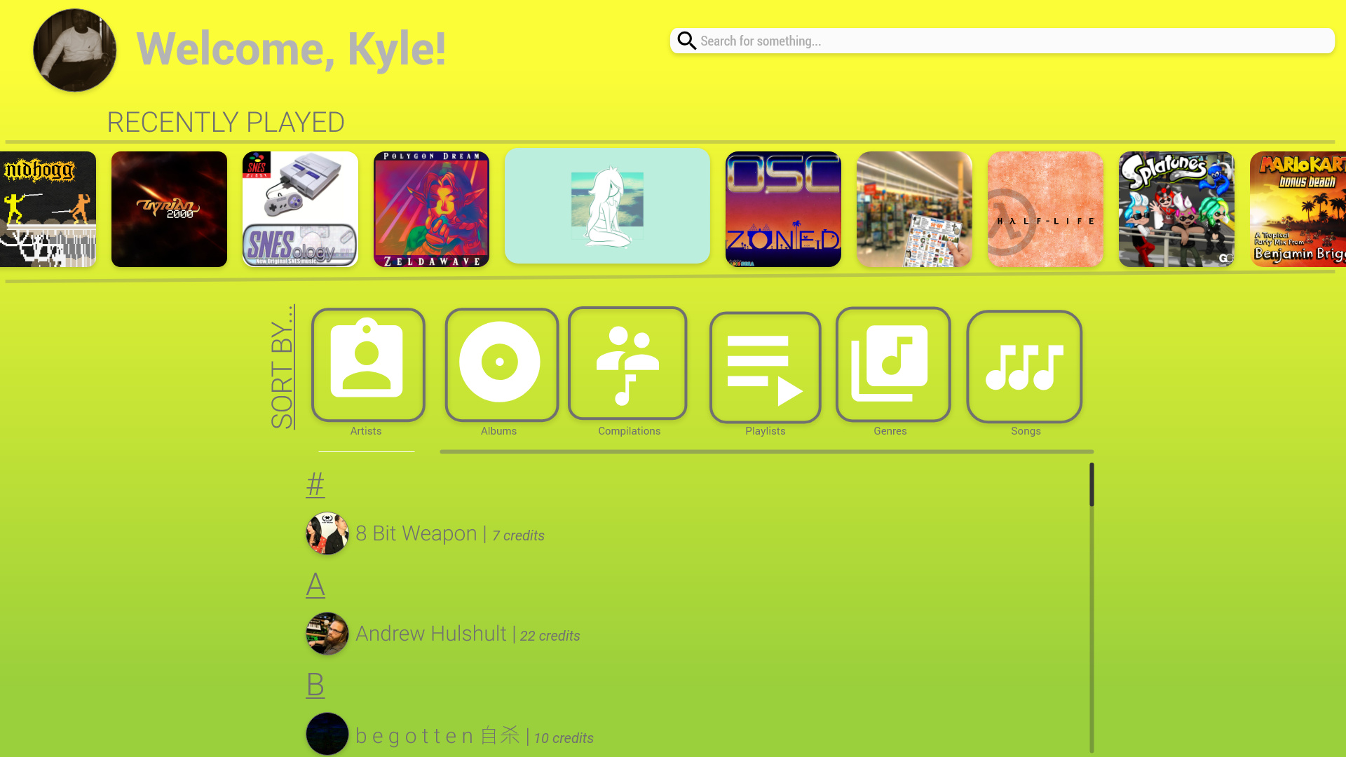
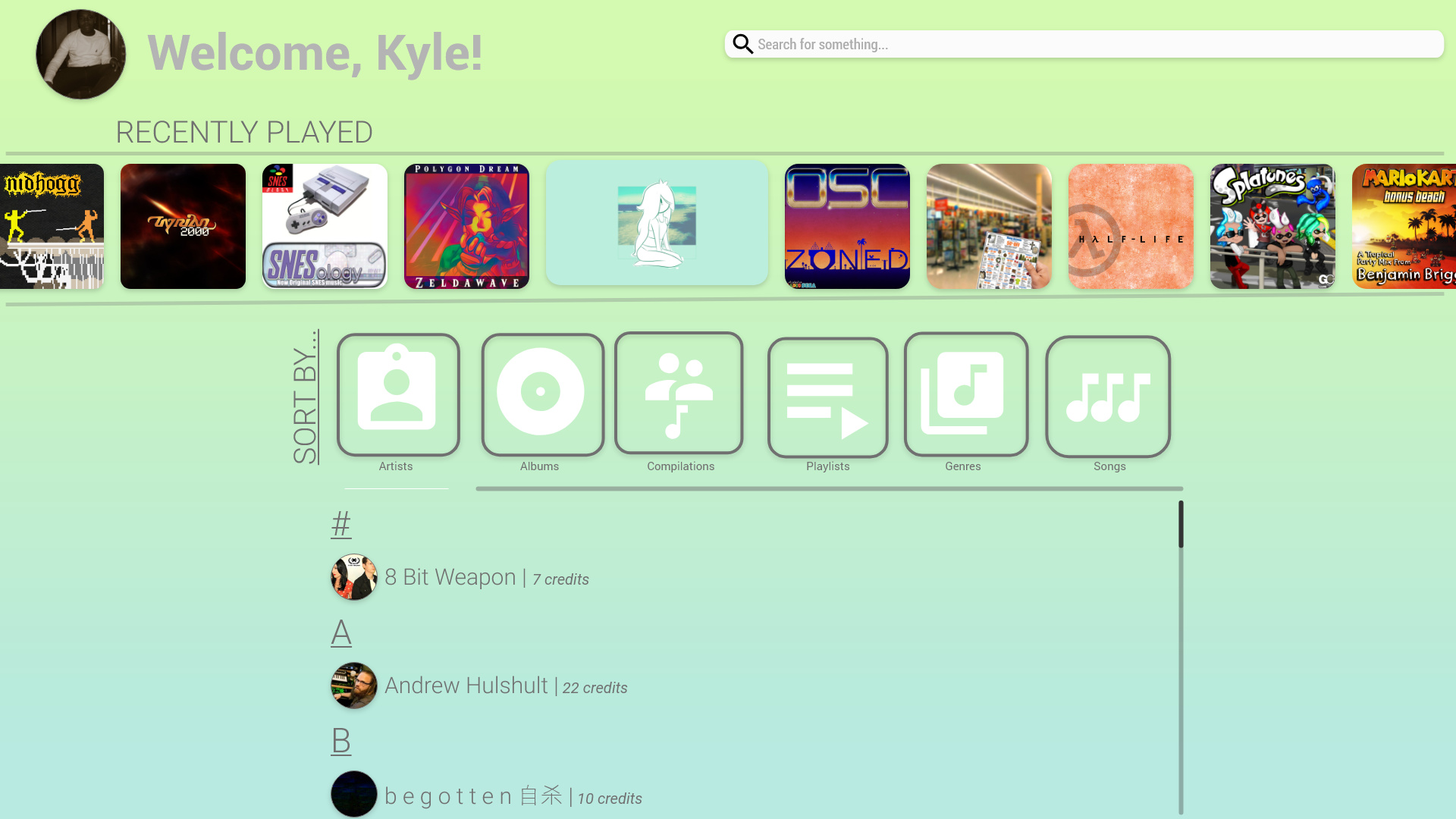
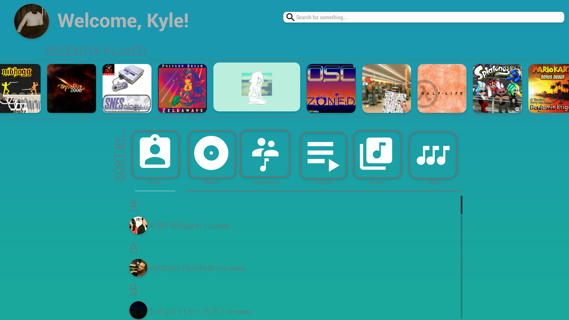
@Biggs I took your idea into account and have tried four new gradient backgrounds: Lime-aid, Miracle Grow, Most Epic Blue Green, and New Leaf. I believe I’ll have to make the text color lighter for the latter two gradients. What I imagine is that I can have an assortment of gradients, and then the user can choose what they like the most. Also, could you please show me examples of that “‘rolodex’ type style” you mentioned in your post, so I can take that into account for my next iteration? Thanks for responding to me!
EDIT: My brother gave me a great idea just now about backgrounds; we could have them be randomized(every time you open up the app, you get a different background). I also just came up with the idea of having background “playlists,” so you have more control over the randomization.