BYU student?
I agree with PrintDriver’s observations. In addition, here are a few of my own.
Placing images of a book inside a magazine is an interesting idea, but I think it could be made to work better.
The margins around the edges with the wooden planks are seemingly arbitrary and, in spots, like the top and bottom, claustrophobic. If you’re aiming for a random placement look, make it look comfortable and deliberate instead of like an oversight.
Spaces between paragraphs are standard for online text, but less than ideal for printed materials. Use paragraph indents instead.
You seem to have avoided hyphenation except in the larger introductory paragraph, which definitely should not be hyphenated.
The tops and bottoms of the columns of text need to line up. This one is an absolute must — especially at the top of the pages.
Pay more attention to the spacing between the various objects. For example, the space between the large introductory paragraph and the byline is too tight, and makes the byline appear as though it’s more closely associated with the intro than the story itself. Another example: the spacing around the pull-out quotes is uneven from one page to the next and awkward.
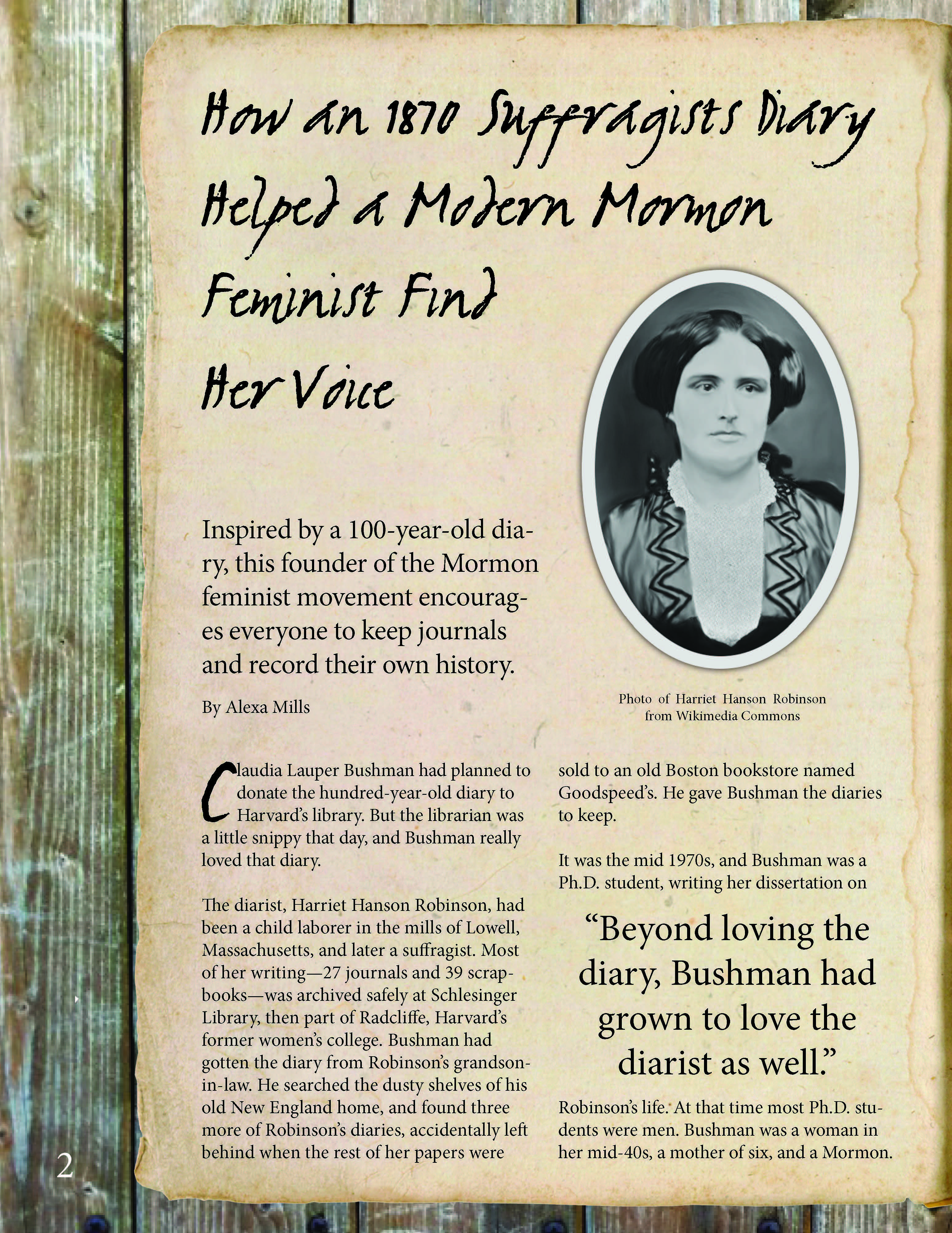
You’re going for a realistic antiqued effect, yet the bluish, duotoned photos with their bluish-gray background couldn’t have been printed on the yellowed paper. In other words, if you’re aiming for a realistic look, make the photos look as though they were actually printed on the paper in the book.
You mentioned your target audience being women in their 20s and early 30s, and I suppose the story could very well be of interest to a certain subset of women, but your visual and historic treatment of the subject matter, while interesting, doesn’t really seem to be an ideal fit for the demographic group you’re targeting.
I have my reservations about the difficult-to-read headline typeface you’ve chosen, but that might be more a matter of opinion.