Your text is formatted like a website with spaces between paragraphs instead of paragraph indents. Magazines, like almost all periodicals and books, use paragraph indents. Your leading is also way too spacious and the lines at the bottom of the page don’t horizontally align.
If you use a drop cap to start the story, make it larger so that it attracts attention and unambiguously says the story starts here. This would also have been a good opportunity to reuse the beefy slab serif you used for a headline. Thick slab serifs make great drop caps.
Speaking of where the story starts, it’s usually the place for the author’s byline and title. You’ve placed the byline at the end of the story, which is sometimes done, but it’s customary to supply readers with a little more information about the author’s credentials than just a name.
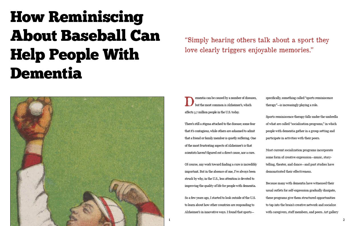
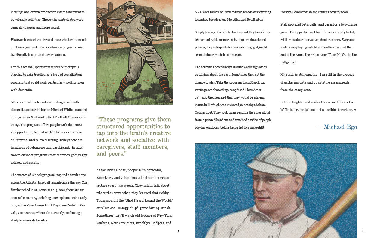
Illustrations almost always require credit lines — you’ve left them out. The illustrations are also poorly cropped.
A magazine feature spread is an opportunity to use the entire spread to extend photos across the gutter or into the gutter to the spine. This isn’t always done, but did you consider it?
Your pullout quote is visually dull. A pullout quote is an opportunity to grab attention with big quote marks and interesting typography that interrupts the grid.
Magazines almost always use various graphic devices, like page rules, special typography for the page numbers, running heads, etc. Each spread almost always contains the name of the publication — typically on the opposite side of the page from the page number.
Odd numbered pages are always on the right. Even numbered pages are always on the left. There really are no exceptions to this rule. A magazine starts out with the cover. The next page is the inside front cover. The next right-hand page is typically page one. In addition, a magazine article never starts on the inside front cover. Instead it would begin several pages into the magazine — beyond the ads and the table of contents. In other words, use realistic page numbers on your layout. Instead of starting out with page 1, start out with something further into the magazine.
Look at other magazines. There’s no shortage of them. Pay attention to what works and why. A magazine layout is an opportunity to design something that’s fun and visually exciting. Here are some examples: Google Search
All this criticism aside, you’re new at this and your layouts are par for the course for a beginner. They are by no means terrible — mostly just too conservative for the subject matter and don’t reflect those things you haven’t thought about until now.