Hello, please give a critique on my magazine design.
please, change headline to a more serious font.
the galley is small, and the paragraphs need a quote or graphic.
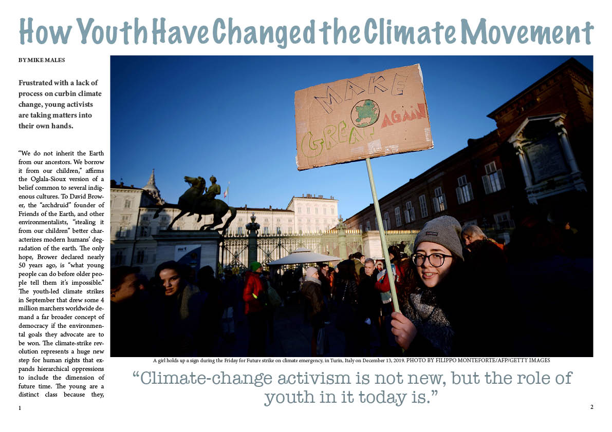
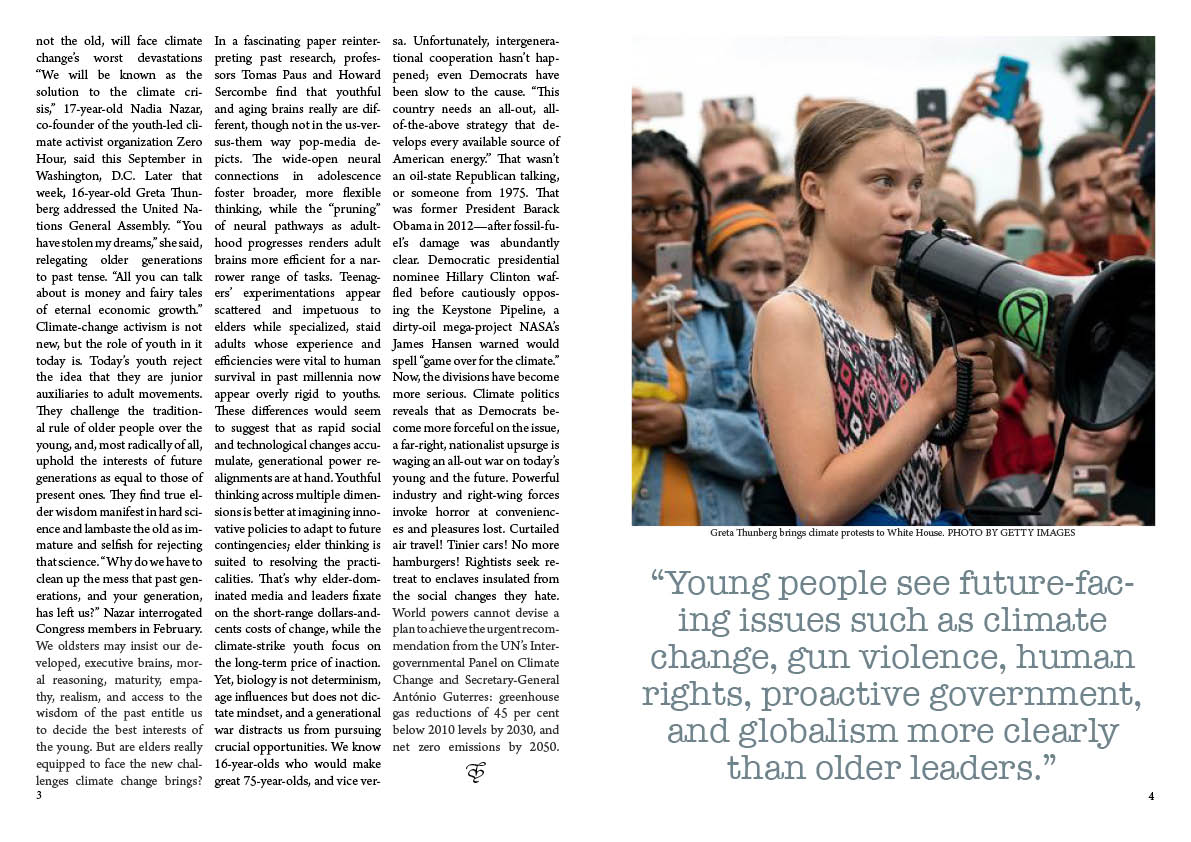
Greta should be facing towards the reader or page.
all text as heading, photo quotes should be bold.
reward the photographer
remove hyphenation on “facing” (future-facing)
We see a lot of magazine spreads for critique for class assignments. What grade level is this for?
I fee like I copy and paste this into every magazine spread critique. But it still applies, IMO.
Take a look at actual magazine spreads. Preferably “quality” spreads. Go to a bookstore and check out their magazines or even your grocery store, corner store, etc.You’ve been given some feedback already. But if you’re looking for an online site that may give you some decent examples, you may want to check here as well . Not all of these examples are perfect either, but it may be a good resource to at least dig through.
I’d say, on a positive note that the photos are good, but everything is very, very boxy and angular.
Yeah, lots of them, and much the same advice applies to this critique as all the others. It seems that every student makes the same mistakes, which ought to give instructors a clue on what to teach before making these assignments.
I don’t want to go over it all again, but a forum search for magazine design will turn up lots of good advice: Search results for 'magazine design' - Graphic Design Forum
Four things worth specifically mentioning:
- The space between the columns of type is too narrow
- Left-hand pages are always even-numbered and right-hand pages are always odd-numbered.
- Create more space between the photos and their cutlines (unlike the others, good job on actually adding cutlines)
- Marker Felt (as EB_comix suggested) is not the right typeface. For that matter, it’s rarely, if ever, the right typeface for anything other than as an example of a typeface not to use.
1 Like
Body-text-size copy crossing gutter is never a good idea. Neither is quote.
The symbol at the end of the article is bothersome. It just looks like “I need to fill up this two-line space”.
You have adequate space for the folio in the first spread. Why not the second spread? There’s a reason for baseline grid for body copy.
A single paragraph for the whole article? Break it up.
Drop cap in the first paragraph will remind readers where the article starts.
Cutlines read better if they’re flushed left.
Make the Intro text stand out more.
1 Like
Way too many hyphens and in weird places. You wouldn’t normally hyphenate a person’s name or carry just two letters to the next line. Forcing justification on both sides gives you those. Along with some pretty bad rivers.
1 Like