Go for a walk or drive and find some examples of well-designed signage with type set large in a common serif face, like the one you used here, if you can. It won’t be easy to find because it looks horrible, especially all caps.
And, if you’re going to “write” the banner’s content, you must think harder about the words. “Baked Bread”? Obviously, you’re forcing the word “baked” into the mix, but preceding “bread” is a terrible place for it. Without a blade, a knife is just a handle, and it isn’t bread until it’s baked. Even if you were offering choices of raw bread dough, par-baked loaves, and fully-baked loaves, “baked bread” would be an awkward and redundant combination of words for a headline.
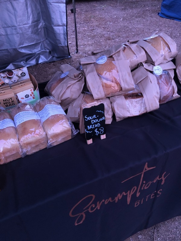
I can barely read that italic and every time I see the name all I read it as Scrumptions. But, I’ve never been much of a fan of Behavior Indihome because of how some of the letters join up
Your more recent banners are certainly better than the first, so you’ve made progress.
However, I agree with the others about the typography. The banner should be legible from a distance. A headline set in a serif text typeface using a small point size doesn’t meet that requirement.
Why black? The banner should look appetizing. Are you limited to only black for some reason?
There are various resources online to help you determine legibility at different viewing distances. Google “font sizing calculator” or “viewing distance and font size”
Even with those calculators, it’s always best to print out a piece of your text and tape it to the wall at the end of a long corridor, then walk backwards. Especially when just starting out.
I get how it feels old fashioned and outdated, I will definately change the font. But I cant change the logo, its all over their products and on the stall, and it was made by someone else.
Thanks, I was thinking of going for a drive to some of the local bakeries. And I’ll definitely change the wording, it does seem confusing saying Baked Bread… Fresh Bread sounds better.
I am a beginning student but I can make a recommendation. All of the text is about the same size. The Scrumptious BITES should get the most attention and so it should be the largest. Everything else can be much smaller. I think the fount used for Scrumptious is great.
Hi Duke, this is a solid starting point. The layout feels clean and easy to read, which is a good base to build on. You’re right that the text-heavy look can feel a bit flat, but that’s very common at this stage.
One thing that could help is creating a stronger visual hierarchy. You might try making one message the clear focus, then letting the rest support it. Small icons, simple illustrations, or subtle dividers could also add interest without cluttering the design. Even changing font weights or spacing can make a big difference.
You could also test how this would look from a distance. Designs like this often end up on signage or custom printed banners, so clarity at a glance matters just as much as detail up close.
Overall, the idea is good and the message is clear. A few visual accents and spacing tweaks should help it feel more balanced and engaging.