Market Stall Banner

Hello everyone, just wanted some thoughts on how I could improve this design. It is only in the starting stages of design and I felt the need to get some feedback on it before I continued with it. The trouble I am having is that I believe that with so much text and so few visuals it makes the design uninteresting and a bit bland.

Cheers, Duke

It’s monotone. There’s no focal point, no hierarchy. The font change-ups are gratuitous, achieving only oscillation devoid of logic. Some pieces beg for symmetry, but here it’s not working; it’s forced, and yet lazy. Start over and apply some bravery to it.

1 Like

That’s a bit like me posting a pic of a bag of flour, some eggs and sugar and saying, I’m starting a cake-baking business. It’s in the early stages. Any suggestions?

Currently, it is just words typed in dubious fonts. What are you wanting to say? Who to?

I am assuming that the market stall is yours and you are the baker, not a wannabe designer commissioned to produce a banner for a family member’s market stall. I sincerely hope it’s the former.

Honestly, this is so far off the mark, My most helpful suggestion would be to find a good designer.

You need to start by creating a brand. The logo is terrible, but a logo alone does not make a brand anyway. As I touched on, you need to identify your audience and speak to them in a tone of voice they will respond to.

Why would that banner make people come to you? What does it say about your business or product? What unique aspect of your business is it telling people? Does it make customers mouths water? Does it make them want to put their hands in their pockets and spend money?

Actually, what it says, ‘I don’t care enough to invest in my business’

Harsh criticism, I know, but unlike cakes, there’s little point in sugar-coating it.

Right now your not very helpful mate. All your doing is typing typical questions that designers face and basically rephrasing what I have already said in my original post. What made you so fired up over a simple mockup? I mean “I sincerely hope it’s the former” is just plain childish. And you can’t just say the logo is terrible, there are plenty of logos just like it in this area of marketing and they work quite well. As a budding designer your “helpful suggestion” of finding a good designer is really disappointing to say the least. All the banner needs to be is an information visual that shows the buyers what exactly the stall is all about, not some all important advertisement campaign. In the future try to show others how a design could be made to look better, even if it is terrible. Don’t tell them how bad it is without giving them at least some help.

As I said its only a mockup, the monotone colours you see are only temporary, I was thinking of some dark burgundy shade later on down the track. The font change-ups are needed, staying in one font family would make it look terrible. Do you reckon three font families would work alright?

It’s a rarity that a design benefits from more than two typefaces, and those typefaces should contrast with each other.

Sprout is hardly a budding designer if that’s what you meant to say. He’s been in the business for decades and has done rather well for himself. I also agree with every word he said, so I won’t repeat it.

I’m not going to sugarcoat this, but your banner design leaves much to be desired. I don’t have any helpful hints on how you can improve it because it’s not salvageable — it’s a complete do-over.

I’m sorry, but you really should hire a professional for this. It’ll pay for itself. No one here is trying to be rude; we’re just giving you our opinions as professional designers because you asked. Between HotButton, Sprout, and myself, we probably have close to a hundred years of education and professional experience in design, but if you want to disregard our opinions, that’s up to you


You are right. I was probably a little harsh and for that, I apologise. In my defence, it was 4am for me and I was wide awake and not all that happy about it, so that probably had some bearing on my response.

However, I stand by what I said and even your response bears this out. It is not just a case of stating what is on your stall. You need people to choose you over and above the next cake stall. For this, you need to create an emotional response from your potential customer.

Even if you don’t attempt to create brand connection, people will have a subliminal emotional response to any visual information they are presented with. If that message is poorly considered, disjointed, etc, etc, this is what your customers will see and those associations are made with your product or service.

It is a common misconception that if you’re only a small business, it is overkill to have a solid brand. Good branding is just as important – if not more so – for small and burgeoning businesses. Because they are small, they have to fight harder to be seen.

You want people to immediately understand the love, care and passion that goes into what you do. They’ll more likely buy it ten. They’ve made a connection with you and your product.

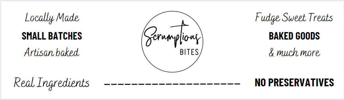
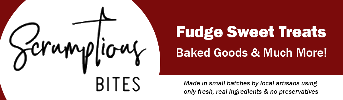
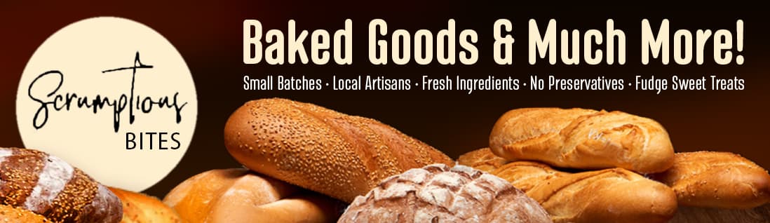
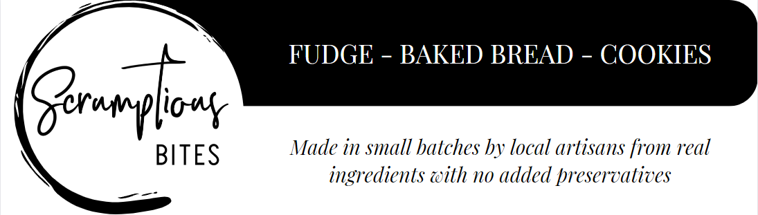
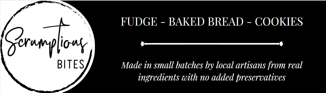
Good photos, perhaps of you actually baking are hugely helpful. The typography you choose is absolutely paramount. More than you’d ever imagine. It is the tone of voice of the words you say (not that I am one to talk about tone of voice at the moment!).

That why I suggested finding a good designer to help. It will elevate your customers’s perception of who you are and what you do.

Once again, my apologies if I came across to brusque, but I hope you can now see what I meant.

By the way, burgundy may not be the best colour for a baking business. It may, but that’s why I’d suggest you need to speak to a good designer who will be able to get a good understanding of your business and represent it visually.

Good luck

Too many words
No focus (heirarchy is important.)
The thin line font logo cannot compete with so many other words even though it is dead center on the banner. Lose the outer circle and make it larger (sounds like a cliche, but in this case it simply cannot overpower the bold type that draws attention away. It can’t even compete with that dashed line directly under it.

2 Likes

Well, you didn’t say that, and, even if you had, “mockup” is a term that means different things when context varies; it wouldn’t have made any difference in my reaction.

I wasn’t referring to color. I meant it is monotone in perceived voice; all the same in terms of impact; no visual anchor; nothing to grab attention; no clear reading order; “no focal point; no hierarchy”.

You’re incorrect. Reconsider.

No, but considering the logo already brings two poorly-paired fonts with it, neither of which is useful anywhere else, a third will be needed. A fourth will just turn it into scattered debris.

Furthermore, the logo is crippled by the close-fit circle. Losing that circle would really open up the layout options. If you’re stuck with it, either make the logo a focal point (large on the left, first in the reading order, with some assumption the market already recognizes it), or relegate it to the bottom-right corner and make those “features” the stand-out element, all in one font.

I’m not saying you should do this, or even that it’s any good, but I wanted to offer a quick and dirty example of how, with a few minutes of thought realignment, you could change the approach:

2 Likes

Thanks for the comments and the example, but my friend has literally given me a detailed sketchup of what she would like and my design mirrors it because I didn’t know if she would approve of something else.

There is only one way to learn something, I’m not just going to give up in the starting stages. And by budding designer I meant myself, Sprout was obviously right in most of what he said. My main problem is that my banner mirrors exactly what my friend sketched up for me on paper. Should I try to make it look nice as it is or not follow what my friend exactly wants and do something different?

We’ve already discussed pictures and she’s decided not on them. Thanks for the other tips though. And like I said in other replies she’s given me a detailed sketch up that I have mirrored digitally. Can I change it totally to make it look better or stick to what she has drawn?

That’s a conversation you need to have with them. However, I’ve lost count of the times clients have come to me with a fixed idea of what they think they want, but that simply won’t work.

Part of the designers job is sometimes to help the client see this. The designer, though, has to have the ability to be able to solve the problem and present a better solution that will do the job they need it to do. This takes time, education, knowledge and experience. You have to understand a bit of psychology, human behaviour, as well as to then know how to interpret this visually.

Out of interest, what stage are you at? Are you studying at university – or planning to?

1 Like

I erroneously assumed you were the owner and not a budding designer who wanted to learn and develop your skills.

Your friend is making design decisions under a common false impression. She apparently thinks persuasive words are enough to persuade people. That’s not how it works in advertising because people aren’t quite that logical.

First, it’s important to catch people’s attention in ways that elicit an immediate positive emotional response. It’s only after the potential customers are emotionally engaged that their thinking brains kick in to determine whether their subconscious impressions were correct. People aren’t all that different from Pavlov’s dog, but instead of the dog salivating, you want the bread banner to make potential customers’ mouths water.

It’s only after clearing that first emotional hurdle that they’ll pay attention in an analytical, thinking sort of way. When you skip over that first critical step of grabbing someone’s emotional attention and move directly into the second step, you’ve lost the sale before you’ve even had the chance to make the sales pitch clincher about the fresh ingredients and small batches being baked by local artisans using fresh ingredients.

Like HotButton did, here’s an example. I don’t know anything about what baked goods are being sold, what the client will insist upon, or anything else about the store, venue, customers, or competition, which are all important. I also have no idea what “real ingredients” are or what “Fudge Sweet Treats” could be. Even so, I quickly put together the following to show you an example of what I’m talking about — it’s not intended in any way as a solution to your problem.

If it were me, I’d try to gently persuade your friend to let me show her some of my ideas. Clients usually say “yes”, but when they say “no” or reluctantly agree, I usually turn down the job. Clients with their minds already made up are looking to rent a pair of hands to implement their ideas — they’re not looking for a designer.

1 Like

Thanks Sprout, I am in my first year of a bachelor of Design.

Thanks Just-B, I’m sure she will understand. We both are only teenagers. Both your and Hot buttons designs make a lot of sense and Im going to attempt to actually design the banner now. Thanks again for all your help guys.

Good to see you are going about it the right way and not one of the growing army of those educated at the University of YouTube.

When you’ve done, please post it here. I’d be interested to see what you come up with.

1 Like

Am I on the right track with any of these? I know one of them looks a lot like HotButton’s design, but I will change it if I do choose that layout. I still don’t really like the sharp edge contrast between the black and the white but I am trying to find a way to make it look better.


Think application. Stand 10-20 metres away. How legible would it be? Compare that to Just-B’s, which both, comfortably ticks that box and tells a story.

The examples you have put up, I’m afraid to say, have more of a Dracula-esque Victorian horror vibe than they do artisan, craft baking.

That logo still isn’t working, for me either. It doesn’t feel all that ‘scrumptious’.

Sorry to be so negative, but I think you need to think about the typefaces you are choosing and the job they have to do.

Hope this helps and isn’t too deflating.

1 Like

Fudge-Baked Bread-Cookies in that particular font looks very stern and demanding.
Can’t read the serifed Italic type either. Certainly not at a distance.

A market booth is like a tradeshow booth. You gotta make them want to stop and visit. Once you hook em, you can pile on the small type inside the booth, like on a menu board or similar.