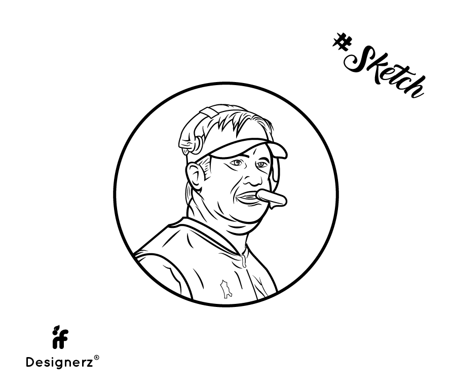
Hello Buddies ! Critics are welcomed !
Here’s a mascot’s sketch that I did recently for one of my client.
Hello Buddies ! Critics are welcomed !
Here’s a mascot’s sketch that I did recently for one of my client.
I’ve never eaten a Twinkie before but he kinda looks like he’s about to enjoy a Twinkie.
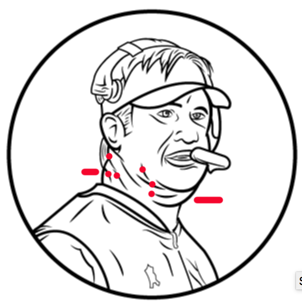
Did you sketch on top of a photo? I feel like there are a lot of unflattering lines around the head, especially the neck and chin area. Sometimes the lines we don’t draw are as important as the lines that are drawn.
I love your style of critiquing.. Awesome !!
Yes I sketched it at the top of the photo.. Can I know which lines around the head aren’t working.. I mean there’s a headphone around the head.. I think it will be more clear when colored..
Try removing the lines with dots and revisiting the ones pointed to by a line. I really like the way you’ve use line weight. Not a lot of people get that when illustrating with software. Watch the line weight around the mouth. You usually don’t want to outline lips completely or they look a little rubbery. Just the undersides.
You might want to also revisit that emblem(?) on his chest. Did you per chance reverse the photo? Usually an emblem is on the left chest.
Nice work!
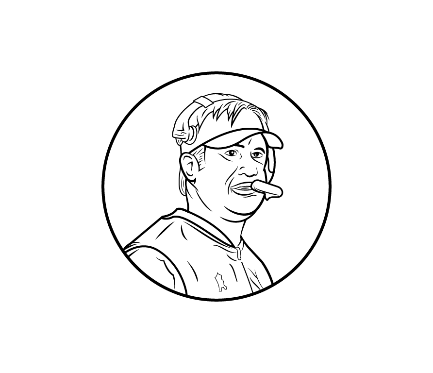
Jay Gruden?
If that’s Jay Gruden, his likeness isn’t “mascot” material.
Thanks ![]()
Yes, I believe so..