Looking for some critique on both these menu board designs.
These are just some examples that we’d like to show to potential customers.
Are these your design?
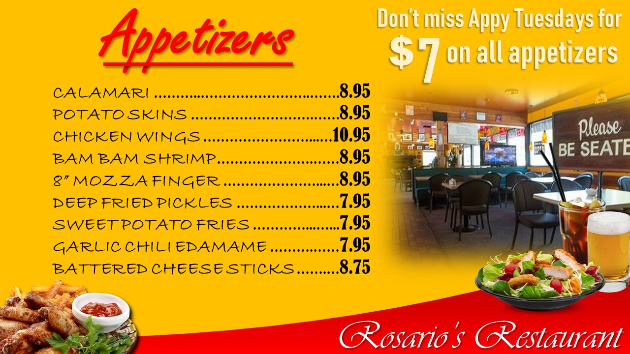
Why would you consider a menu board showing a photo of the inside of the restaurant to people who are already inside the restaurant?
4 Likes
You need to have a really good reason to chop off words. It isn’t “edgy,” it looks like a mistake.
“Please be Seate” and “Restauia”
Oh, that’s an r not an i?
Yes these are my designs.
The word restaurant is going to be the actual restaurants name, which is shorter, so it will be more visible.
The picture of the restaurant will be swapped out with something that makes more sense.
Well, in that case, spellcheck is your best friend.
It’s difficult to answer your question since how well they function depends so much on the context of how and where they will be used, which we don’t know.
The most important thing to consider is how well they might function, as in are they easy to read and do they give customers enough information to make good choices. After that comes how nice or how professional they might look and how well they match the look and atmosphere of the restaurant.
With that out of the way, they’re all different styles, since I’m assuming that’s what you’re after. You didn’t come right out and say it, but I’m assuming you’re designing these menu boards as mock-ups to propose to various restaurants.
They’re all nice-looking and could work in the right situation.
The first one looks like the kind of thing that might be seen in a small, independently owned roadside restaurant. Whether or not that’s good or bad, I don’t know. I guess it depends on the situation. It is legible and readable, though.
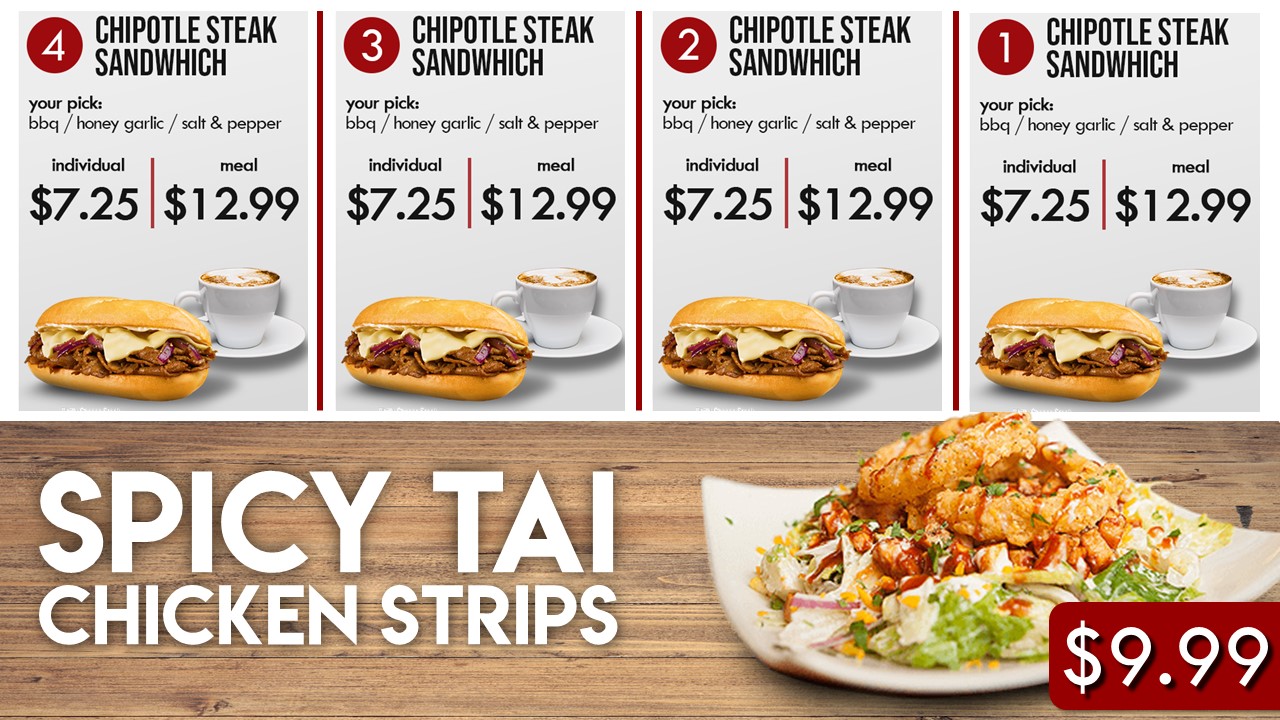
The second group looks more like something seen on the behind-the-counter displays at a fast food chain. Again, I’m not saying that’s good or bad, but depends on whether or not that look is appropriate to the restaurant. I would be concerned, however, about the smallness of some of the typography. Depending on distance from the customers, the small type might be hard to read. They look very professional, though.
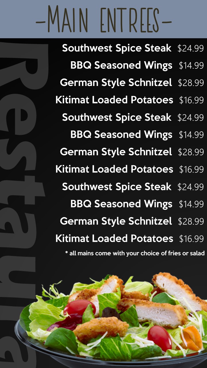
The third one is a bit quirkier and looks like something that might be appropriate for a more trendy, hip, smallish corner restaurant catering to a younger, image-conscious clientele. The typography is small, a little awkward and might be difficult to read (especially the prices). I probably wouldn’t be inclined to combine the three typefaces you’ve used — they don’t work all that well together. The sideways type creates an interesting look, but it needs to actually say something meaningful, like “Menu,” You mentioned placing the name of the establishment there, which might work too, but seems a little odd. Black is an unusual color to be paired with food, but like I said, it might work for a quirky, in, cool place that was trying to be different. I like the brightness of the salad and how it stands out against the background — sort of makes me hungry just looking at it (then again, it’s close to lunch time for me).
If these are proposals, you might want to check your spelling, as noted above by Eriskay.
Typos are deal killers in portfolio pieces. Typos in resumes get you binned automatically.
I don’t know about flyer menus, but I believe posted menu boards in restaurants now have to include calorie counts per some law or other.
(ah, looked it up. They do if they are part of a chain of 20 or more establishments.)
Sandwich*
Thai*
The one in the centre is the only one that looks like it’s on track. I wouldn’t show the first or third design to the client unless I wanted them to reject them and pick the second. That said, I wouldn’t present those 3 with the fear of the client picking the first design.
Make sure the font is clear. The hand drawn font is difficult to read. Also, I wouldn’t recommend “Don’t miss Appy Tues…” being on the menu board. If that ever changes the whole graphic wouldn’t need to be replaced. Also, that seems to be something that can be placed on a tent card on the tables, or a window cling.
I know clients like to see pictures on everything, I’d try to argue not to have any images except for related food items. as in the second example. Again, if a menu item changes, and is no longer served, then the graphic (in a perfect world) would need to be replaced.
Having worked in the sign business for some time, and creating/installing some menu boards. I know how difficult it can be to sell an independent owner a clean and clear design. I don’t know if you consulted with them about the frequency of price changes, item changes, or if these are digital menu boards or plexi/acrylic. That would all play a factor with how the design should function or look.
These all are looks good, As menu for a restaurant all design can be use. Second one is looks good to me than other two.
I counted 11 fonts.