Thanks Steve_O.
“Chaos” is perfect. I see it as the same. Dynamism. But I don’t want readers thinking it’s crashing. I just see it as cutting through the clouds. But some writers in another forum mentioned the crashing too.
Thanks Steve_O.
“Chaos” is perfect. I see it as the same. Dynamism. But I don’t want readers thinking it’s crashing. I just see it as cutting through the clouds. But some writers in another forum mentioned the crashing too.
This might demonstrate the result when this happens:
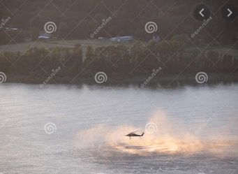
Model makers sell military aircraft. On the box covers there will be paintings of the models they’re selling. My question is, how did that happen? Somehow they must have this legal matter resolved – either that, or it doesn’t need resolving.
Your book is titled, Navy Seal Everglades Rescue, and shows a helicopter seemingly floundering as it crashes into water in the Everglades. In other words, your title implies a big problem where rescuers are needed, and the illustration picks up on that with an image of a violent crash into the water.
Or so it seemed, at least to me. But now you’re saying it’s not crashing at all; it’s just cutting through some clouds. The trouble is that it looks like a chaotic crash, not a helicopter flying through misty clouds. My best guess is that readers of your book will be expecting a helicopter crash.
On another note, does the U.S. Coast Guard have Navy Seals? I’m sure you’ve done your research, but I was under the impression the Coast Guard had its own version of Navy Seals called the Maritime Security Response Team (had to look up the exact wording). I really know very little about this, though, so I’m mostly just wondering.
Thanks Eriskay. This could work.
Yep.
That’s what I was trying to figure out. I figured somebody in the forum might know.
Thanks B. I hear you about the crash factor. I don’t see it but other people besides you have said the same. I’ll go back to the drawing board. AFAIK there are no SEALs in the Coast Guard. They’re strictly Navy. But SEALs more often than not use helicopters from the other Armed forces. For whatever reason, they don’t seem thrilled with Navy helicopters.
I think this is your best cover yet.
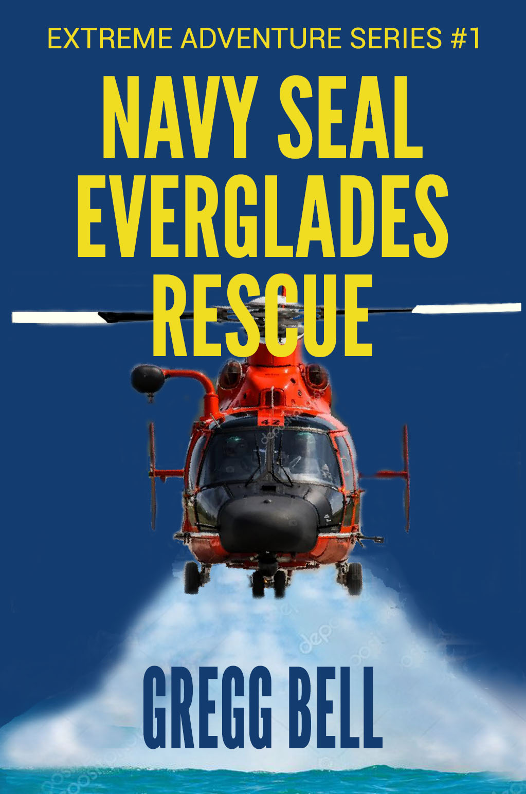
It appears as though you’ve horizontally compressed your name. This gives the typography a distorted look, with the vertical strokes being narrower than the horizontal strokes. I’ll suggest not doing that. If that makes your name too big or too wide for the space, just make it a little smaller.
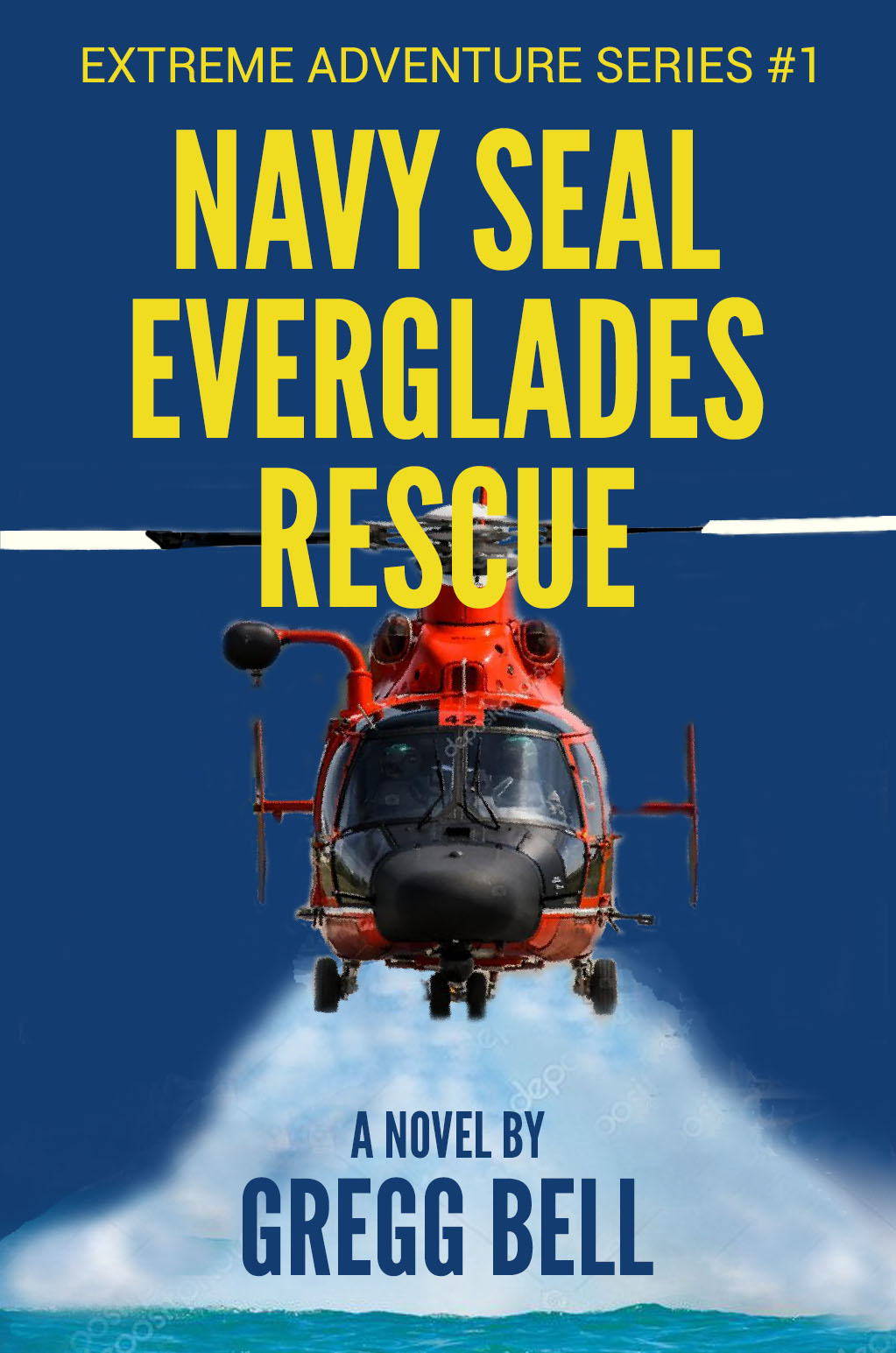
Another suggestion might be to include in small words, A NOVEL BY, above your name. Given the realistic photo and the book title, it might come across to some as a non-fiction story about a rescue.
Are you experimenting with stock photos to see what effect you can achieve? I only ask because I see watermarks all over it.
![]()
I do prefer the set up on this one however … as Just B mentioned I think it’s the best looking I’ve seen so far.
Thanks Kat. Yes, just experimenting. Will buy the actual photos when I’m confident it works. And thanks for the encouragement.
Yes, the front-facing images does bypass a lot of potential problems. It is good that you took @Just-B’s advice on the author name. This is the best looking cover yet.
Thanks Eriskay
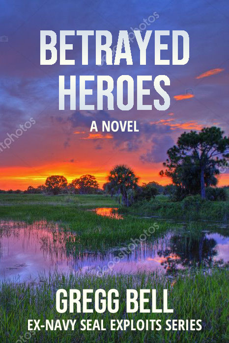
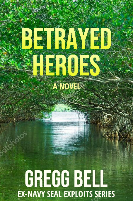
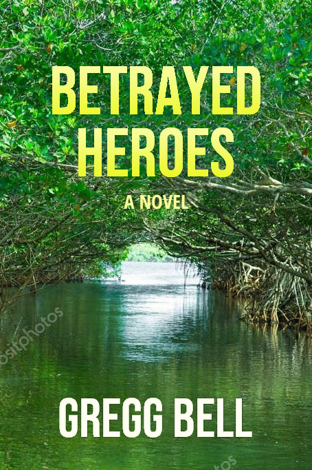
I headed in a different direction. Same book. Different title. Different covers. Any feedback is welcome. Thanks.
Much better. I would say, you could take the title size up a and the author name down. They tsill fight for attention. Unless the author is Frederick Forsyth, et al, then the book title should have much more prominence.
It’s looking good! But it’ll be better if you try some other font.
Thanks, sprout, but writer friends are telling me it doesn’t look like a thriller. I think I’m going back to the drawing board.
Thanks amitbassi. I think I’m needing to start over though as several writer friends have said the cover doesn’t look like a thriller.
The font on these last three was Bebas Neue. Can you suggest some better fonts?
I agree. It looks more like a book about a lazy day floating through the wetlands. If the book is a thriller, some drama and tension are warranted.