It’s a serious thriller with a fair amount of humor. It is not a super detailed, super authentic account like an actual Navy SEAL would write. It’s a military thriller/adventure hybrid. Thanks.
1 Like
So, I know in the past you’ve posted other book covers like this one.
Is there a reason for the departure in style? Or is this a separate series that you’re trying to differentiate from the others?
Hi Craig. Thanks. Yes, I am definitely trying for a nearly clean break from the first series. What’s happened is that with each book the characters have gotten less zany and the writing descriptions have gotten more realistic.
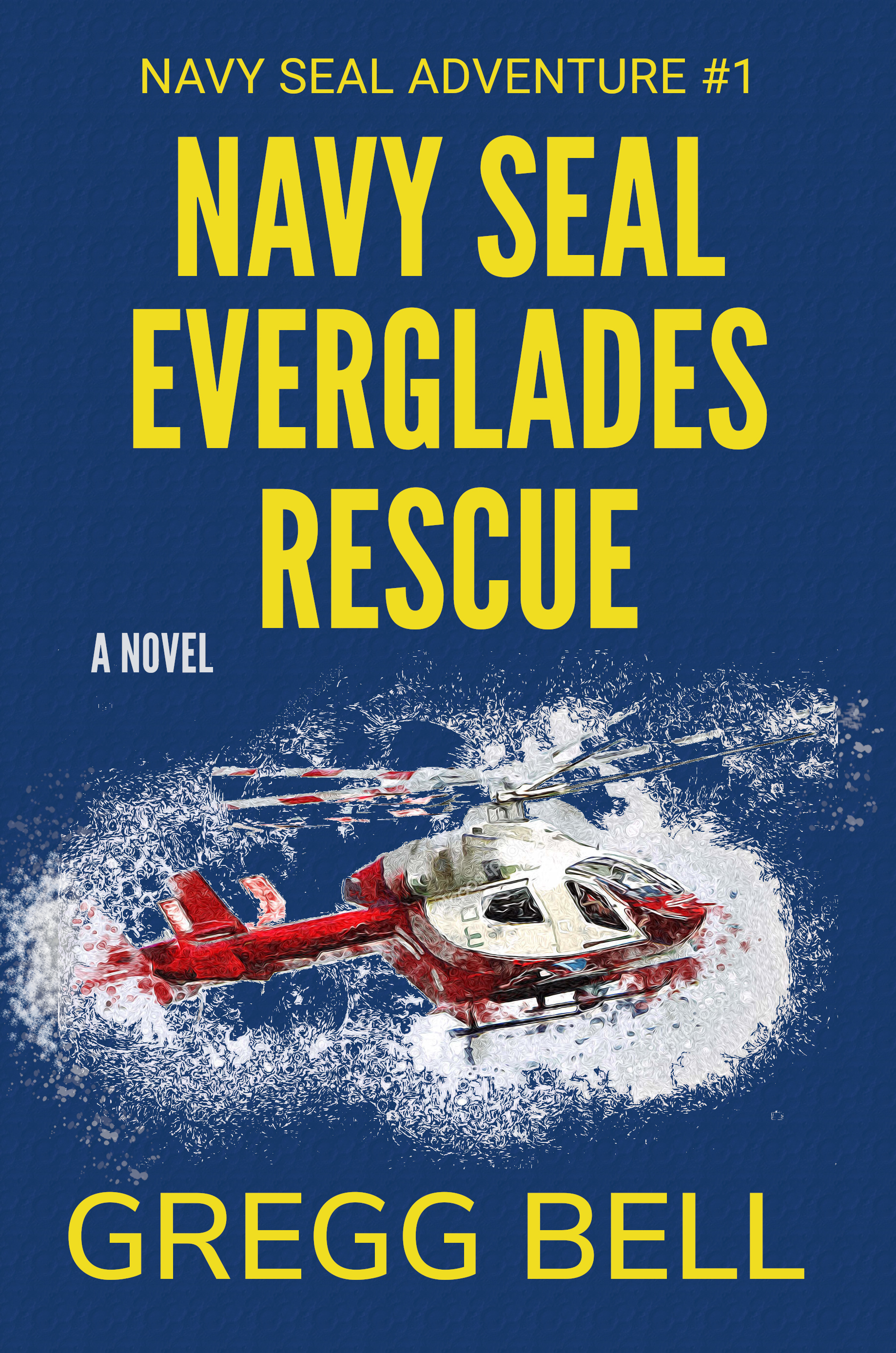
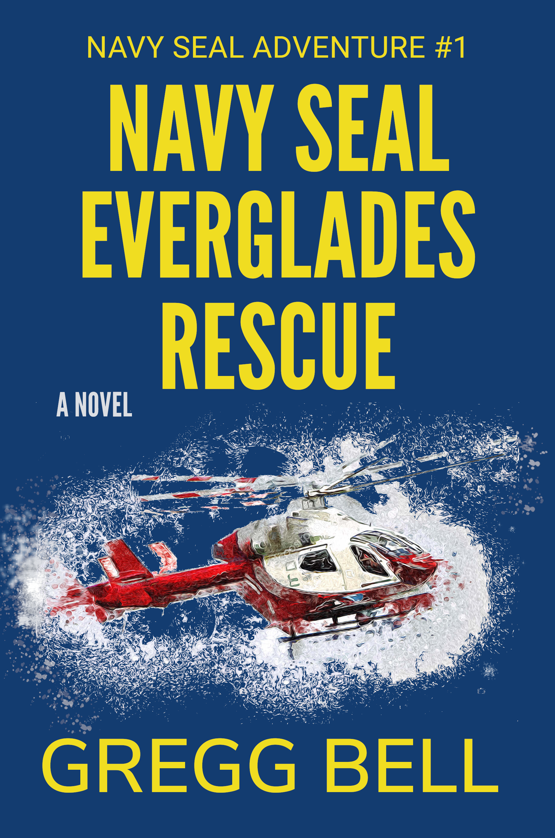
Is the helicopter shown on the cover a helicopter that the Navy Seals are rescuing? I ask because it doesn’t look like a military helicopter.
The author name does not appear to be set in the same font family as the rest of the type. I’d change that. Mixing sans serif fonts is tough to do, and this isn’t working.
“A NOVEL” looks like a tacked on afterthought.
I’d take a look at enlarging the white texture so that it overlaps RESCUE or goes behind RESCUE to help tie the type and graphic together.
To be honest, for starters, I think the scale and relationship between type and image is all out. They fight each other, rather than support each other.
The type just looks plonked on to fill a space. The font is cold and pretty characterless. Not a fault of the font. There is a place for dispassionate typography. Trying to evoke the sense of a novel is not it. It just looks like you’ve gone to the font menu and gone to the first font that comes with your computer and made a ‘that’ll do’ choice. I have no idea what the tenor of the story is – apart from the fact navy seals are rescuing something in the Everglades.
Speaking of the title; this one does not exactly want to make me open the book. There is no energy, no passion. The impression I get from this is if the author can’t come up with an engaging title, what is the rest of the book going to be like? I know this is a bit off-topic, from what you are asking about, but it is all about getting people to want to read the book. Design and title should work together, in the same way image and type should. They need to support each other.
Would you ever have opened a book called, ‘Boy in workhouse wants more gruel – a novel’ or ‘Prison camp escape – a novel’. The fact the author has to qualify what it is so you don’t confuse it for a non-fiction title speaks volumes.
The design, I am afraid has the same lack-lustre, unimaginative approach.
Regarding the image itself; I would also suggest not just running a roughly cut out image through a strong photoshop filter. It tends to look like you haven’t cut something out very well and just run it through a very strong photoshop filter to disguise the fact. It doesn’t.
Apologies for the assassination, but the point of a Crit is hopefully to improve the product and help it do its job. Currently everything about this says, ’self-published, tediously, uninspiring book’. I guess that’s not really the impression you are wanting people to get from this.
It may or may not be the best novel ever written, but the cover says the exact opposite.
I am assuming you are the author and designing your own cover. If so, my suggestion would be to get a good designer to do a cover. Book cover design is a very specialist area. You cannot imagine how much a cover influences the sales of a book. They can live or die for the want of a good cover. That said, the book has to back up a well-designed cover.
Probably not what you want to hear, but please know I am not trying to crucify you, but I am trying to be as honest as I can to help you do what I imagine you want to do; sell your books.
Thanks a lot, Steve. The helicopter in the story is Coast Guard and those are usually orange and white. This was as close as I could come to that. I will make the author name the same font as the title and see what I can do with the white texture so that it goes under or over RESCUE and post back. Any suggestions for what to do with “A NOVEL”?
Just because one has Photoshop does not mean one can use the filters wantonly.
Thanks for the feedback
as close as I could come to that just won’t cut it. At least a U.S. Coast Guard helicopter should have the USAF roundel and the wording “U.S. Coast Guard” clearly displayed on both sides of the fuselage.
With the cloudy stuff under the “RESCUE” it was just too crowded. I used a condensed version of the title font for my name. I made the chopper orange and added the roundel and Coast Guard name.
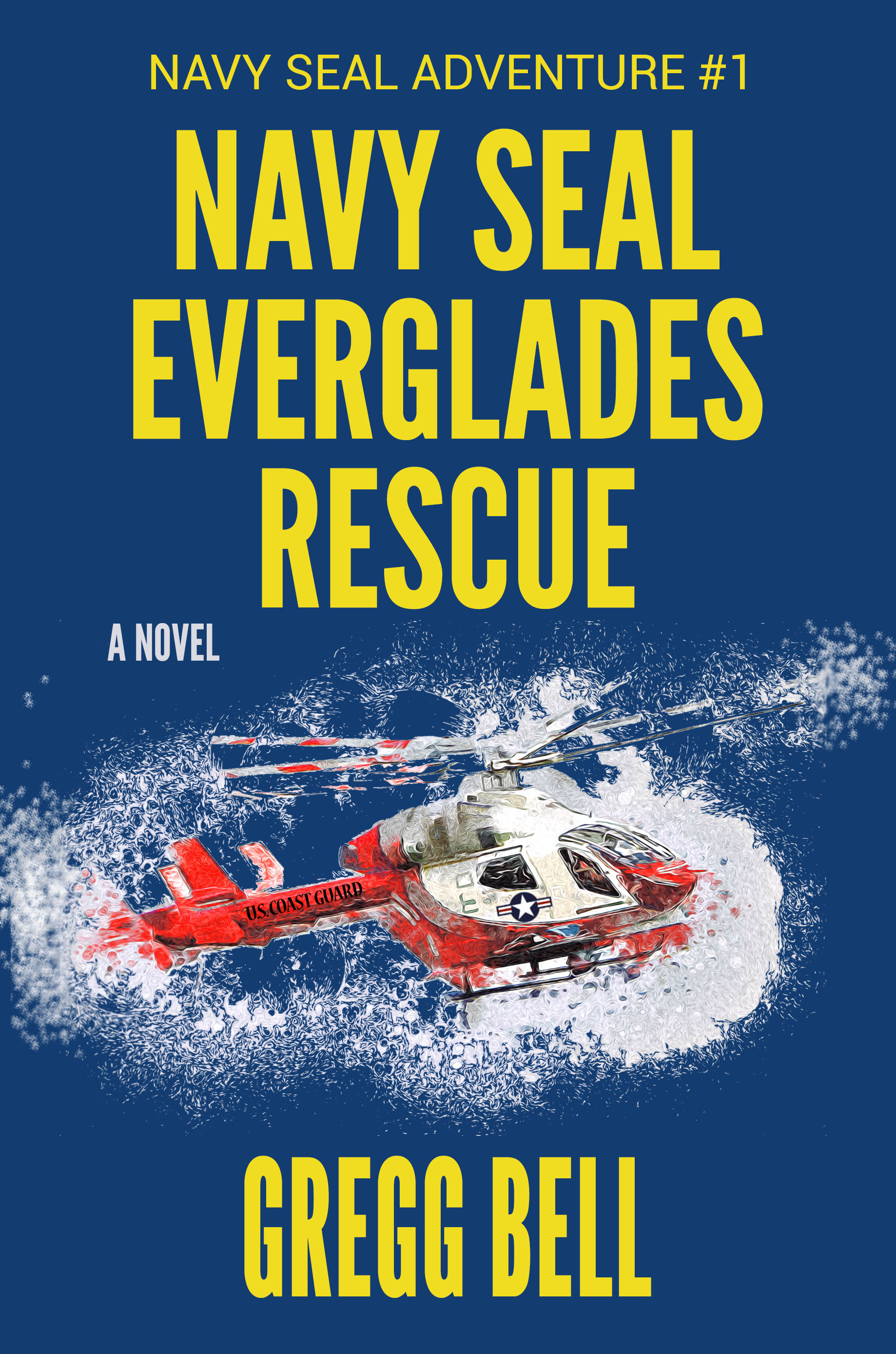
You may not know it, but the official typeface for markings on the sides of the Coast Guard’s craft (sea or air) is Helvetica.
I don’t think the author’s name has to be the exact font as the title – actually, I don’t think it should be – but it should be in the same font family. Also, isn’t that the USAF logo on the door?
sprout made a good observation about the proportion of the type to the image. They have a similar visual weight. I think one should be dominant.
The roundel is actually the United States military aircraft national insignia. It applies to the U.S. Navy, Air Force, Army, Marine Corps, and the U.S. Coast Guard certainly qualify for that too.
File that in the “learn something new every day” category. Thanks.
I built plastic model kits when I was a kid, so military hardware nerdy stuff quite naturally became a hobby of mine,
1 Like
@Eriskay. Thanks for the Helvetica catch. And do you happen to know if I’ll actually need to get permission to use that roundel? It’s in the public domain but it says you need permission from The Institute of Heraldry. https://commons.wikimedia.org/wiki/File:Roundel_of_the_USAF.svg And I’ve shown this cover to a bunch of writer friends and a lot of them said they were confused by the white around the helicopter. Do you see a problem with the white?
@Steve_O Thanks. I will pay closer attention to that image/text proportion, but I’ll ask you the same thing I asked Eriskay.
I’ve shown this cover to a bunch of writer friends and a lot of them said they were confused by the white around the helicopter. Do you see a problem with the white?
I’m from Canada, so I am not in a position to provide you with anything with finality regarding this. Did all the model kit box cover illustrations require permission? … or, do you have to stick to this for your cover?
As for the white stuff: I have no idea what it was without any kind of reference. I hope it’s not one of those “Because I can” rationale. If that does not tell a story, perhaps it should not be there.
I don’t necessarily love it, but I read it as either representing chaos or a water crash.
Thanks, Eriskay, but I’m not sure what you’re asking. The image has nothing to do with model kits.
No
No, it tells a story. In the book a Coast Guard chopper hovers very near the water. It is not part of the rescue though. The chopper is pursuing the rescuer-protagonists. Certainly, readers will recognize the cover image when they get to that scene. I would think the white stuff would be clouds or even water perhaps somehow splashing up from hovering so close to the surface.