First of all I’m new in this field, I’m not expecting any positive feedback thus I’m hoping that you could enlighten me of my mistakes and maybe a little tips to make this logo a lot better. Thank you so much everyone!
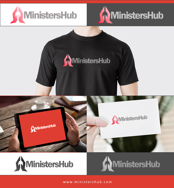
I like the praying hand idea, but the corners are too sharp and for me it looks like Sauron’s Eye :x which is kind of Ironic for a Christian community..
I would round those corners, and try to include the musical aspect into it. Maybe with negative space.
It looks too corporate in my opinion, maybe a thiner, more organic font would improve the idea of community.
I saw the praying hands right away. After that, it looked more like a nib of a fountain pen to me. I see the church now that you point it out, but that didn’t jump out at me.
I don’t care for the gradient from red to pink (or dark pink to light pink).
There is a disconnect between the icon and the type. They aren’t working to gather that well in my opinion.
Praying hands, a church, and a cross all quickly suggest Christianity, but I’m wondering what could be done if you think outside of the cliches. There is nothing in the logo to suggest music, and music seems to be the focus of the website.
Most of my thoughts have already been expressed by others, so I won’t repeat them.
One additional thing I’d do is create more space between the hands and the words. They’re uncomfortably pushed up against each other. I’d probably increase the letter spacing just a bit too for similar reasons — the letters are piling up against each other in a way that seems a little claustrophobic.
It’s too complicated and too dependent on gratuitous effects. Keep it simple and resist the temptation to add additional decoration. One of the tenets of good design is that subtraction is typically a better choice than addition.
I do like the slightly rounded angles of the hands in your last logo, though. The sharp angularity of your first idea in the thread wasn’t as psychologically welcoming as it was threatening.
I’d try removing the thumbs, and adding a knockout of an ear bud so that the negative space in the centre actually represents something (based on the original logo you created), or at least adds another layer of relation to the communication.
This is feeling like a throwing-things-at-the-wall endeavor, and I’d say it’s going in all the wrong directions. The more organic-looking hands were better, the gradient pink and tinted thumbs have failed every time, and all-caps just brews an unfriendly tension, especially with a run-on word-mash in a tightly tracked serif. And, no matter what you do with the face weight, I can’t un-see MINISTER SHUB. A proper space and/or the apostrophe that should follow the S would help, despite the web-address conflict they’d imply.
Keep at it. I think there’s a concept that’s going somewhere, but everyone’s feedback is so true – it needs a good amount of finessing before it’s finished.
I’m in agreement with a lot of the feedback so far. The font is letting the side down and the gradient isn’t working on the praying hands. May i suggest using smallcase lettering for ministershub and unifying the colour of the hands?
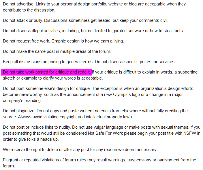
Since it was your first post, I imagine you’ll get a pass (I’m not a moderator), but what you did there is against the forum rules (screenshot follows), and it’s enforced pretty tightly.