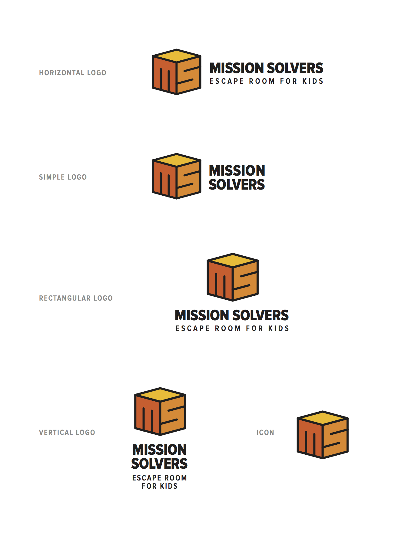
Mission Solvers is an upcoming attraction in NYC. An escape room for children.
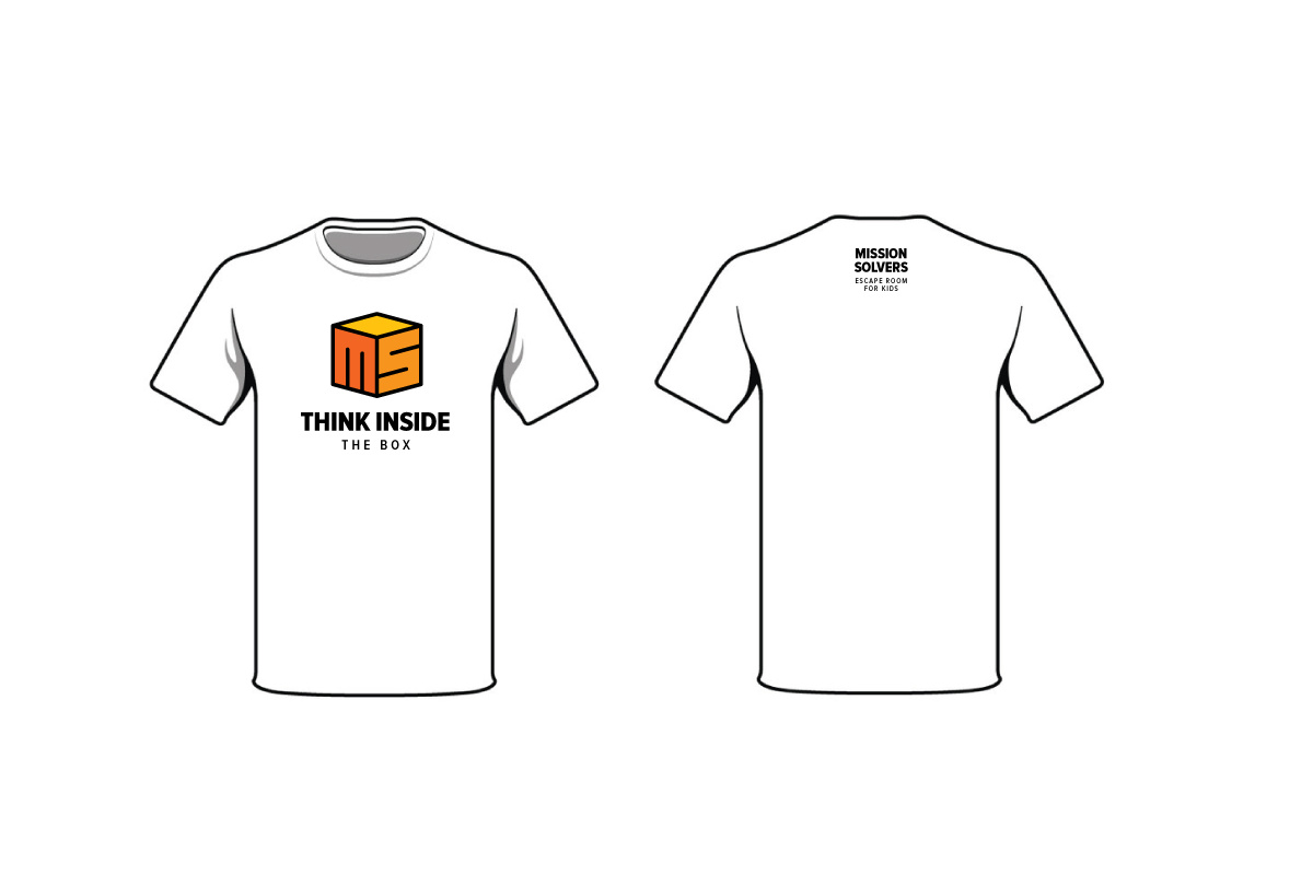
The logo is inspired by mazes, puzzle cubes, and it has ‘hidden’ (for kids) acronym of the company name: ‘MS’.
What do you think?
Mission Solvers is an upcoming attraction in NYC. An escape room for children.
The logo is inspired by mazes, puzzle cubes, and it has ‘hidden’ (for kids) acronym of the company name: ‘MS’.
What do you think?
I like it. It’s simple, friendly, suggestive of the product, a bit kid-like and seems to solve the problem nicely.
Lots of cube logos have been done over the years, though, so I might worry about something similar already being in use somewhere.
It’s very attractive. Blocks and kids are always a good combination.
Just wondering though, since it’s something to do with kids, if contrasting colours might help to make it catchier.
As much as i like it (and think it’s nicely executed), I couldn’t help having this same thought.
Also, some part of me would want to make a stronger graphical reference to the “escape” element, perhaps somehow incorporating a padlock, for example.
Multiple designers can come up with similar solutions to different design briefs. This is a very familiar shape and solution. But as far as trademarking it goes, there are other parameters involved; proximity and similar business model being two of them.
It still might be a good idea to run a trademark search on it though.
I like this just as it is. The colors are good. The contrast is good.
The full vertical logo might need a little revisiting if you really want to include the tag line. It’s starting to look like an eye chart but otherwise very nice.
Now the big question…how fast will this show up on a Google search…? Sounds like the sort of project that would have an NDA attached to it.