Hello Again, I would like to share a mockup for a lawyer.
I would like to ask you what do you think of it as an identity pack.
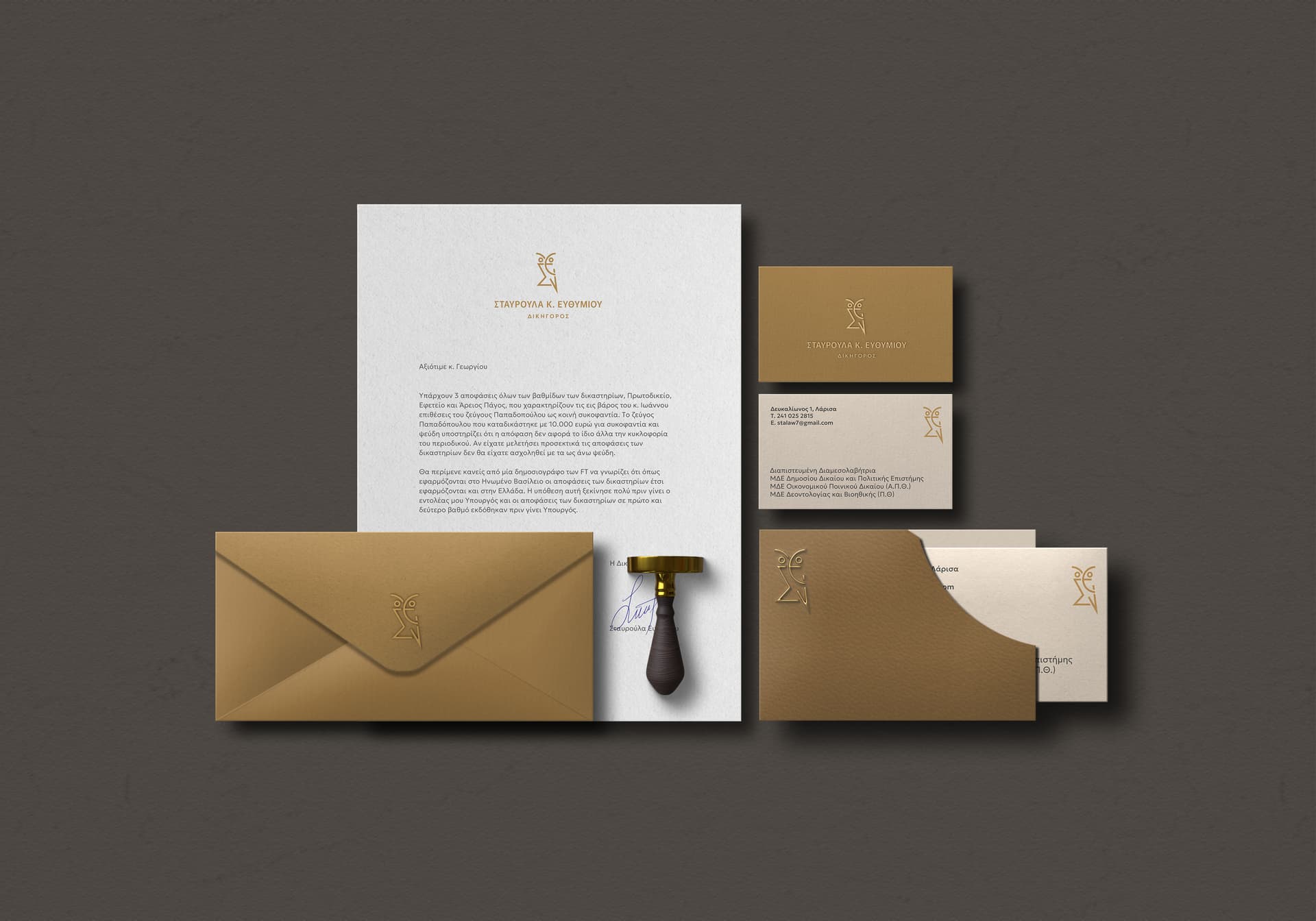
She is a lawyer, she wanted a logo with an owl as a symbol, so I combined her initials Σ + Ε (Σ is the greek S) from her name Stavroula Efthimiou (or Σταυρουλα Ευθυμιου).
This is an old project, but I want to make it proper for my portfolio (which I am currently working on).
Any thoughts about colors, layout etc would be appreciated!
1 Like
Just a quick one - the image name you shared here is called ‘stationary’ - it should be ‘stationery’ - with a e…
It doesn’t look like an owl to me if you hadn’t said Owl I would probably be still staring at it wondering what it’s supposed to be.
From my experience, lawyers/doctors etc don’t tend to have fancy stationery as they send 100s of letters per day possibly.
Business cards are handed out and discarded so spending money on them is not a priority.
Usualy cheap and cheerful - or maybe I’ve never done work for a good lawyer ![]()
Just my 2cents.
1 Like
I saw the owl right away and think it’s a great looking logo.
The logo lockup on the letterhead looks good for presentation purposes. In real life, it might be too big and too low. I say that due to the amount of real estate taken up above the area where an actual letter would go. Again, looks good for presentation purposes, so you may choose to leave it as-is.
The only other comment I’d make is the size of the logo on the envelope. I have not designed a stationery suite in years, but, when I did do them, I’d make sure the logo on the letterhead was the same size as the logo on the envelope. Is this a rule? No. Is it a nice detail that provides continuity? Yes. So I’d reduce the size of the logo on the envelope.
Ah I was zoomed in, when looking at it from a distance, I kinda get it better.
Maybe I need stronger glasses ![]()
Thank you both for your comments.
I have already reduced the logo on the envelope, good point!
Smurf2, of course my client will never materialize all these, but I need to showcase it somehow as a brand.
Let me start by saying it’s good, and not much to critique, pretty nice stuff actually, fairly standard - so I’m way past that. I’ve a habit of looking at the bigger picture, not so much what’s great about something, I could wax lyrical about that all day, so when I critique I focus on what I find in the negatives, you don’t need me telling you it’s pretty and rubbing your ego. That’s not really what critique is.
I’m not having a go at you and you’ve done nothing wrong, but just want to make a point about branding and target audience, as they go hand-in-hand.
Overall it’s good - too good, too luxuruious, too expensive for intent.
I’d expect to see this at a 5 star hotel - or luxury SPA - or something along those lines. It has that vibe moreso than a lawyer.
This isn’t for today - and you don’t have to change anything about your stationery project - it looks ACE - well done.
But going forward I just want to give my insight and hopefully you can take away from it for your next project.
Food for thought:
What are the cost implications of these designs? Will it alienate your client? Will price drive a wedge that sees you part ways, will they ever order from you or word of mouth?
What happens next when presented to the client? Say for example, can they get costs for 20,000 C5 gold evelopes with their logo embossed, or even printed on the outside lip of the evelope - that could be costly printing on that area or embossing.
To get the unit price down they might have to order 100,000 envelopes and store them. I don’t know, just surmising, just food for thought.
Practical consideration:
Have you considered this; a ‘vanilla’ manilla C5 envelope, logo is then franked into the corner when posting, might be a better option for them. That way they just have to order standard C5 envelopes. And surely they’ll have a franking machine.
Where I’m having an issue
For me I think the crux of the issue is that so many branding projects, especially in a professional context, fall into the trap of focusing too much on aesthetics and less on real-world practicality.
I think the heart of my critique is that designers need to step out of the “wow, look at what I can do” mindset and really think about how their designs will function in the client’s world. Luxury branding can be tempting, but if it’s not suited to the client’s needs, it becomes more of a vanity project than a practical solution. It’s a fine line, but one that’s crucial for long-term success and a solid client relationship.
The key takeaway here is that branding should serve the client’s business goals while respecting their practical constraints. It’s about giving them something that feels elevated but isn’t unnecessarily expensive or over-engineered for their needs.
And it’s probably fair to say it’s ‘over-engineered’.
In the old days, I would print out 3 - 5 logo samples, use spray mount or hot wax to mount them to black presentation boards and present to the clients in a face-to-face meeting. Clients were generally happy and a frequent comment was, “I don’t know how I’m going to pick which one to go with.”
Logo design morphed into corporate identity which morphed into branding.
These days, clients seem to expect to see something like what @Stefanos1984 has presented — even if they don’t know they expect it. I haven’t tried this out, so it’s only conjecture on my part, but I’d bet you could take a fantastic logo, print it out, mount it to a black presentation board and show it to a client next to a mediocre logo presented in a slick branding mockup and that the clients would go for the mediocre logo in the slick presentation.
What I typically do these days when presenting a logo is to show the logo by itself on the first slide then have two or three slides showing mockups of the logo in use. The mockups always get more “oohs” and “aahs” than when I just show the logo by itself. I can’t blame clients. It is more fun to see a logo in use than simply on a white background.
The difference between a seasoned pro and an amateur, or one of the differences, is that the work of the seasoned pro will still hold weight, be presentable, and work in the real world when it’s separated from the mockup.
I do agree and understand all these you and smurf said.
What I wanted to do is to make a luxury brand, to get the “oohs” to catch potential client’s eyes.
As I said this is an old project, the client wanted only a logo and a business card (fun fact we made it with emboss and gold foil) and she was really excited with the outcome, so case closed.
Now I found some time to “explore” some mockups I purchased in order to set up my portfolio.
I do know that this might be superfluous, but I want to “sell” myself. So why not.
The mockup is luxurious by itself actually, so went a bit further to match the presentation.
But you are both right.
I like it. Very nice. Most clients don’t appreciate quality stationery anymore, but it’s appropriate for an attorney who wants to make an impression.
I also like the logo. I immediately saw the owl before reading what you wrote and knew it was made from Greek letters.
Nice color scheme. What paper stock will you be using? It looks like you’ll be embossing the logo on some of the pieces. How will you be printing the gold-colored logo on the letterhead? Is it foil or spot color?
The envelope doesn’t have a return address. Does the address appear on the front?
I don’t understand the business cards. The back is a different color from the front. Also, the back is embossed, which will show through on the front. I’m apparently confused about something. What is it?
I agree with @Steve_O that the logo on the envelope and letterhead should be the same size for the sake of continuity. Like him, I always made them the same size.
What is the stamp? Is it a notary stamp?
As I said, I really like what you’ve done. I used to design lots of stationery years ago, but everyone seems to only want PDFs to run out of their laser printers nowadays. High-quality executive stationery is a rarity, but a lawyer needs exactly that. They can always go the laser printer route for their run-of-the-mill, day-to-day needs and use PDFs for emailed correspondence.
Thank you!
As I mentioned before the setup is a mockup I purchased (it had some placeholder design on it). So the stamp is an asset I can’t remove, but gives some character to the composition. All freelancers here in Greece are obliged to have stamps (Business name, owner, Tax Identification Number, address).
The letterhead is just a spot color, close to the gold. But it’s not foiled.
The return address and the rest of info (phone, mail, etc) supposedly are on the other site of the envelope.
The business card has a dark sides with the logo embossed (to keep the continuity with the envelope) and the other side with the has the other side has this beige color so the info can be black and more easy to read. (That was my thought doing so). About the emboss not shown on the other side, is because it’s two cards glued together. I am not an English native speaker to know the exact term.
It’s usually called duplexing here in the US, but it’s expensive, and not many printers have experience doing it.
Oh thanks for the info!