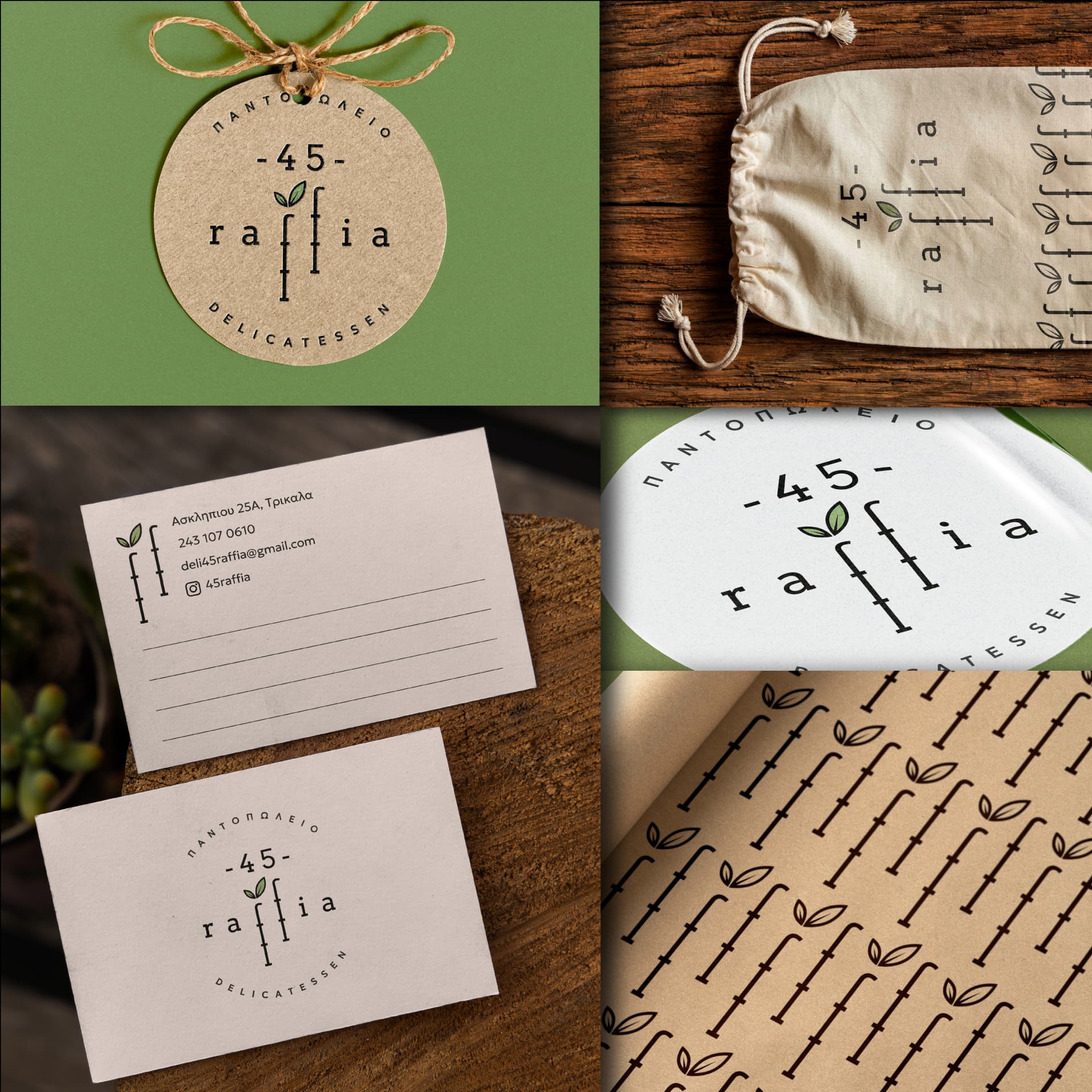
My second work I want to present in my portfolio is a small grocery/vegan (but not exclusevely) /delicatessen shop.
The brand name is 45 raffia (raffia/ ραφια in greek mean shelves, the store has exactly 45 shelves)
Again, is an old project, but now I try to present it in my portfolio.
What do you think? Any recomendations?
1 Like
Visually, it looks nice. It’s warm, organic, and friendly. I like the negative baseline shift on the f. Would it read faster if the two f characters didn’t have shelves? Maybe.
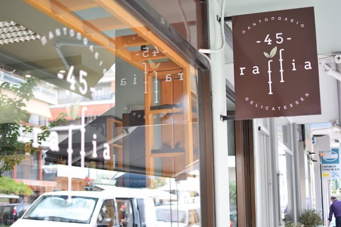
My real question is this. How will this work when someone is driving by or walking by? For a brick and mortar retail client, you need to think about signage. How will the branding work as channel letters, as a blade sign or as a monument sign?
The actual sign is this (real photo) . I didn’t like it much so I skipped it. (The client did it without my advice)
So you suggest to put this, or another sign on the pic? as a part of the mockup collage?
I would suggest you include a signage image as part of the mockup, yes. That particular image? Probably not. You could Photoshop the sign to whatever you think would be best. The problem I have is that all of the reflections in the window are very distracting to my eye. Maybe shoot it later in the day so the brightness of the light inside is the same as or a little brighter than the light outside.
I’ve found that a physical location shot, like the sign, lends credence to a portfolio piece. The design becomes more real and less abstract to the viewer. It’s a psychological thing, I suppose.
As for the distracting reflections, well, yeah, they’re there. Still, you’re not trying to draw attention to the inside of the store, and the busy reflections push one’s attention to the relative calmness of the sign, which is probably what you want anyway.
If you’re dissatisfied with the sign’s design, Photoshop what you like better onto it, as @Steve_O suggested — just be sure it’s indistinguishable from reality instead of looking like a mockup.
The presentation is nice in your portfolio - looks good.
One thing to consider is if the medalion is a mockup then you should have aligned your text to be inside where the punch hole is.
I think the greek letter ‘n’ is obliterated by the hole punch, it looks like it.
I’d include the photo in the portfolio - it’s still your design. You can’t stop clients making bad decisions.
The amount of advice I’ve given clients in 25+ years could fill the Library of Congress ten times over, they always know better.
If a question pops up, say it’s what the client went for after the asset handover.
Thank you all for your replies.
As for the missing letter in the medalion/tag is the letter “Π” (Pi , or P in English).
It’s a mockup of course, I tried to make logo smaller so the letter would be visible but it didn’ look good.
Another take was to rotate the logo 90 degrees maybe I’ll try it.
As for the sign, unfortunately this is a project away from my city, so I have to travell there to take a pic.
Or ask my client to take a pic for me maybe.
A more general question: Is it bad to include in my portfolio assets that have never been materilalized?
I mean for an existing business. Why is it bad to make a totally different sign (a round one for example)? I can say it was my suggestion, but the client went for a different option by himself.