Hi
I have taken a personal challenge of designing monochrome posters every day and posting them on my Instagram page. So far I have designed 3 posters and I want some critique so I can improve.
Anything will be helpful!!
Hi
I have taken a personal challenge of designing monochrome posters every day and posting them on my Instagram page. So far I have designed 3 posters and I want some critique so I can improve.
Anything will be helpful!!
A poster is typically meant to convey some kind of information or to advertise something. Yours seem to do neither. Instead, they come across mostly as experiments with composition and aesthetics. As such, they’re difficult to critique as graphic design since their functions are ambiguous — leaving little for someone to say other than subjective opinions.
Overall, I like the look of these. Good work.
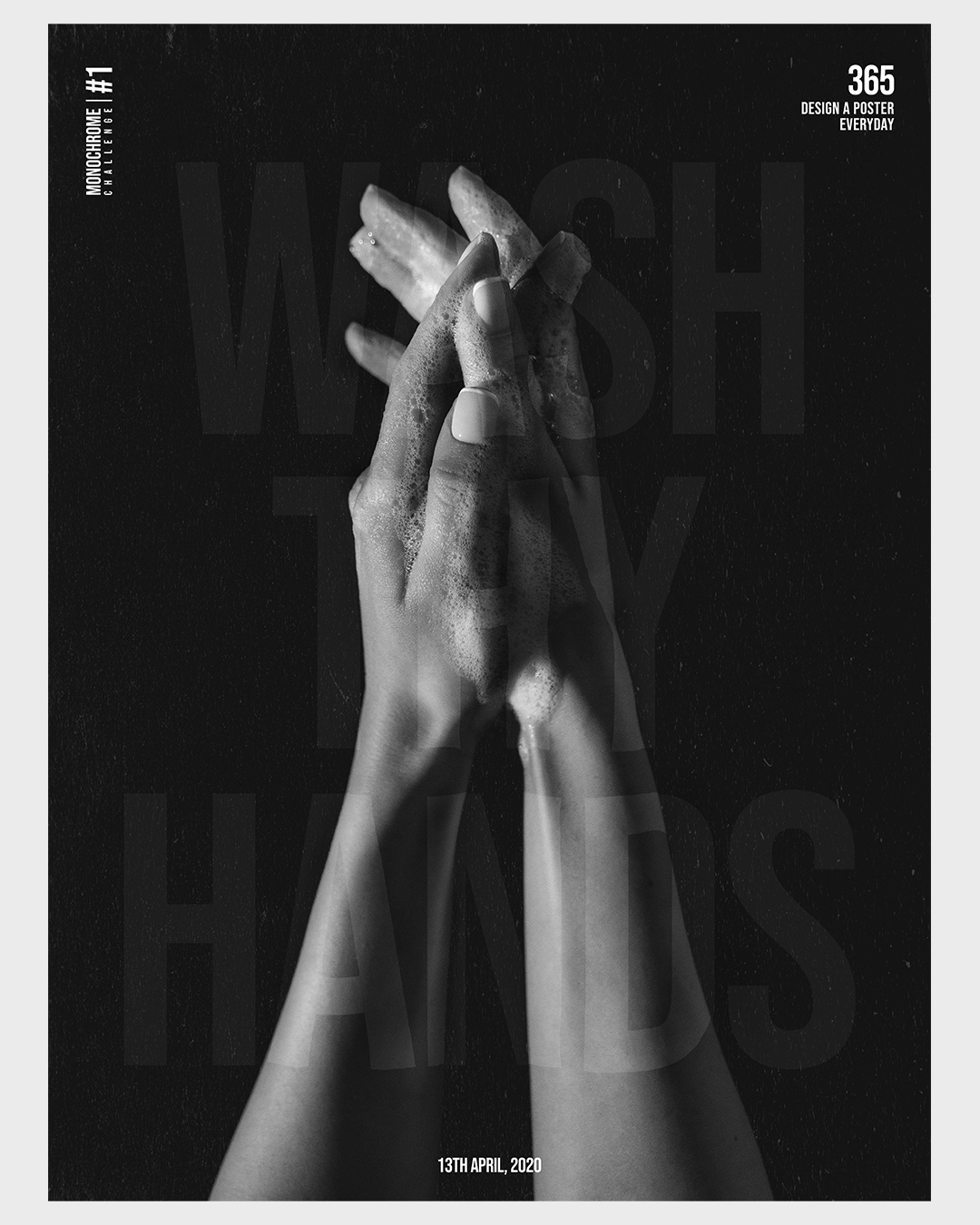
Poster 1 – I’d make “wash thy hands” a little more opaque. Not so much that it dominates the image, but it’s pretty tough to read as it is.
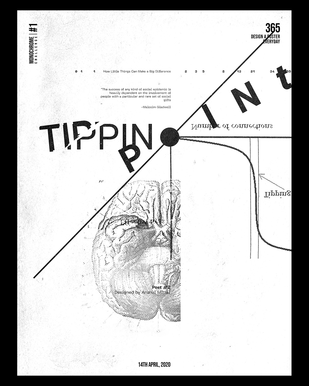
Poster 2 – I think it would read faster if you had a G on TIPPIN.
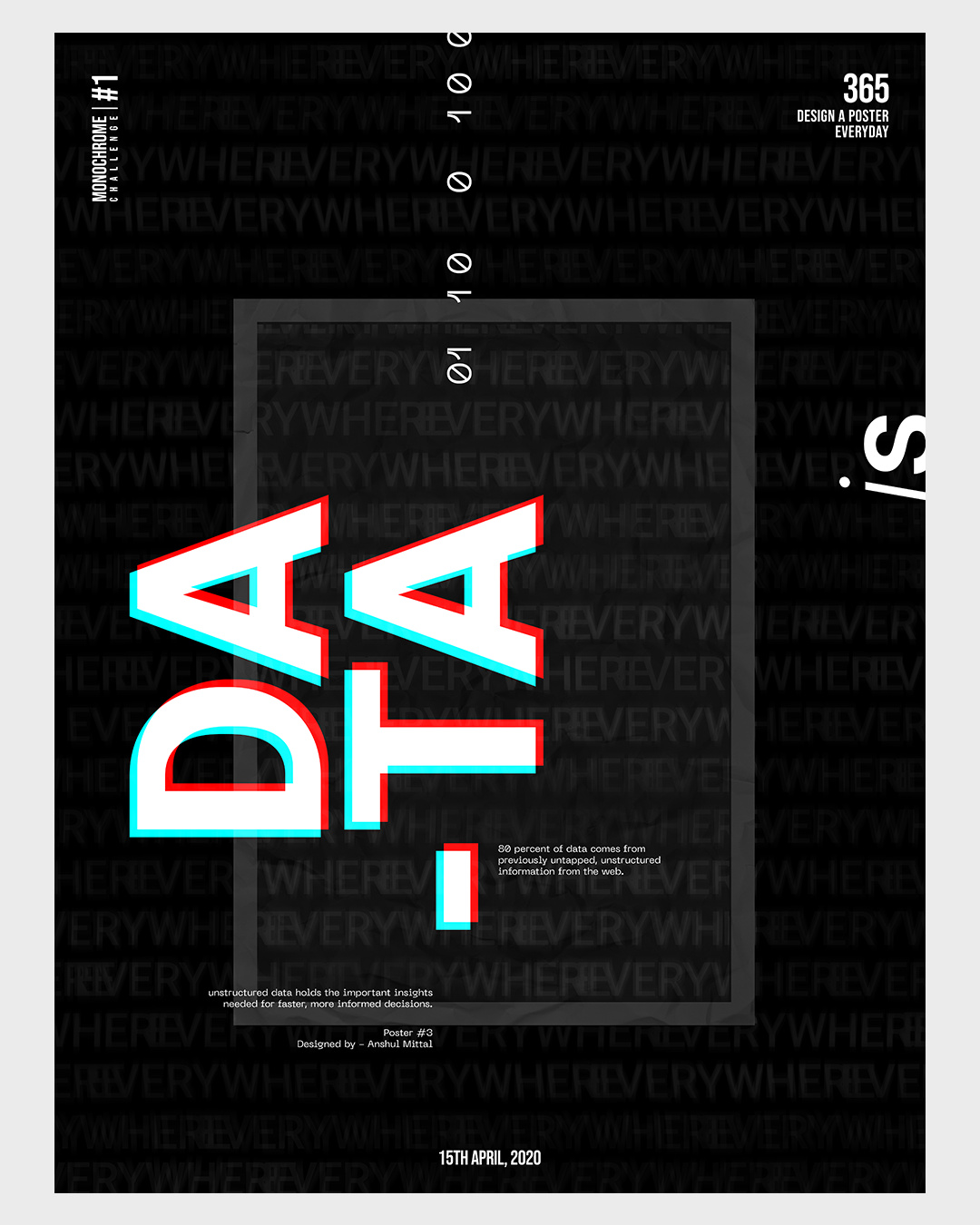
Poster 3 – It took me a minute to read DATA. At first, I read it as DA and TA and was trying to figure out what that meant. Moving the hyphen would help, but I do see how the type is anchored on the hyphen.
Are these supposed to be a series of posters related to the coronavirus? Are they about spreading awareness? Assuming they are, then they might work better if they look like a series. Maybe being obvious and using the words coronavirus or covid-19 might help.
@schweta
No these are just random ideas out of my head.
@Just-B
Thank you for your critique.
So, you mean these are not designs but something like art?
Do you suggest its important to convey a particular idea?
any other tips?
Well, that depends on how you define design. Most graphic design is the result of a client/employer needing to communicate or sell something.
Design certainly plays a huge role in your posters, but that design is more centered around, as you put it — art. Art is a great thing, and it plays a huge role in graphic design, but graphic design isn’t really about art. Your posters, on the other hand, are mostly about just that —your artistic expression.
They’re nice compositions, and I do like them as works of art or experiments in composition. They remind me of when I was in college and experimenting around with the same kinds of things.
Thanks! Thats helpful.
Are you familiar with a designer named April Greiman?
She is a very influential designer who made her mark in, probably the late '70s and '80s. Her designs were part of the “New Wave” movement of that period and leaned heavily on the use of computers, which was a very new thing at the time. Her work was very experimental and her posters, like yours, seemed to be more about personal expression than traditional graphic design.
Similarly, there’s another designer named David Carson. He came along a little later, but his work is also highly experimental and relies heavily on compositions involving distressed type used in unusual ways.
You might also look up Zuzana Licko and Rudy VanderLans. They published a magazine focused on typography titled Emigre, in which your posters would have fit very nicely.
I have no idea about any of these designers ![]() But I will read about all of them. I’ve just started a few months back as a graphic designer.
But I will read about all of them. I’ve just started a few months back as a graphic designer.
By the way, you have so much and so refined knowledge about design. How long have you been practising?
And do you have any blog, website, social media I can follow and learn more from you?
Forever — about 40 years. I guess that’s what happen when that much time is put into something.