These ideas show a whole lot more sensitivity than your previous attempts. Much better!
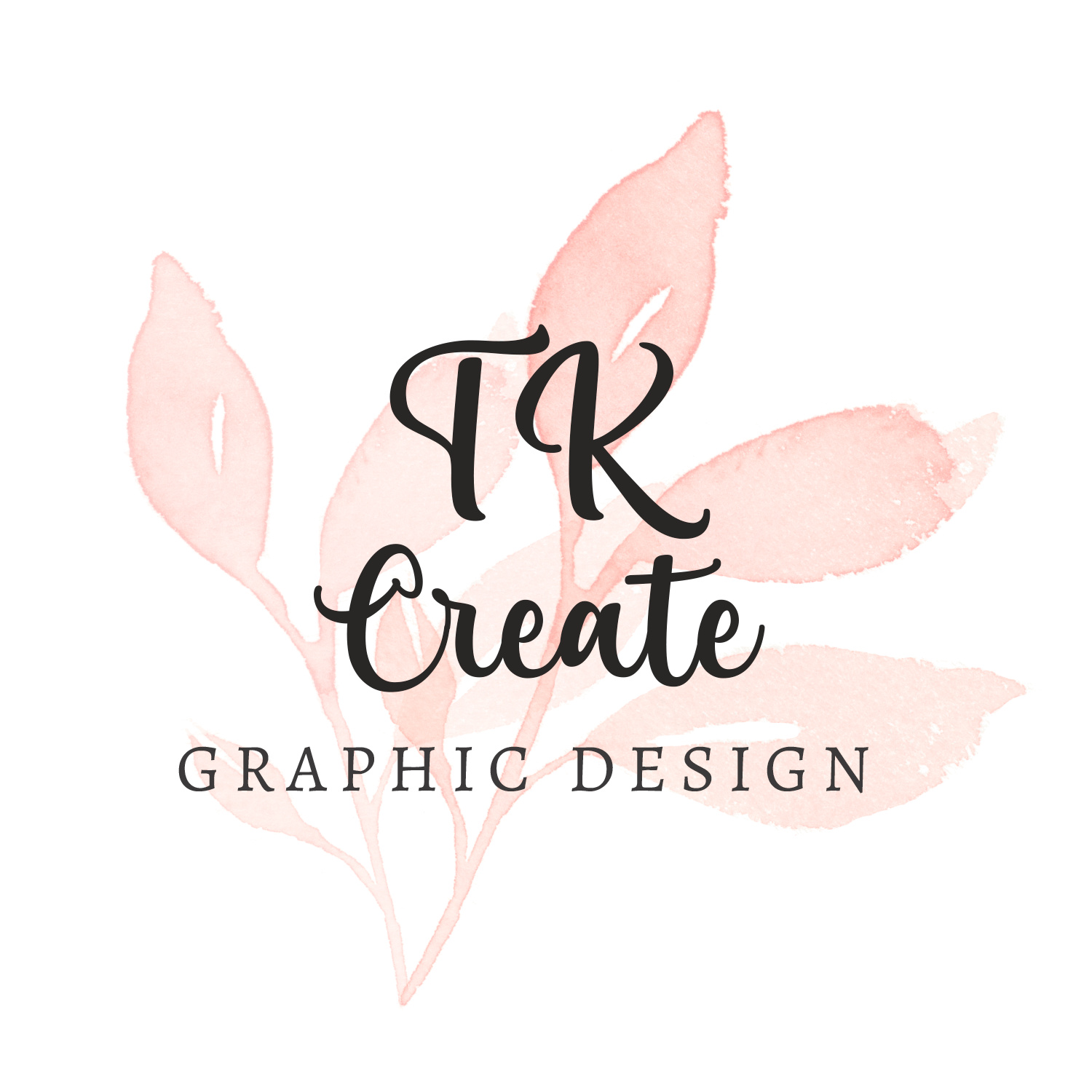
Although I like the top one, a logo consisting of raster artwork for print production will always be a headache. This problem won’t get in the way for online use or, perhaps, as a personal logo, but it would be a deal killer for a growing business. I do like the looks, though — soft pastels and watercolor.
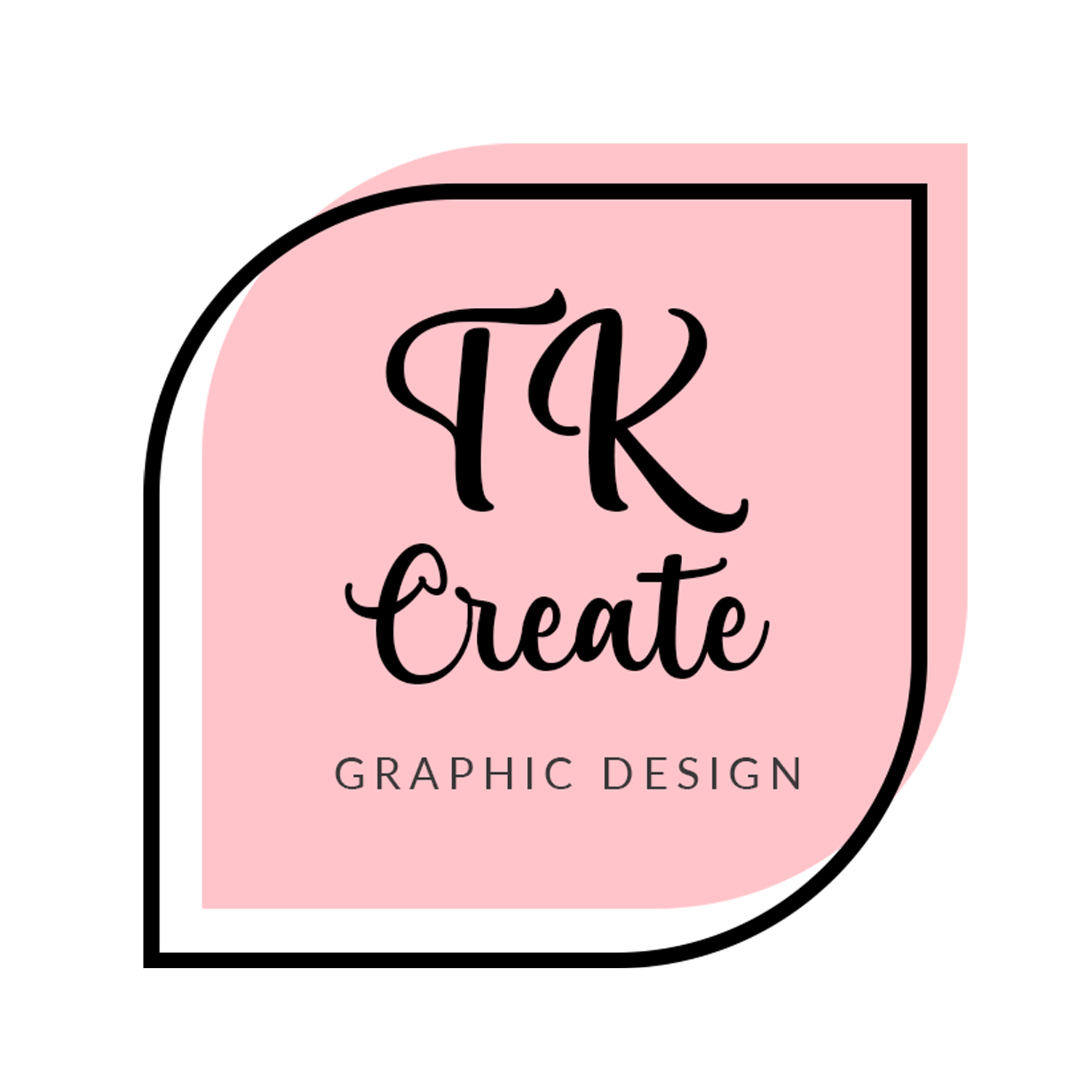
The bottom one is interesting. It’s about 180 degrees removed from my style, but I still like it. It has an early 1960s look that’s sort of nice, if not a bit trendy.
A logo should be vector and it should work in one color. You could use the flower background as an element in your branding separate from the logo.
Logos need to work in flat black and white so they can be reversed easily when placed on dark background or embroidered on shirts, for example. If you were to make the logo just black and white, it wouldn’t work.
You could possibly integrate a smaller version of the flower into the type. But I would start by designing only in black and then working in color only after that.
Logo #2 looks good to me. (except for that odd embellishment on the “C” - that bothers me) Otherwise I love the typesetting, it’s simple and clean, should print rather well.
As a printer, I once had a client that used a watercolor-like element in their branding. Oddly enough, almost the exact shade you chose for the flowers. It was a nightmare to print with any consistency. Even the slightest Delta-E fluctuation was incredibly noticeable. Don’t get me wrong, I like the way it looks, but it’s not going to work.
I like both of these and the choice between the two depends on the kind of image you want to project, and the kind of work you want to be doing. Both of these will work OK online.
As others have said, the raster pic and the pastel colours could be a problem for printing but there are ways around this. You said that this is only for use online but why limit your choices later?
The pastel colour is no problem as long as you are prepared to pay for spot colour printing. This will add at least 25% to the cost of any printing you get done.
The raster pic will need a really good clipping path unless you want to use it solely on a white background. As it is, the clipping path would have thousands of points so you will need to simplify the outline. For mono jobs it would be ok in grey. White out of a dark background it will look like a negative which will look really odd.
As with any logo design, you need to consider from the start how it will work in black + white, and white out as well as in colour.