Hello guys,
I’m wondering, is any of you a freelance graphic designer?
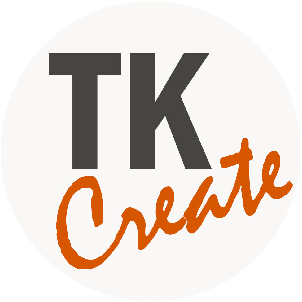
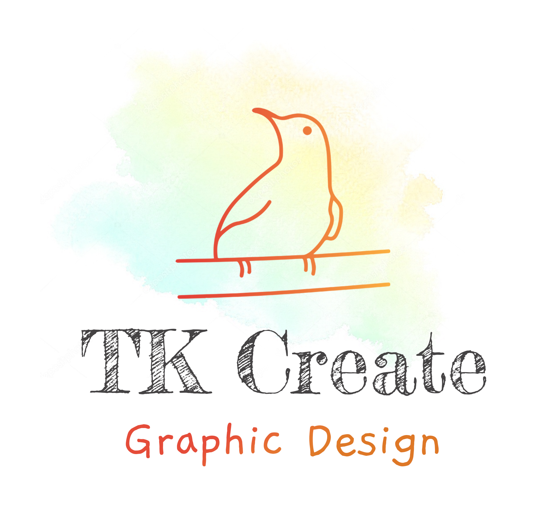
I’m trying to make myself a logo, have three options so far, any thoughts on that?

- IMHO a logo should be more than just a font.
- If you do go with a font .. please don’t go with anything childish. It reads as immature and unprofessional.
If I were looking for a Graphic Designer to create my vision … I would not choose the person with the kids writing.
That being said, get out the sketch book. It can really get those creative juices flowing. ![]()
3 Likes
You have totally different concepts here that basically amount to sketches.
Designers will do dozens if not hundreds of logo sketches, then proceed with only one or two options by taking them a step further on the computer. The idea of sketches is to get past the bad ideas.
1 Like
Move away from your computer, get a pencil or pen and a pad of paper. Start sketching. Draw up two or three dozen ideas. Pick two or three that seem to have the most potential, then start working with them.
As already mentioned, logos aren’t just type font characters that you’ve colored — they’re original designs. Also, don’t put several different ideas into your logo. Choose one idea and focus the entire logo around that one cohesive idea.
1 Like
The bottom two involve to much ornate detail, and like Red says, rather childish typography.
That one typeface is looks like a rudimentary version of Comic Sans (if that’s even possible).
I like the way “TK Create” sounds, if that’s any consolation. And the top logo has potential, and with half a dozen more takes you may have something. Merge those vectors, smooth that typeface, and pick any of the 100’s of sans serif, neo-grotesque typefaces, that look formidably better than what you have for “TK”.
I could see the bottom logo without “graphic design” and the tiny boxes. Maybe just the pencil, or just two or three larger boxes - keeping it to 2 colors at most, of course.
1 Like
When I look at these wildly different logos, it tells me that you have no idea what you are trying to communicate with your logo.
Design isn’t about decorating some text. I think you need to get back to the drawing board and write a clear brief like you would with a real client. What do you need your logo to say about your business?
1 Like
You’ve received some good advice. The challenge for you is to follow it.
1 Like
Buda nailed it. Yo, can’t improve on this.
1 Like
Hi Kittie, thanks a lot for you feedback, I found it helpful and really appreciate that!
I absolutely agree with you on #1, not just because I love cute graphics, icons and pictures, but also because on my opinion it gives a better visual representation/has a stronger impact etc.
#2 - Thanks for this point, I originally looked at “childish” as being “handwritten” and crafty, made by hand, imperfect rather then boring generic computer one - kind of what I need; I used it purposely because it shows creativity and “has a soul” or personality (no?); but if it looks rather childish, meaning unprofessional and unattractive, then it completely ruins what I was going for..
Yes, I came up with the three I attached at three different times and had up to maybe 50 ideas/sketches, so already passed the sketch step (I thought, lol, apparently need to keep going).
I may as well show the sketches in case I missed cool idea but need to find them first:)
1 Like
Hey, PrintDriver, thank for your reply!
Yes, different concepts because I still in active search for my perfect logo but none of them click, if that make sense; second is my fav and the one I’m currently using; first I had used and with the third never moved on;
and yes, passed the sketch-period, but thanks for pointing it out, I may as well do more through brainstorming at my spare time.
Yes, sir! (Or Maam?)))) And thank you! I could see based on everyone’s reply that I too hurried sketch-to-digital and need to do more drawings (5 times more! and different!);
thanks a lot for the tip, I’m always cramming everything I got into one design, that’s just crazy! Less is more, I guess it applies here ![]()
Oh, man, Comic Sans is an awful reference, this is NOT what I was going for, at all.
Thanks, the name is super generic just because I couldn’t come up with anything smarter, honestly; but oh, well, maybe in a future name will come up just as a perfect logo concept.
Thanks for the very hands-on tips, appreciate any idea or help and super excited to try it!
Yeah, third one - suppose to be pixels, like, “I create pixel-perfect design” kinda thing, and I did wanted to be more brave with the color (also have black and grey versions of that). Hmm, two colors for logo is the maximum? Kind of like with no more then two fonts for one design? I did not think of that but will give it a try in a future, thanks!
Hey, Buda,
sorry, let me clarify what’s it all about!
Here is what I attempted to communicate:
my brand + my personality (some of it in it);
logo contains: brand name (TK Create) + tag line (really need to be in the full version to explin what is TK Create - tag line 1 “Graphic Design” or -tag line 2 “Graphic Design by Tatiana K” + icon/image (unique, memorable, pretty, striking etc.)
And areas I’d be specializing but not limited to is branding: social media templates, sale graphics, email graphics etc. including photo+graphic elements or just graphic elements;
Thinking of your question, I want to position myself as professional and fun, responsible freelance designer who could help to step up your business by making it more visually attractive/presentable for clients.
Yeah, for sure! Lots of great tips! Rolling up my sleeves))))
Reply removed.
This is not a classifieds post. If the OP wants to hire someone, it will be posted over there.
Thanks ![]()