Hi all brilliant designers,
I am looking for some feedback on my first dark-UI trial. Actually, I need some help not only from a dark-UI perspective but also perhaps for UI design ABC 
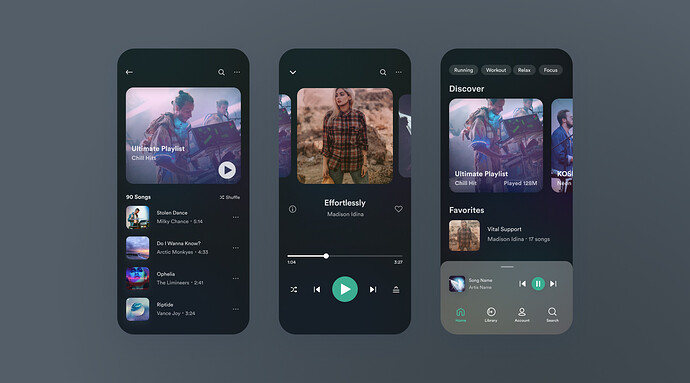
I designed a music app concept. Do you like it, or do you see some improvements to make the design more polished?
With music apps, I’m more into ease of use over what they look like.
A usable interface is a bonus, but managing files in any music app I’ve dealt with makes my teeth hurt.
It looks awesome. I like the overall minimalist feel. Great use of whitespace and contrast.
Nothing to improve here. 
Hiya Unknown Buddy! Welcome Aboard.
Did you join just to review this App? It’s funny how your IP is just a stones throw from the OP’s 
Brother, sister, friend perhaps?

As for the app - visually it’s plain, but that’s ok. As long as it works properly and not be too cumbersome to use.
Thank you.
No, I just want to push my badges, so that I have more rights here in the forum. 
Best Regards


