Music Band logo - Decibel

Hi Everyone,

I have a brief for a logo.

Name - Decibel
What - music band
Type - pop, Rock, soul, r&b

They play with guitars, keyboard, drums & there is a singer.

Client request- to play around with the “d” & “b” in the name decimel & incorporate music notes as those two letters.

They are open to other ideas…

I have come up with a few.

I am finding that some of my ideas are looking like a music store selling instruments.

Any feedback would be much appreciated.

Thanks.

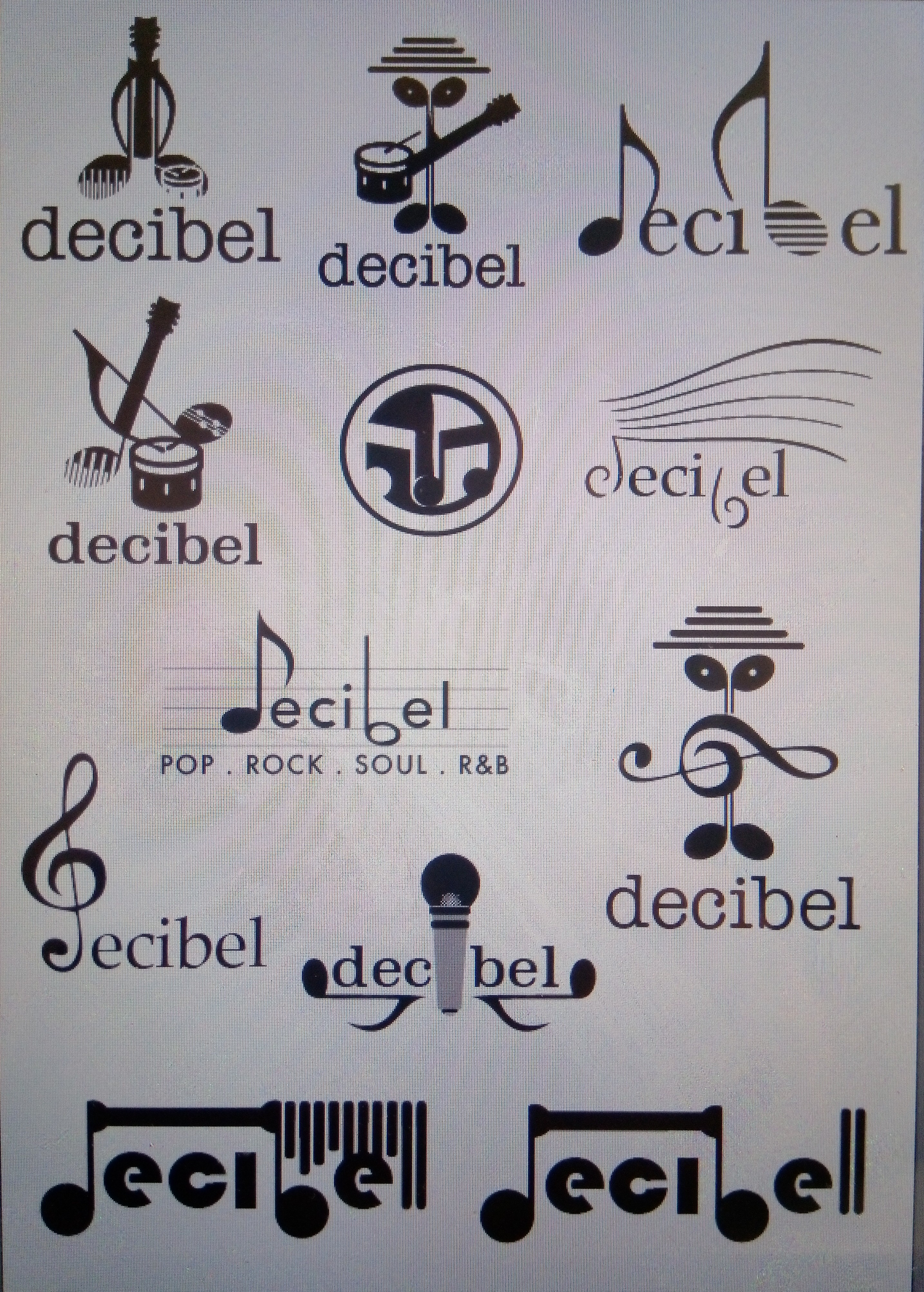
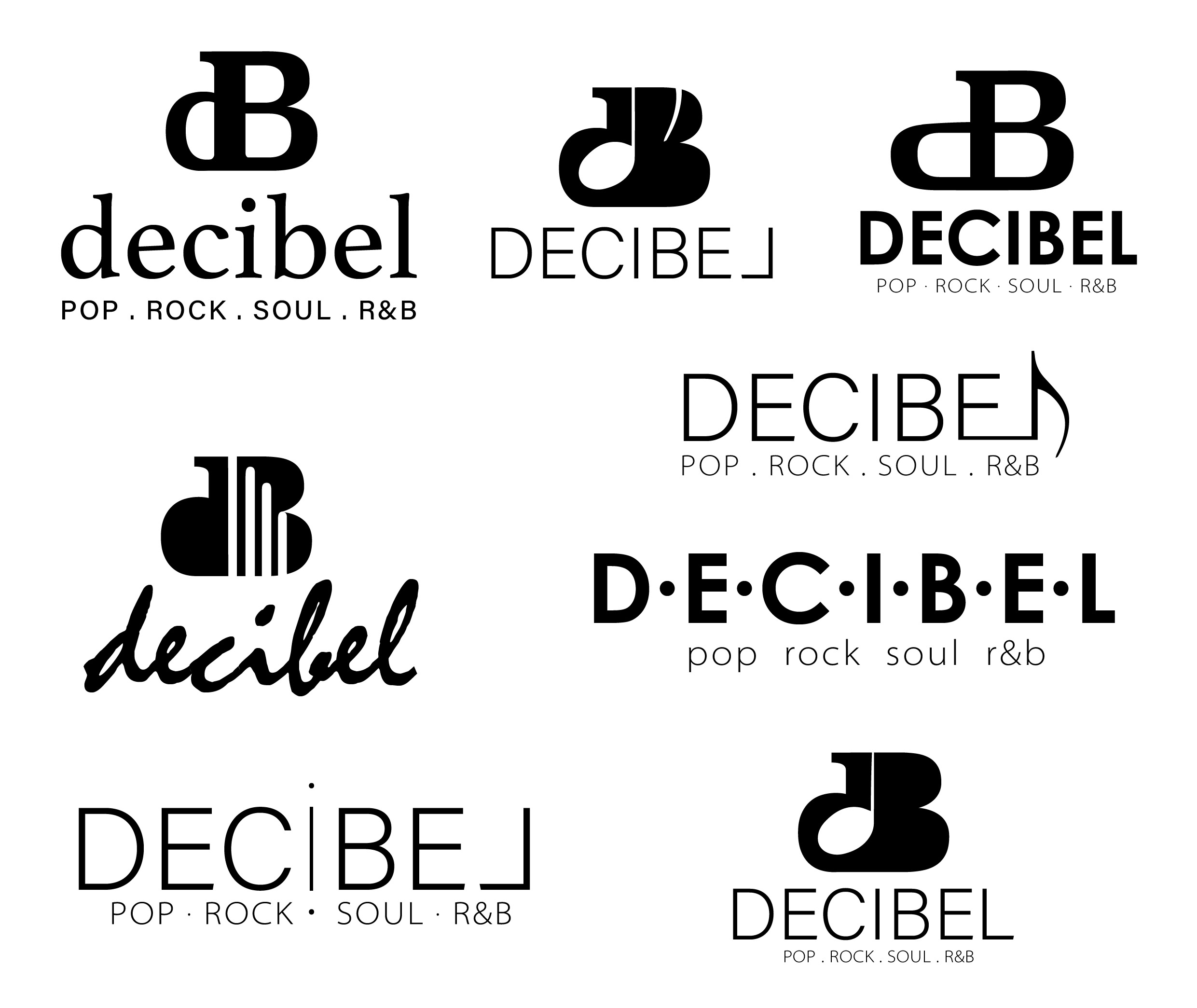
Please, please, avoid, notes, treble clefs, staves, in fact anything at all to do with musical notation. Cute cartoon faces in musical notes are to be avoided particularly.

What you have done is gone for a visual cliché. You need to think about who they are, their style of music and give a feel for that. I would also strongly suggest they change their name. It, too, is about as cliché and cartoony as it comes.

That said, if they are the sort of group that all dress in tuxedos (with tinsel accents) and move in unison whilst playing James Last, easy listening versions of R&B classics, on cruise ships, then this will do the job beautifully.

Sorry if that sounds more than a bit dismissive, but there are certain things that will both expose your inexperience as a designer and also, expose the client’s lack of visual literacy. in which case the client needs to be led by someone who can visually communicate who they are.

Prior to that, rather than going back to them with a solution that they are not expecting, you need to have had a conversation with them about why what they want, will not do a good job for them and in fact will harm them and their reputation.

This one needs research and an understanding of their music. A few years back, I used to work on CD cover design for record companies and before we did anything, we would get the music and play it over and over again in the studio until we understood it and had a real feel for it.

Sometimes you have to be strong with clients and explain to them why musical notes are not a good idea. I have done enough work for composers, musicians, choirs and dead composers’ trusts over the years and without fail, in the first instance they ask for musical notes. In fact, they usually already have a home made logo featuring musical notes fairly prominently.

I’m afraid, the logos you have shown us are all visual clichés, in the same way, things like crosswords and jigsaw puzzles, etc are. They need to be avoided on almost every occasion.

Hope this helps more than disheartens.

1 Like

Have you done any research into bands with a similar sound. Not to copy to get a feeling for the aesthetic.

Sprout is right, your designs look very cliche. Stop trying to illustrate the band name. Research fonts that will express the band’s style.

Thank you for your feedback.

I have told them that using notes etc is very cliche and not suitable for the logo but they are insisting that the music notes should be incorporated into the letters/name.

They are not backing down from that visual. In regards to the name, they are not chnaging it as people already recognize them as decibel and they have a facebook page already with there band name in an italic font and a drum next to it.

I will start again and use a more subtle approach with giving them what they want but not obvious as in using a font and altering it slightly and seeing what fits and what represents them as a rock, pop, soul rnb band.

I know my ideas were cliche and thats how they want it.
I am going to work on the name, using a font that suits and keeping it simple

I really appreciate your detailed feedback.

The symbol for decibel is small d, large B.
If they insist on musical notes, don’t be quite so literal about it. Think waay outside that box.
Their music mix is rather broad to give you any indication of one type of musical style.
Is this a crowdsource brief?

Exactly. I won’t be literal about it. I will do something subtle.

They are a local group in western Australia, they are not going national or international or anything.

there is 6 people in the group and the fact that it is very broad in their music genre, its not specified to one style.

The head guy of the group wants the music notes incorporated.

Back to the drawing board.

Okay, the campy name and a list of 3+ genres typically betrays a cover band doing club gigs as opposed to, say, agroup of young, creative brandirons self-publishing a portfolio of unexpected Alt Rock originals. So yeah, the brand doesn’t have to break new ground, but still, unless they wear ruffled shirts and bow ties on stage, your ideas so far would be rejected as too tame for a 1970’s family act.

They insist on music notation? Okay, so as PD advised, get outside of that and come in from a different angle. Don’t reach for gimmick. It doesn’t have to be wussy. Some visual seedlings for further exploration:

image
image
image

For me, a music shop connects to luxury as it sells expensive instruments. So a logo needs to look luxury and sophisticated so I feel reassured when I spend a significant amount of money on an expensive instrument.

The problem with your logos is that they look too much fun and playful. That’s the wrong emotion to go for a music store. Fun is the opposite of expensive. Fun is cheap.

The only one that feels vaguely right is the one that says “pop. rock. soul”. There the font choice is cleaner than the rest, but it’s still way too much fun.

Sorry to say, but if I was in your place I’d start again. I’d look a luxury brands where people spend a lot of money and use their logos as inspiration. I can see you’ve put a lot of effort into drawing instruments and figuring out how to make them look like a character. I guess the good news about going down a luxury route, is that luxury logos tend to be simpler, so although such logos aren’t necessarily easier to design, you won’t have to make lots of shapes and characters.

But I do feel that you need to make your logo clean, simple, elegant and modern looking. I know the client wants you to incorporate musical notes. Personally, I’d explain that you are going for a more elegant design due to the expensive nature of musical instruments and show him examples of luxury logos. If s/he won’t budge, then I think you can still incorporate the musical notes, but you need to make them the focal point of the logo and scale back on everything else. At the moment, your designs have way too much going on in them.

I remember there’s a band of some fame who used a plain logo without the adornment of any musical suggestion. Didn’t seem to affect their career in any way.

Beatles

It’s not even a superb logo.

That’s because what the Beatles were doing was new music, not covers. It wasn’t about the logo.

HB, I’m not sure I’ve ever heard music “forte” compared to a vacuum cleaner’s noise level. That makes me laugh. :slight_smile:

1 Like

Why is the L backwards?

The DB monograms are interesting, but the decibel isn’t two words. For this logo, if you’re going to have a monogram or initial, I think it should be a separate entity from the logotype.

Looking at the latest, I feel a bit like you are decorating text rather than designing a logo. What is your concept?

My concept is to go on a different route and use the lower case d and uppercase B as a monogram (that is the symbol for decibel) so if they want to print on shirts etc, that can be the symbol that represents them as a group.

deciBel means volume/sound. so i am incorporating dot point and space, sizing of letters to represent level of volume. I am working on a few more ideas.

Thanks for your critique

These new ones are headed in the right direction. Although the execution needs tweaking, this approach is better – especially the last one, if developed further. However, typographically it has all gone too far the other way and now looks very corporate. The whole thing needs slightly loosening up a bit – though obviosly nowhere near as loose as your first solution.

The dB with the crotchet as the counter of the d works, but there is some jarring in the shapes of the glyph. Also, why did you drop the counters on the B? it makes for a very heavy shape.

You could try the d of the dB simply as a minim – maybe making the stem of the note nod a little more towards the ascender of a d. Perhaps with the hit of the curve of a plantin-type serif at the top, or some other serif-type curvature malarkey – just to make a note/glyph hybrid. Then the B as a normal B. Not sure exactly how. Maybe a straight minim with a slightly thicker stem will do the trick, You’ll need to play around with it. Just seems to me that a minim is a musical lower case d on a plate.

Have fun.

Out of the ones you have posted, I like this one the best:
21

I like it because it is clean and simple, but the curve adds a touch of elegance.

But I am not a fan of the backwards L at all. It doesn’t make sense. It even makes it hard to read what the logo is saying.

The other ones you have posted are just too busy. I like the white music note silhouette in the black D. But combining it with the B makes it too busy.

Thanks Sprout and Sabrina.

Both of of those are my favourite ones also. I just need to tweak them a bit.
The dB is heavy with a solid B but i did try with the negative areas in the B and it looked odd especially with the music note next to it in the d.

I will polish them up and see how i go.

Thanks again for your feedback and help.

going to a dB monogram is a better idea, but go sketch on paper, yes paper, with pen, pencil, etc. It frees you up and doesn’t constrain you with trying to figure out how to accomplish a look you’re going for in the software, and why would you list the genres of the music the band performs as part of the logo, or ever really? Even for bands that stick to one genre wouldn’t do that. It comes across as cheap and its unnecessary.

That, and I understand the importance of branding, but few bands have a singular logo. The logos usually adapt to the album or their current style. There are some that do consistently use a logo (Weezer comes to mind) but even someone like Taylor Swift, despite using her signature (I assume) as her logo, her later albums and merchandising do not use it. Search around for some other larger bands and you’ll see that for the most part, their branding and logos are pretty fluid to adapt to the style or periods in that band’s career.

Agree here. As logo designs go, the only good tagline is no tagline. If that list of genres has to appear somewhere, the business card is the appropriate place.

True, and a fair point, but I’d say it doesn’t quite apply to the gig-seeking cover outfit the same way it does to recording artists. In the quest for bookings, the cover band marketing model is not at all unlike that of the contractor vying for a building maintenance contract with the same nightclub.

Good call @HotButton on the gig-seeking comment.