Hi! So, I am not a professional graphic designer. I did go to art school and studied GD for a semester before switching to animation. But I have been working in the print industry for most of my post-college career.
I’m also a musician and I’m getting ready to release a new song called “The Rising Sun” very soon. It’s a hard rock/metal track and a collaboration with a vocalist friend of mine. Lyrics include the chorus line “And the world around you, it will fall over you. You must find a way, rise above this doom.”
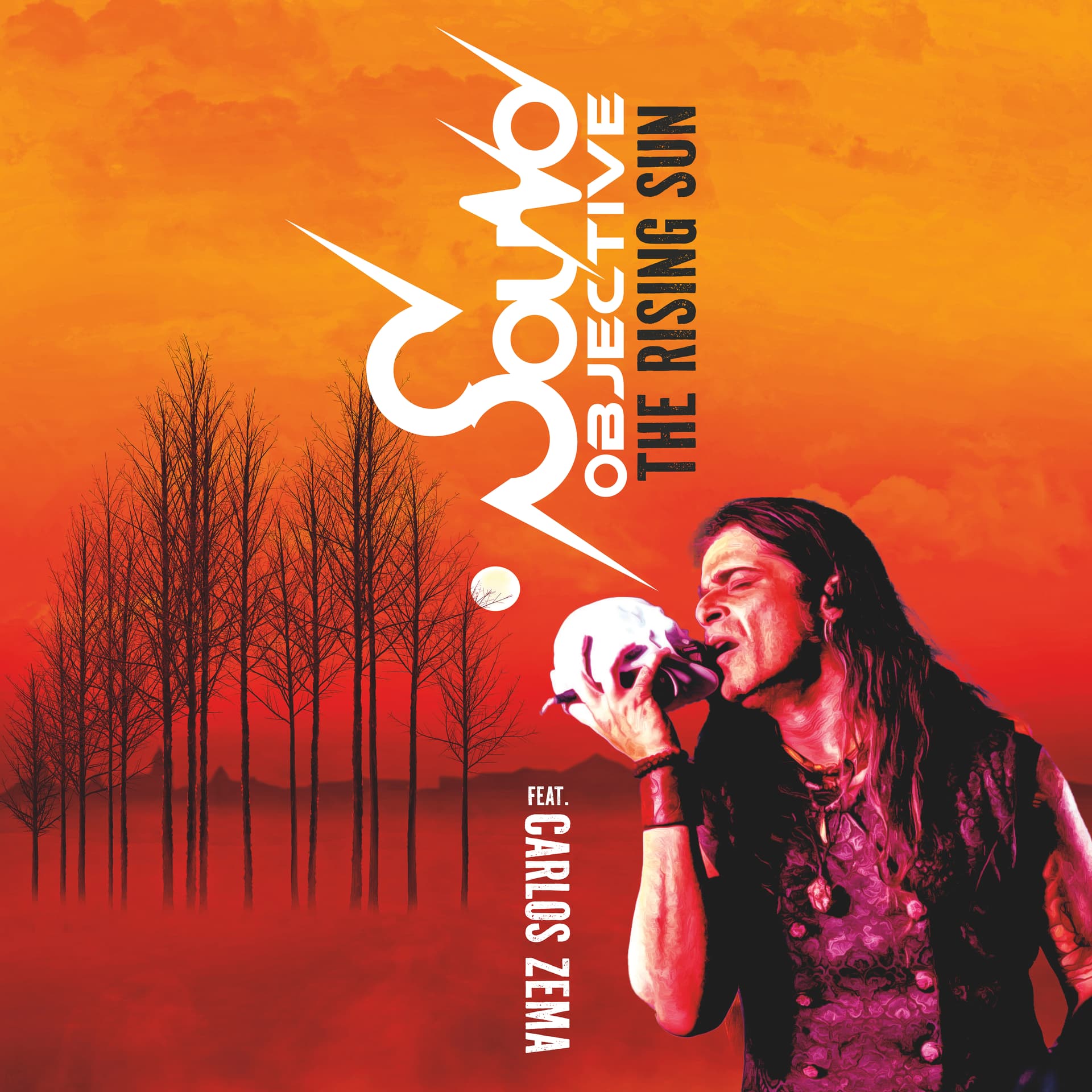
I created the Sound Objective logo myself and edited the photos as well. I would love to know your thoughts, especially regarding composition.
I love the Sound Objective typography with the sound wave spikes.
However, positioning the song’s name immediately to the side of the logo is a little confusing since it seems to be a possible continuation of the logo instead of the song’s name.
I was also confused by the word “FEAT.” until I read it probably was an abbreviation for featuring. If it were me, I’d spell out the entire word.
I’m unsure if the photo of the singer successfully integrates into the rest of the design. The entire composition seems slightly disjointed, with only the red background tying it all together. In other words, you’ve cordoned off a spot for the singer, another place for the trees, and another spot for the typography, then attempted to tie the disjointed elements together with color rather than integrating the shapes into a cohesive whole.
I like the overall look. However, if it were me, I’d spend more time figuring out how to connect all the pieces into a single composition rather than a collage of independent parts.