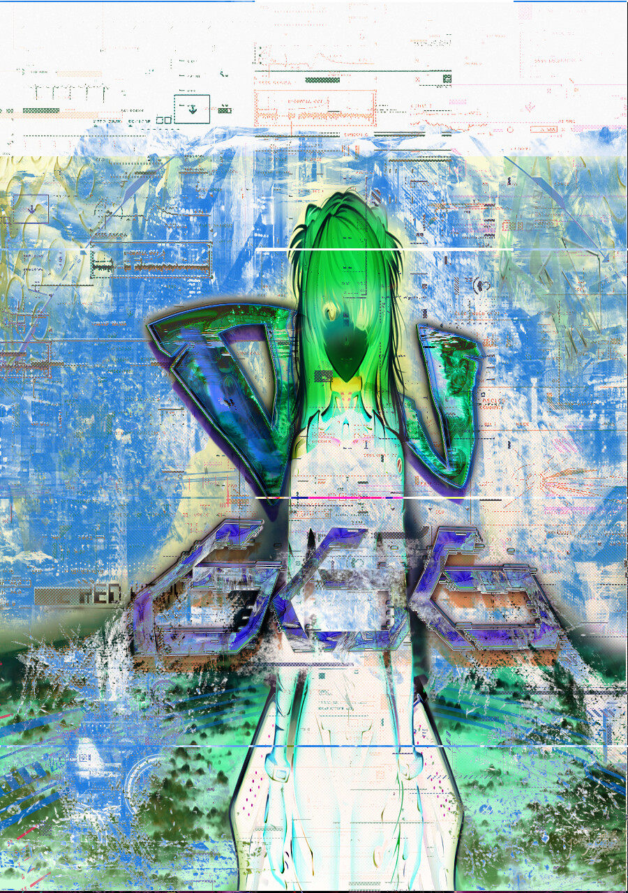
Per your other thread, I am guessing these are covers for your music. Is that correct? There are many types of music to appeal to many different ears, and there are many types of art to appeal to many types of eyes. The work here doesn’t particularly resonate with my tastes. But that’s not to say some others might relate to it.
It’s in the crit pit.
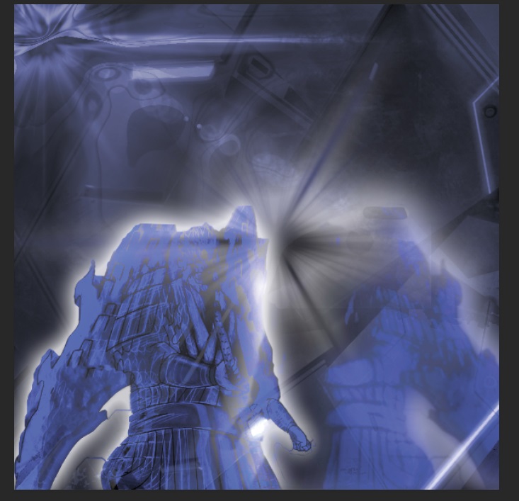
The squished distortion of the figure is jarring. It makes the whole piece (both of them) appear compressed. If that is the character look…I guess it’s art.
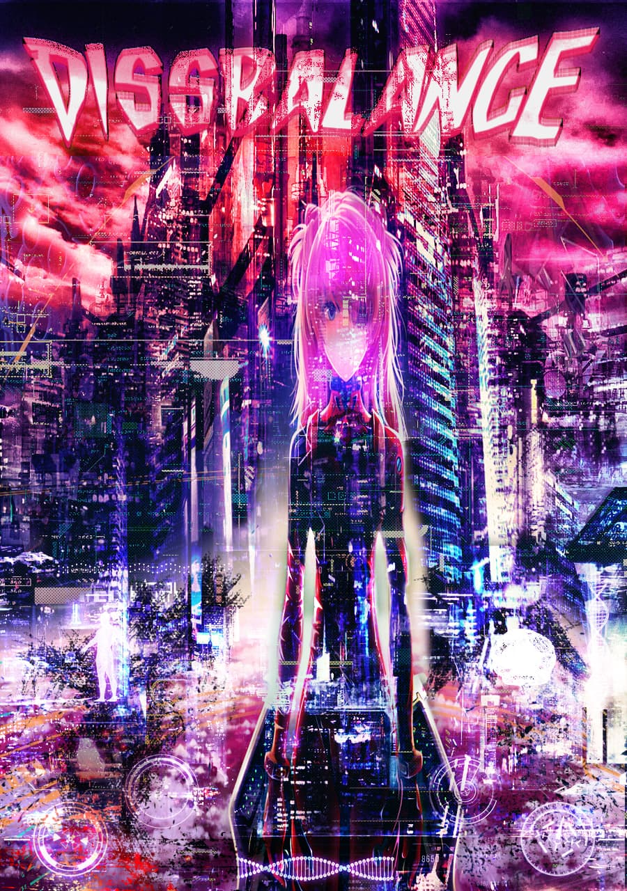
The chaotic, abstract grunginess of decomposition is interesting.
However, the headline typography doesn’t match since the font was originally designed to look that way rather than having decomposed into it. A more standard sans-serif typeface subjected to the same kind of decay as the rest of the illustration might work better.
I don’t care for the Japanese anime style of the girl either. The style is alien to the rest of what’s taking place in the illustration.
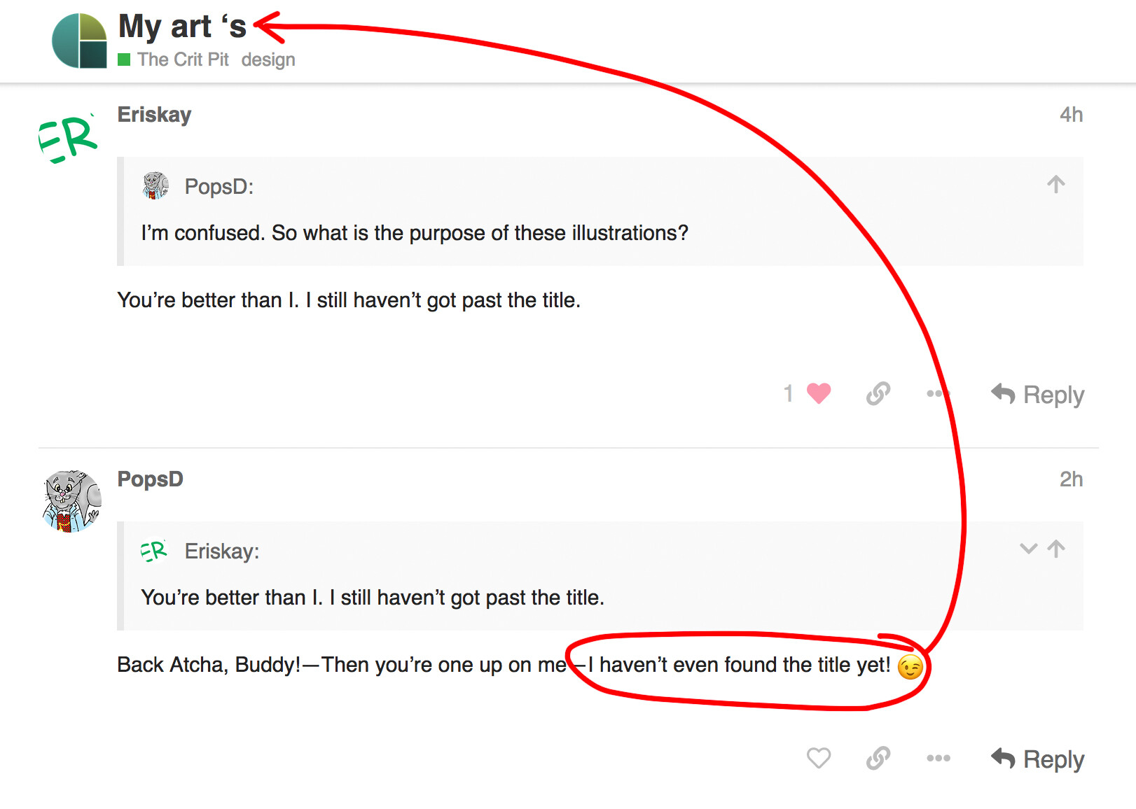
I’m confused. So what is the purpose of these illustrations?
You’re better than I. I still haven’t got past the title.
1 Like
Back Atcha, Buddy!—Then you’re one up on me—I haven’t even found the title yet! ![]()
You read me like a book, Steve-O !
1 Like
Thanks, Steve_O. By the way, “My art 's” still makes no sense—and it’s grammatically incorrect (no apostrophe or space between the “t” and “s” needed).
1 Like
That’s not an apostrophe. It’s a single opening quotation mark. I’ve been staring at it for a long time (and scratching my head).
2 Likes