My Fashion Brand Logo

Hello to you all,

I am honored to be part of this community.

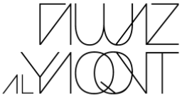
I have created a logo for a fashion brand for myself, using my own name. The aesthetic of the brand is minimalistic, chic, and timeless. I am pretty happy with the way the logo design looks so far. I have been refining and evolving it for a few years, as I never actually launched the brand officially yet. Note that I have been working on the design on my own and it is about time that I shared it with the right community to get some feedback and critique.

The concept behind the logo is to communicate the brand name (my name) through stylized yet minimalistic upper case letterforms in the most balanced and eye pleasing way possible. As my first name is placed above my last name, I enjoyed making mirroring effects between letters placed above each other. Notice how my first name FAWAZ has a lot of sharp angles, and zigzags, I made the W out of curvy shapes to lessen the sharpness, and create a mirror effect with the curves of QO of my last name underneath it. I also made the W wider than usual and made the QO overlap so as to make the double circles of the W and the QO equal in width to further add to the mirroring effect. On the other hand, my last name, it is Spelled ALYAQOUT. I replaced the U with a U with a V to add sharpness and mirror it with the A above it. Apart from that, I dropped the horizontal lines in the As and Fs to create a minimalistic effect.

Moreover, I figured that playing with kerning between the letters is a key factor to add to the aesthetic of the logo. By bringing the letters as close as possible, and sometimes even overlapping them into one another, I intend to create a balanced negative space between the black lines, and to make every element connected to the other. I also find it very pleasing as it reminds me of line art, which a key signature style of mine.

Other than that, in case you were wondering why the AL of my last name is smaller in size than the rest of my last name; that is because Al in Arabic is just a prefix commonly used for last names in our region. This is similar to Mc, Le, El, etc.

When it comes to legibility, it is important that the audience is able to identify the logo with the brand name, but I like a little bit of mystery. Which is why I do not mind the altered letterforms as they add individuality to the brand. I personally don’t see it as very hard to read to tell that what is written is actually Fawaz AlYaqout. Especially that nowadays, with social media accounts and websites, one can easily know how a brand name is actually spelled, and they can figure out pronunciation on their own. A lot of legendary and highly successful fashion brand names are not pronounced the right way throughout the world, and that is because the designers behind these brands come from diverse cultures.

I hope I covered most of the important points about the story of this logo and how it came about. I would highly appreciate it any feedback or input of any kind. What do you think of the kerning? what shall I add or remove? And what do you think of the concept behind the logo in general?

Thank you and peace
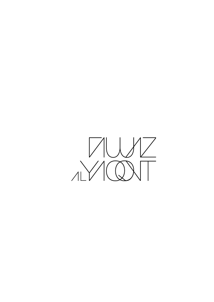
You can do whatever you want, but if a potential customer can’t even read it, in any way shape or form, what makes you think they will attempt to look up what it is online?

It took you a big, long pile of paragraphs to describe and self-justify your design. Your potential market is never going to see that.

1 Like

I have not read your post; I just scrolled down to see the logo. It looks like:

T (maybe?) AUUAZ AL YAQONT

I’ll go back and read your post to see how close I got.

1 Like

the lines make for a lot of visually confusing vague letterforms. try to imagine it reduced to the size of smaller than a passport stamp. all of that negative space will begin to block up. have you thought of just using your first or last name? I just think that when you try to repurpose this for other reasons, you’re going to be disappointed. the construction of it has some lines that don’t match up so that would need to be cleaned up. think of the great clean branding of other fashion houses, i.e. Gucci, ysl, coach, Dior. embrace sophistication and simplicity, think timeless and not trendy. rebranding on down the road to clarify some smarter decisions up front would be disaster to a new brand. better rethink it a bit.

1 Like

To my schoolboy mind, I saw a top and front views of a not unample female bosom.

1 Like

You’ve obsessed for years over doing all that for you.

Now with it out of your system, do one for your market.

1 Like

But more specifically…

image

That’s an awful lot of “minimalistic”.

if you’re happy and satisfied, and you don’t want to consider any options, then there’s not much we can do for you. we’re professionals in the industry so our critique comes from experience in creation and production of artwork over myriad industries and clients. not done lightly or dismissively, but from honest suggestions for some changes. we’d love to help you but if you’re happy with it, it’s your logo. thanks for sharing.

Thank you for sharing your perspective. I was obviously in need of a fresh perspective on things

Thank you. I agree that the logo needs to be more readable

That’s excellent advice. Thank you!

Hahaha! Okay, good to know!

Thank you for pointing that out. I really needed that perspective!

I agree! I guess I must’ve lost the plot, and over worked it in the wrong direction.

it’s hard when you’re the client. it’s why logo and graphic designers have such a hard time making their own logos. we’re never happy with what we come up with because we can’t translate our entire being into the design, and as soon as we do it we want to change it. we also make lousy clients for ourselves because we’ve got no one to complain to when to doesn’t turn out like we want it. :wink: when in doubt, reach our to your friends in the business and ask them. would it look good on a label if you’re doing ready to wear? on a bag or clutch? shoes? any accessories? a lipstick package? so many factors to consider when developing your brand.

1 Like

I couldn’t recognize more than 3 letterforms. It said absolutely nothing to me.

1 Like

oooops :see_no_evil:
I’m really glad to hear this feedback.
Thank you

That’s so true. It is hard to be one’s client. I guess I’ll work on a cleaner and simpler approach or higher someone.

Thank you for your kind and constructive feedback.
cheers!

you’re most welcome, from all of us.

1 Like

and if you do hire someone, take your sketches and remember to be patient! you have a perfect image in your head – it’s trickier trying to get it into someone else’s head! :smile:

1 Like