Hi everyone, I’m a student in my final year and I’ve been going back through my old projects from first and second year and trying to critique them afresh with new eyes and new knowledge. I know this is the Crit Pit and is a brutal place where no student can escape unscathed but, frankly, the most valuable feedback is from an experienced hand. So I’d appreciate any and all feedback! This it the first ever brand identity I did, I was asked to create a brand for a fictional airline based around an animal of my choice. So from here on I will share the concept, some choices and some of the final imagery I handed in.
Beeline
Beeline is a conceptual airline with the core focus of making life as easy as possible for the customer. Using smart technology, AI and automation, Beeline is designed to help individuals and groups book flights in a no nonsense manner. Throughout the project, many developments took place, including a rewards and incentive scheme for travel and a lottery seats system to promote filled seats. Beeline is dedicated to what I call “hive travel”, this is, to travel as a group or family. Even going so far as to dedicate sections of the flights for “baby bees”.
During this project, I created all the assets and animations for an app that could be used to book tickets. The app also utilises NFC technology to allow multiple users to synchronise their booking, converting to a “hive” booking system allowing the group to nominate a ‘Queen” who could then book group seats at a discounted price on a single phone or tablet which would then disseminate the tickets amongst the hive members. These hive discounts can also be applied to couples, families or friends; the more in your hive, the cheaper your seats. This app was also prototyped in Adobe XD for the lecturers to use on their phones and have a feel of it.
A big part of Beeline’s concept is the bespoke points system I developed. By tapping the app to kiosks across different locations worldwide you earn “honey points” on the app. These accumulated points can then be used to pay toward upgrades like leg-room and priority boarding. They can even be used in flight to purchase drinks and snacks from the stewards. This is a completely unique system designed from the bottom up for Beeline.
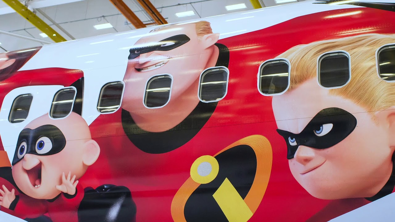
I created an identity for Beeline, including logo, colour scheme, brand guidelines, social media and more. Every asset and icon is hand created especially for Beeline, keeping their tone of brand in mind across the board. Creating customised vinyl designs to brand their planes and ensure brand recognition across the board. I was very proud of this brand and the work I have done toward it at the time, my skills with animation and app design increased drastically during my time on this project. Looking back, I can see changes I’d like to make but I’d appreciate a professional opinion.
Thought maybe you might find this interesting.
Hope your installer has insurance. If that isn’t applied right, heck of a liability if it comes off at 30,000 feet.
Oh this is cool… Yeah that wasn’t something that was in my remit to research to be honest. But a scary prospect. I’d like to think that any company that did that would know how to do it right!!
I’ll add it to the list. I think it’s helpful to go back to old projects and tweak them to see how they can improve over time. I really appreciate all the feedback guys!!
Thank you for sharing this project. You’ve done a wonderful job of giving us the brief as well as several examples. I like the various wordplay and general concept of this airline. Here are my critiques of your examples:
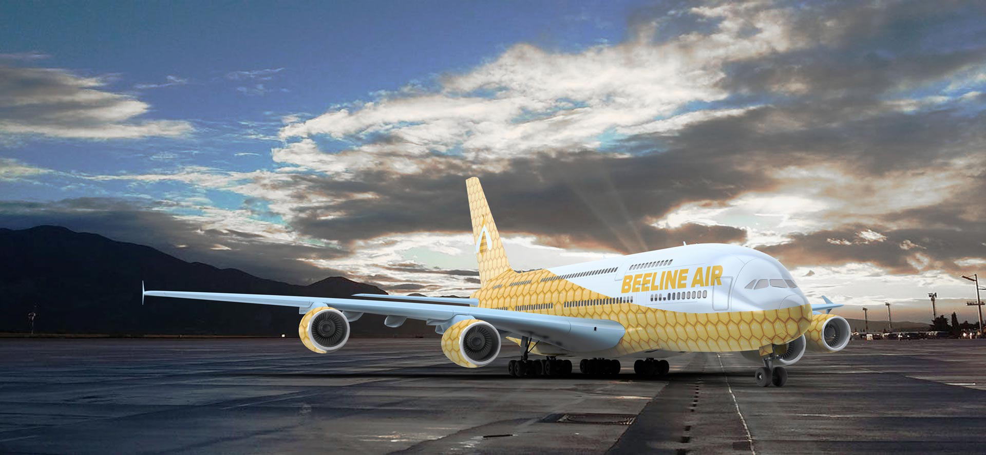
PLANE WRAP: The plane wrap is a good start, but I’m not sure if you need the honeycomb design across so much of the body. Perhaps pull it back so that it ends around the wings and takes up most the back half. I’m also confused if you’re calling this company Beeline Air or just Beeline. I’d pick one and stick with it.
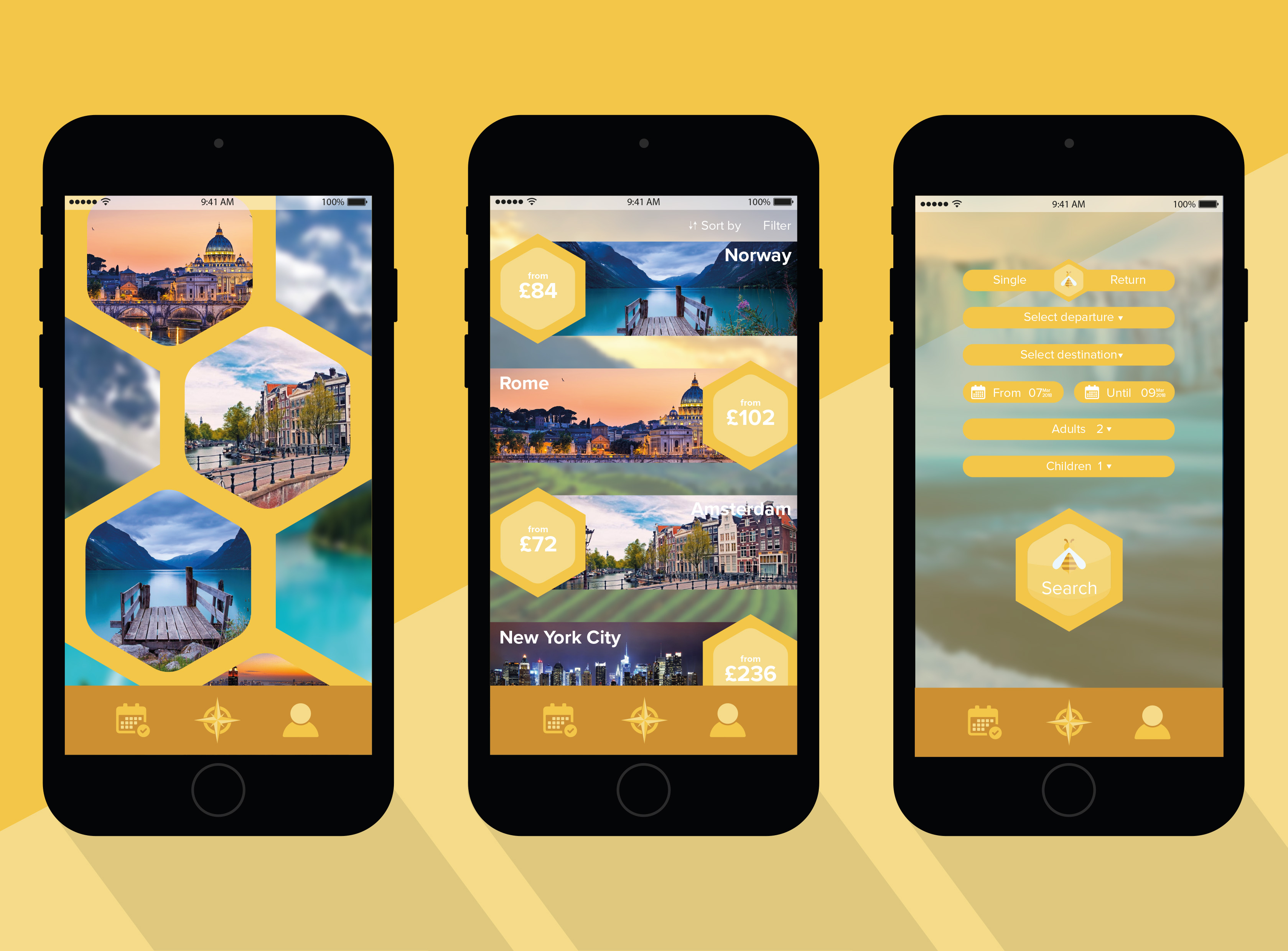
APP: The app looks clean and pleasing. Without testing the functionality, I can say that you might want to reconsider the text color. White on yellow can be difficult to read on some screens. Consider making the buttons a darker color and using yellow type instead. Also, since you have all cities listed, change Norway to Oslo (Norway isn’t a city).
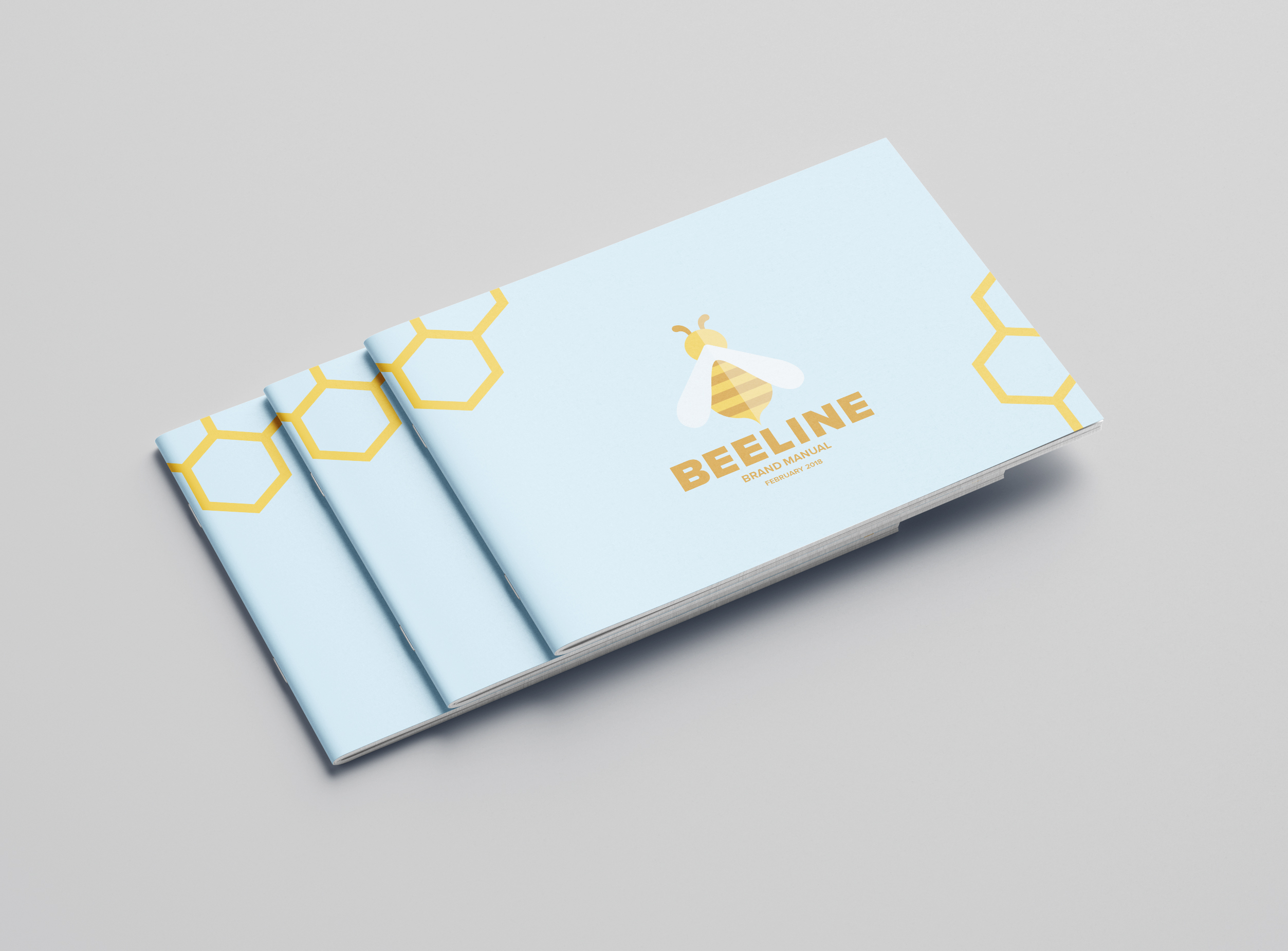
STYLE GUIDE: The brand guide looks great. I know this is a mock-up, but please build more white space around all the edges of the interior pages. Maybe .25"
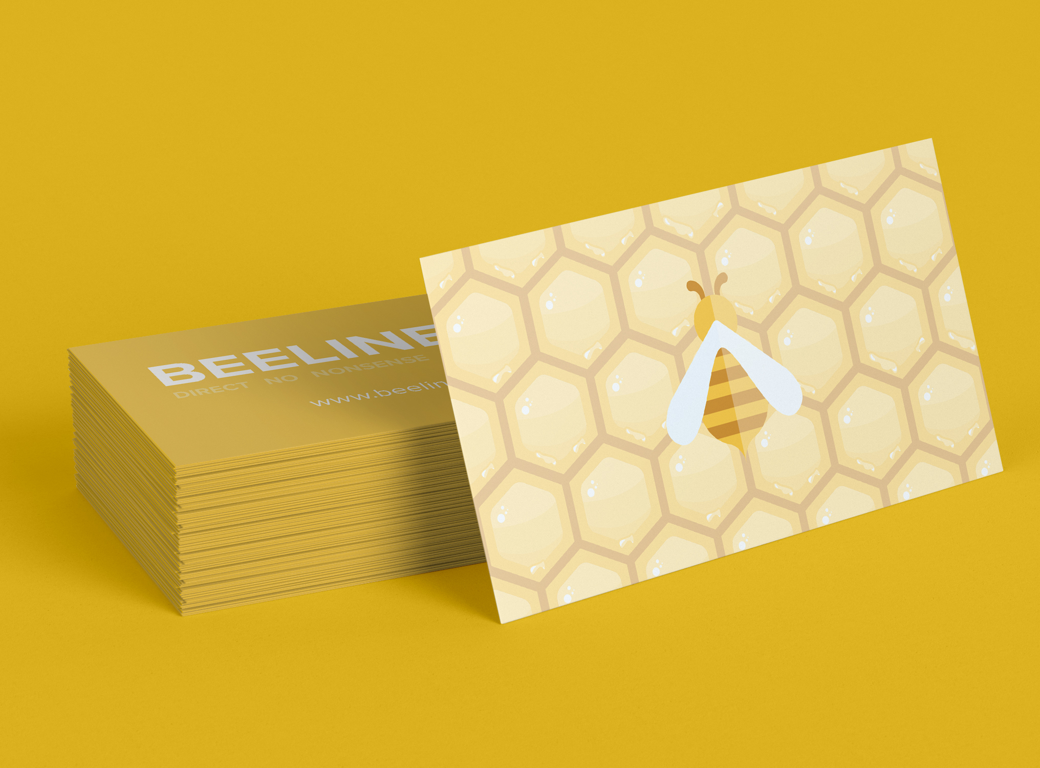
BUSINESS CARD: The business cards do not have any content on them. Are they meant to be personalized or generic cards?
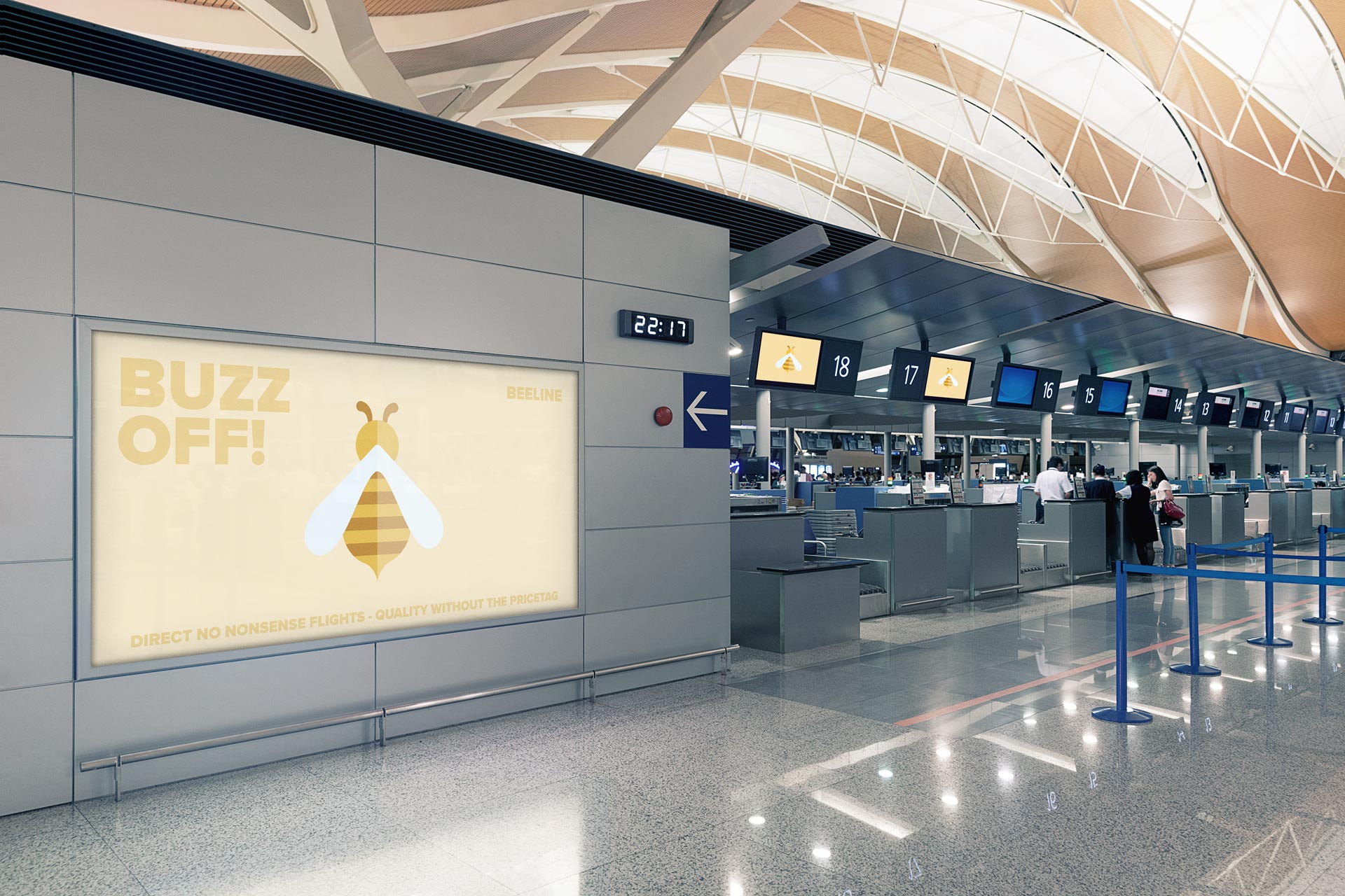
SIGNAGE: The “buzz off” tagline isn’t working for me. I feel like a sign with that much space needs to be talking more about the benefits of booking or the value the app gives them while in the airport (gate check? Upgrades). The benefits listed are way too small near the bottom. Also, as I mentioned in #2, your contrast in color isn’t great enough.
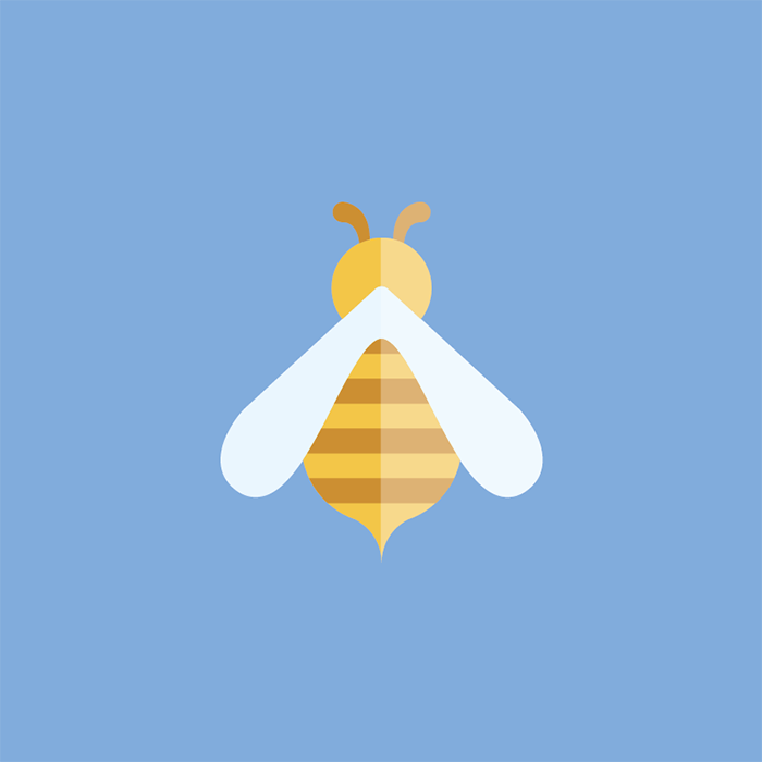
LOGO: The logo is a literal bee, but it doesn’t say much about the company name. The name is “Beeline” which implies direct/fast. This bee is still. I want to see it whizzing by. Wings flapping. I want to ride that bee to my destination in the fastest way possible. This bee looks like it’s parked. Is there a way to imply movement or speed within the design?
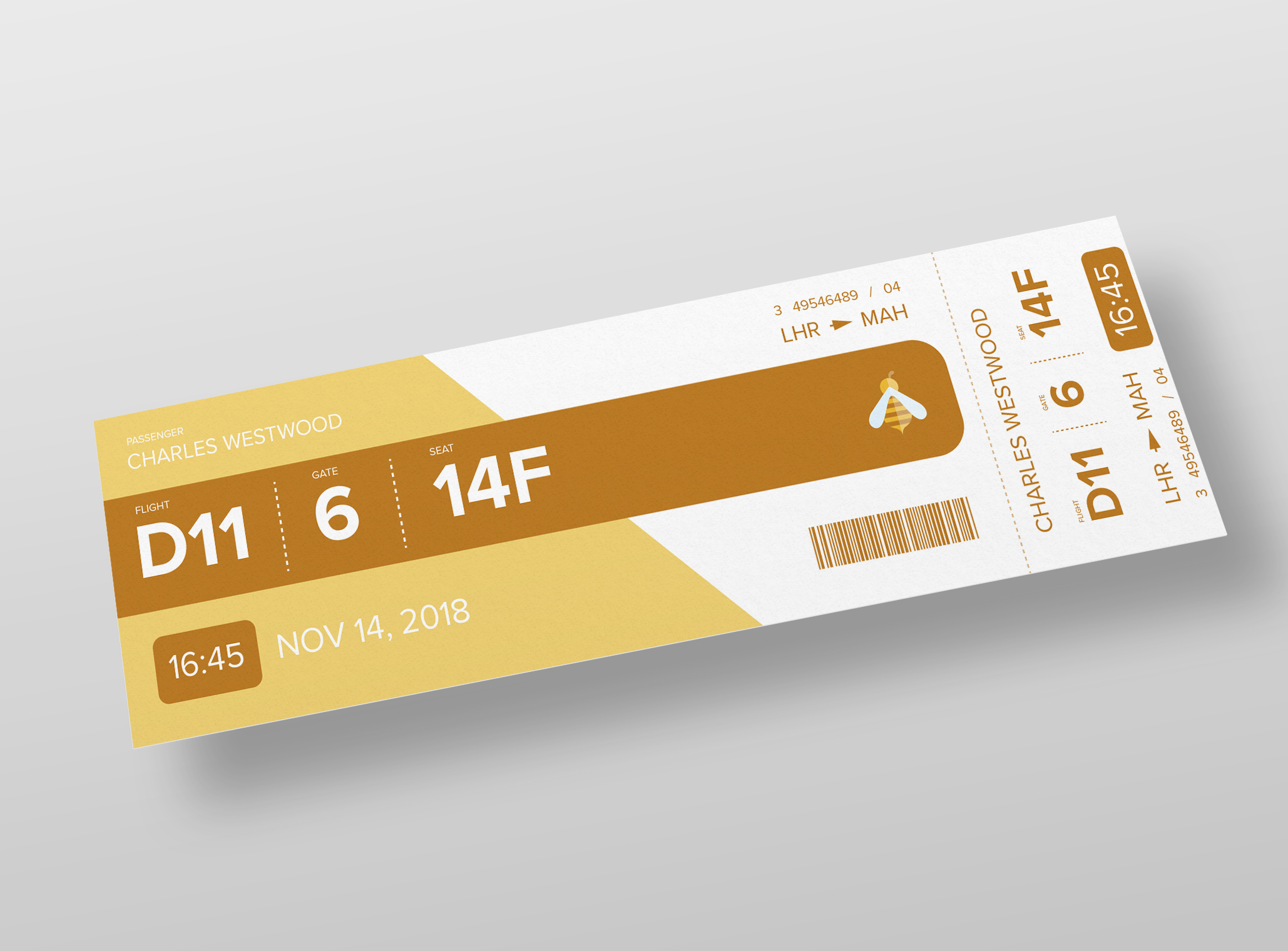
TICKET: Again, the contrast of white text on yellow backgrounds isn’t working. I kept thinking if this ticket was real… how it would need to be printed. They’d have to print the large block of brown, not white, to make this work. Also, why not include the hexagon motif? Plus, I’d like to see the digital ticket on a phone.
Thank you for such a broken down critique! A lot of what you’ve said has already occurred to me and will be changed in time but it’s always pleasing to know where the improvements can be made. To answer some of your questions though:
The app, 100% agree on the colours, they were very readable on the screens they were tested on but you’re completely correct that white on yellow isn’t always super readable.
It is the mockup I believe, the printed version I handed in had 12mm (1/2") all the way around.
The business cards were designed to be a simple design that would then have different information on them depending on who’s cards they were. This doesn’t come across very well in this way or in the mockups but my workbook at uni explained it all.
The signage was mostly done like this because in the brand guidelines I specified our voice should be humorous and whimsical, hence the pun, which obviously doesn’t promote the transfer of information as easily. I’ll work on a new way to create the signage though.
The logo needs a lot of work, it was, realistically, the first logo I had every created and its creation is highly limited by my knowledge and practice at the time.
There is so much possible with the tickets that I’m afraid to say I just didn’t really consider at all. It’s a shame really.
This module was run over about 8 weeks alongside multiple other projects so now that I have unlimited time to tweak and play I think I can do so much more, I’ll update this forum at the end when I’ve added more changes. Again, I’m very grateful for your feedback, this is the kind of stuff that is really needed when starting out!