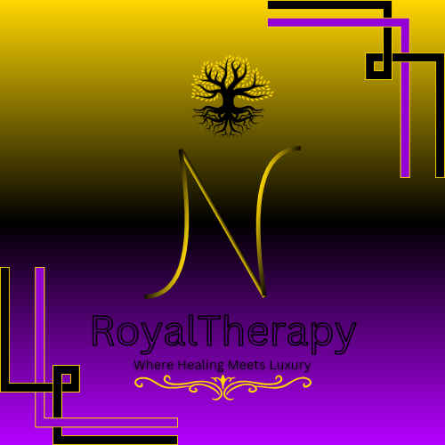
N being the first letter of my name
Colour
Gold and purple is elegant and often used as a sense of luxury, which should align well with the “Royal Therapy” theme.
Typography
The fonts chosen for “Royal Therapy” and “Where Healing Meets Luxury” are clean but don’t appear very legible.
Tree Symbol
Good representation of growth/healing/nature, which complements the theme of therapy.
Suggestions
Balance and Hierarchy
The “N” design is bold but dominates the poster, making it hard for viewers to focus on the brand name and tagline. Consider reducing its size or blending it more into the design.
N might be your first name initial but nobody knows that.
The tagline “Where Healing Meets Luxury” could be larger or spaced better to increase visibility.
Border and Decoration:
The decorative corner lines supposed to be a nice touch but I feel it is disconnected from the central elements. Adjust size/alignment and see if you can integrate them better into the overall design.
Adding symmetry to the corners (e.g., mirroring their placement) could enhance visual harmony.
Gradient Background
The gradient is not visually appealing, the transition between gold and purple could be smoother to avoid a harsh divide.
Consider using a soft vignette effect to subtly draw attention to the center.
Logo and Text Placement:
The tree logo feels cramped at the top. Giving it more breathing room by increasing the margin would help.
Aligning “Royal Therapy” centrally with the tagline and ensuring consistent spacing can make the design more cohesive.
The tagline could use a different font style or weight to contrast more with “Royal Therapy.” This would enhance readability and distinction.
Overall:
The design does not effectively communicates luxury and healing, needs a lot of tweaks in alignment, spacing, and integration of elements could take it to the next level.
It doesn’t feel like a luxury brand and has a long way to go to be finessed into a quality looking brand poster.
1 Like
The tree looks a bit menacing
This much would do
Even at that it looks very angry and not luxury.
Compared to competitors
Think the purple needs ot be a deeper shade.
Your typography needs a lot of work, Royal Therapy doesn’t luxurious or what royalty would use.
Look at some competition in this space
You really need to ramp up the luxury and sell it has a luxury brand that can’t be missed.
1 Like
I’m afraid you are probably not going to like this, but I don’t think pulling punches will do you any favours.
I don’t know what stage you are at and if you are still very young, then I apologise for the following – although, even then, I still stand by it.
I am afraid what you have done is quite some way off the mark.
It is cliché, derivative and looks like it was done with something like – yawn – canva. Please lose those awful corner decorations. They add nothing and, in fact, make it look anything but luxury.
Typographically, it leaves a lot to be desired. It does not say luxurious, as much as it says how little time you spend choosing a font. It is not really appropriate for the market.
Colours: as Smurf said, purple I’d often associated with luxury – albeit in a bit of a cliché way. It is a throw back from when the only way to make a purple dye was with a particular shellfish and thus was only affordable by the wealthiest, ie royal families. Study luxury brands now. How many use such heavily saturated colour?
The graduated fade to yellow also further erodes any sense of luxury. Makes it feel gimmicky and cheap,
The tree adds nothing and just appears derivative. Just because others have used it, doesn’t mean it’s the best idea.
I think you need to do much more research and think a lot deeper. Who is the target audience? What is unique about the company. Communicate this, rather than pastiche, oft-repeated visual cliché.
Im afraid, for me this one needs to go back to the drawing board
Hope this helps rather than discourages. Good luck.
5 Likes
My colleagues have given you what you need in their comments, so I don’t need to add to it. But I will offer you advice on other matters.
First of all, you are smart to seek professional help with your design.
Second, you call yourself “King—“. Titles like “King—“, “—Master” and etc. are titles that need to be earned. Giving yourself such a title before it is earned is a sure sign of insecurity and a lack of needed humility. Chose a name for your company or studio that speaks of what you do, not who you are.
Third, you really need to learn about color theory, typeface theory, and general design theory. Google these to start learning.
Finally, I genuinely wish you the best of success, and keep learning and stay curious throughout your career.
3 Likes
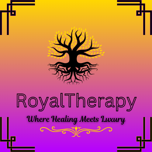
The concept for the design combines a luxurious and therapeutic aesthetic. Here’s a breakdown of its elements:
- Color Scheme
- The gradient background transitions from a warm yellow at the top to a vibrant magenta at the bottom. This color choice conveys positivity, energy, and warmth, aligning with the themes of healing and luxury.
#Gradient Background
*Issue: The gradient (yellow to magenta) is bold but may overwhelm the other elements, especially the tree and text. It might also reduce readability depending on lighting or printing.
*Suggestion: Soften the gradient or consider a more subtle blend of analogous colors. Alternatively, use a gradient overlay with reduced opacity.
2.Iconography
- A central black tree with glowing golden leaves and roots signifies growth, healing, and balance. The roots and branches together suggest deep connection and holistic well-being.
#Tree Icon
*Issue: The black tree with glowing golden leaves and roots is striking, but the fine details may be lost when scaled down, particularly for smaller print or digital formats.
*Suggestion: Simplify the tree design slightly by reducing intricate details or making the leaves and roots more pronounced and bold.
3.Typography
- The business name, “Royal Therapy,” uses a clean and modern sans-serif font. The boldness of the text contrasts well against the gradient background, ensuring clarity and prominence.
- The tagline, “Where Healing Meets Luxury,” is presented in a cursive, elegant script. This font choice enhances the sense of sophistication and luxury.
Typography issues
*Contrast: While “Royal Therapy” is readable, the tagline “Where Healing Meets Luxury” has reduced visibility due to the cursive font and thin stroke weight against the gradient background.
*Suggestion: Use a slightly thicker or bolder script for the tagline, or place it within a banner or subtle semi-transparent background box to improve readability.
Font Pairing: The sans-serif font for “Royal Therapy” and the cursive tagline contrast well but might not fully align stylistically.
*Suggestion: Choose a more luxurious sans-serif font for “Royal Therapy” to harmonize with the tagline’s elegance.
- Border Design
- The corners feature symmetrical black geometric patterns, adding a structured and ornamental touch. These designs reinforce the luxurious feel and frame the overall composition.
Border Design
*Issue: The geometric corner borders add structure but may feel disconnected from the organic style of the tree icon. They also compete visually with the central design, making the overall composition feel busy.
*Suggestion: Simplify or redesign the corners to better integrate with the organic, luxurious theme (e.g., flowing lines, floral patterns, or gold accents).
5.Overall Design
- The combination of vibrant colors, organic imagery (tree), and sleek typography creates a balanced design that effectively communicates the brand’s promise of combining healing with a luxurious experience.
- The layout is simple and visually appealing, with the central icon drawing attention, followed by the hierarchy of text.
Overall Balance
*Issue: The tagline and border elements are pulling attention away from the central tree and business name.
*Suggestion: Reduce the size or prominence of the border and adjust the spacing to create a more balanced layout. Ensure the central elements (tree and brand name) are the primary focus.
I completely agree with what @sprout wrote. There are so many problems that fixing them all would result in an entirely different design. As Sprout said, “go back to the drawing board,” and start over.
Since you used a large N in your first post and you wrote, “N being the first letter of my name,” I assume you’re the business owner and not a designer. If I were you, I would hire a professional designer to create your branding and marketing pieces for you.
The colour scheme is the design’s strongest aspect but poorly executed. While I tried to highlight positive elements and offer suggestions, these were largely dismissed or misunderstood. For example, removing the “N” but nothing with the tree design addressed one issue but failed to improve the overall concept.
The design has potential but lacks refinement. It reminds me of projects I’ve reworked in an hour or two to achieve significantly better results, proof of what an experienced designer can accomplish. The rework is disappointing and reflects the original creator’s inexperience.
Final thoughts, investing in a professional designer may seem costly, but it often pays off. For instance, I once redesigned flyers for a kickboxing club and explained to the owner how attracting just four new students would cover the cost of design, printing, and distribution. He agreed, recognising the value of professional input.
A similar approach could greatly benefit this project.
I agree, it seems you are the business owner, you need to hire a pro logo,branding designer