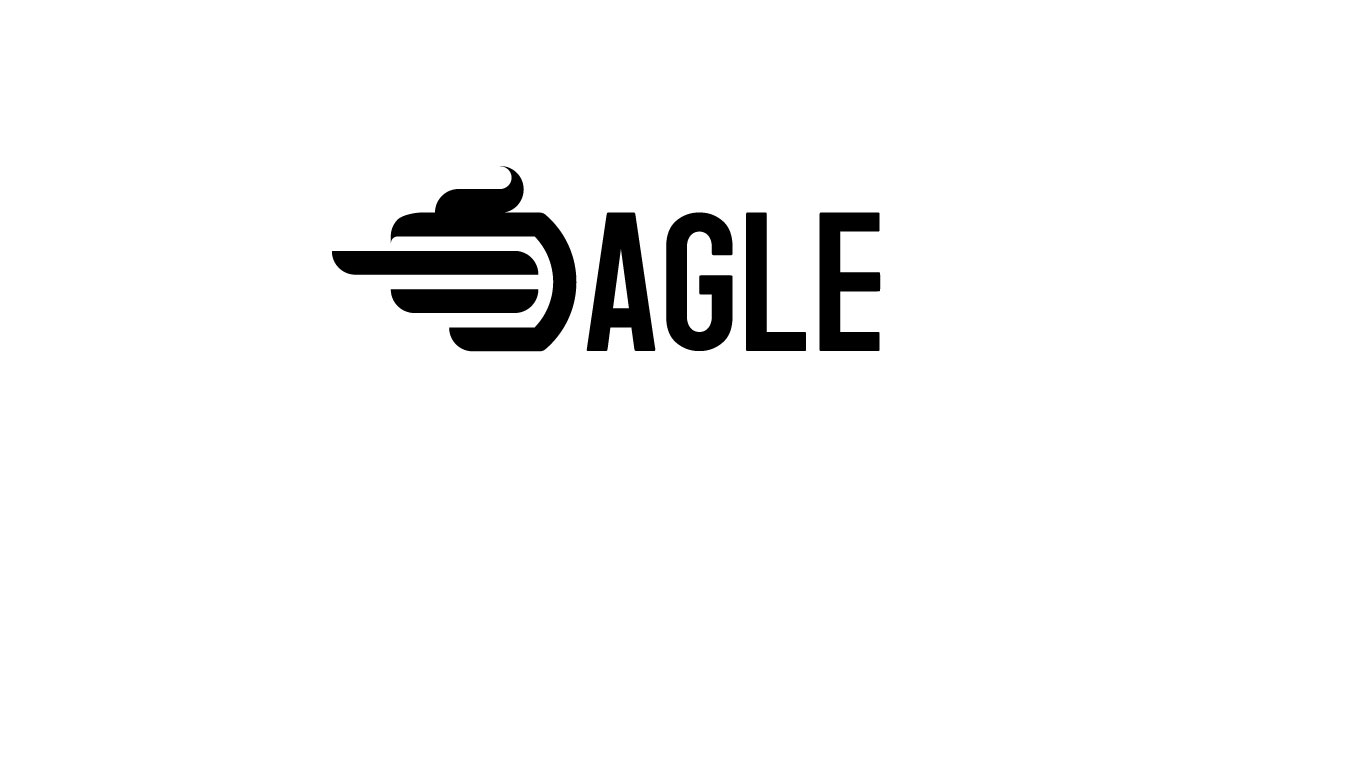
hmmmm frapichino shoppe?
you could put words underneath the logo describing the company.
A logo can’t really be judged on the basis of how it looks alone.
In addition to looking good, a logo needs to be a good fit for the organization that uses it. It needs to be part of a bigger strategy that considers everything from the nature of the organization to target audiences to competitors to at least a dozen other things. You’ve provided no additional information, which leaves no way to make a meaningful critique.
I know (I think) you’re trying to come up with a representation of the word “Eagle”. I don’t think you’ve quite pulled it off. That’s demanding a fair bit of stretch of imagination, a little beyond the range of an average reader/viewer. Work on the “E” first, then figure out “agle” later.
Better still, come up with an alternative from scratch.

I made this logo just for training, but the purpose was for a flight company
You are right to say that it needs to be par of a bigger strategy but I’m, just training at the moment
Thank you for the crit. i will try to make the eagle/e to pop up more
do you think that the “agle” lettes should be stylized too ?
i let it as the font to not “overwheight” the logo
Everything people have said about making a stand-alone logo, id have said too,.However for a first attempt … I have seen a lot worse from people who purport to be professionals. It’s a whole lot better than the first thing I ever did.
Stick at it and learn about branding. If you haven’t looked into it too deeply yet, I think you may be surprised how the logo design is really just the tip of the iceberg. Read Wally Olins, On Brand. It’ll give you a good insight.
I’d work on the “E” first, and not let “agle” be the burden.
Your thought process is on the right track: you’ve developed the logo to work in only one color, no gradients, easily reproducible across a variety of mediums. But, as others have pointed out, the execution isn’t working. I would not have come up with EAGLE on my own. I would have read it as AGLE or maybe DAGLE. If you can come up with a way to integrate the eagle with an E, that’s great. If not, the icon doesn’t necessarily have to integrate with the type.
The readability is poor. What is a flight company? An airline?
I think your logo is very similar to one in this tutorial - https://www.youtube.com/watch?v=4MxRhjHmiVw
Good catch.
In the tutorial example they spell out the name using the D, so the issue of the icon readability is mitigated. Also the dragon horns, or whatever, read better in the tutorial example… And the typography is better also. ![]()
I think as a general rule, it’s best to avoid combining the logo with the company name. Sometimes it can work, but more often than not, it creates a jumble that just doesn’t work. It’s usually best, I think, to keep them separate.
If you are making a logo for practice purposes, that’s one thing. Maybe you’re just learning Illustrator or farting around. I hope you realize, however, that lifting a concept or art like this from a tutorial is not an acceptable practice for a real world assignment. Also, I wouldn’t include anything like this in your portfolio. The work presented in your portfolio should be your ideas and artwork.
Wow actually it look very similarm but i think that i never saw that video. my ideas come from stacking diferent logos like this onem and trying to implement the “E” on it
(if i’m violating some rules by posting this immages i will remove it)
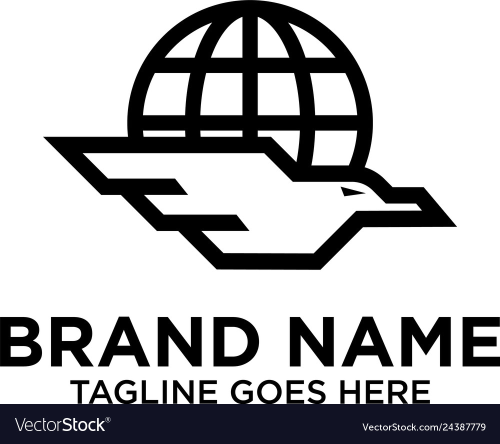
Yeah i’m just learning to use illustrator like u said, but i didn’t copy it from that tutorial as i replayed to aristopromo i jsut stacked some logos that i found togheter, but anyway is not a problem. you can belive me or not
do you think that matching this logo togheter to make a new one is considered bad for the protfolio or a real world assignment?
because for now i’m looking for other logos and trying to get ideas from them
The “Dagle” Coffee Company?